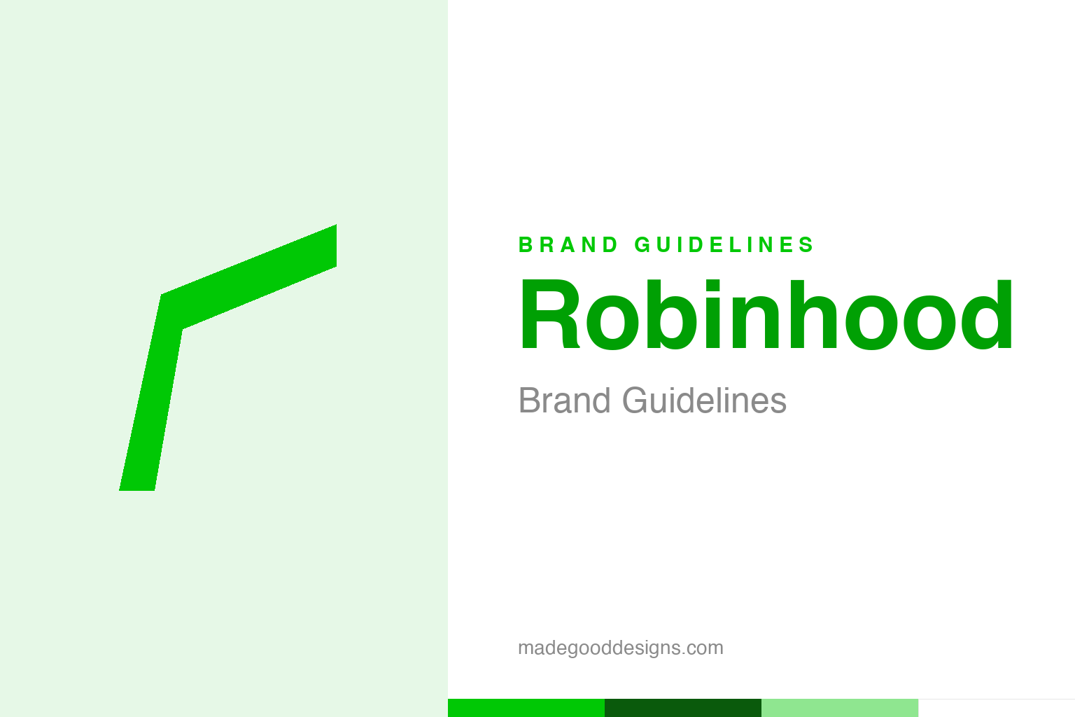
Robinhood Brand Guidelines
A feather and a name from an English folk hero — and the green that came to mean commission-free trading.
An abstract feather — the Robin-Hood idea, not the mark. Deliberately not the Robinhood logo.
A folk hero as a brand
Robinhood’s name stakes out a mission before you open the app.
Robinhood’s brand starts with its name — borrowed from the English folk hero who took from the rich to give to the poor. It’s an audacious, values-forward choice for a financial company, instantly framing the whole enterprise around a mission: “democratising finance for all,” breaking open a Wall Street that had long felt exclusive and expensive. The logo reinforces it with a feather — evoking Robin Hood’s cap, and (with an arrow-like spine in the modern mark) his bow — light, elegant and symbolic of freedom and access. It’s a coherent, confident identity: a legendary name and a graceful feather, both saying the same thing before you’ve placed a single trade. Our homage keeps an abstract feather, not the mark.
Commission-free, by design
The brand promise matched a real product disruption.
What gives Robinhood’s Robin-Hood framing credibility is that it launched a genuinely disruptive product: commission-free stock trading via a slick, simple mobile app. Founded in 2013 by Vlad Tenev and Baiju Bhatt, it removed the per-trade fees that traditional brokerages charged, and wrapped investing in a clean, approachable, game-like interface aimed at a young, first-time-investor audience. So the “take from the rich, give to the everyman” symbolism wasn’t just branding — the company actually lowered a real barrier (trading costs) that had kept many people out of the markets. When a brand’s mission and its product genuinely align like that, the identity feels earned rather than borrowed, and Robinhood’s early growth reflected how powerfully that resonated.
Green as money and ‘go’
Robinhood’s colour choice is doubly apt.
Robinhood’s signature bright green (#00C805) is a clever pick on two levels. Green is, universally, the colour of money — especially US dollars — making it an obvious fit for finance. But it’s also the colour of “go,” growth and positivity, and (not incidentally) the colour of a rising stock on a trading screen. That electric, optimistic green has been Robinhood’s constant — it didn’t drift away from it — and it helped the brand feel fresh, energetic and modern next to the staid navy-and-grey of legacy finance. It’s a small but telling decision: reach for a vivid, upbeat green rather than the sober tones the industry defaults to, and you immediately signal that this is a different, more accessible kind of financial company.
A brand that provokes debate
Robinhood’s identity is powerful — and contested.
Robinhood is also a reminder that a strong, mission-driven brand invites scrutiny against that very mission. The company has faced real criticism — over “gamifying” investing, over its business model (including how it earns revenue), and over episodes like the 2021 trading restrictions during the GameStop frenzy — with critics arguing that a company literally named after a hero of the people should be held to a higher standard. That tension is instructive: when you brand yourself around fairness and democratisation, every decision gets measured against that promise, and any perceived gap between the ideal and the reality becomes a story.
It’s the flip side of a values-forward identity. A bold, meaningful brand like Robinhood’s — the folk-hero name, the feather, the “finance for all” mission — is enormously powerful for building an audience quickly, because people rally to a cause. But it also sets a high bar and hands critics a ready-made yardstick. The lesson isn’t that mission-driven branding is a mistake — it can be extraordinarily effective — but that it’s a commitment. Choose a name like Robinhood and you don’t just get the goodwill; you take on the obligation to keep earning it. The feather is light, but the promise it carries is heavy.
The enduring takeaway from Robinhood is that meaning and consistency beat noise. A mark grounded in a genuine idea — and applied with discipline across every surface and every year — accumulates a kind of quiet authority that no amount of short-term cleverness can buy. Brands are forever tempted to reinvent themselves, but the most powerful identities are usually the most patient ones. The work is less about the initial flash of a design and far more about the long, unglamorous commitment to protecting and nurturing it until it becomes genuinely unmistakable.
Type & the wordmark
A clean, modern sans in green.
Robinhood pairs the feather with a clean, modern sans wordmark — approachable and contemporary. The specimen below stands in with a neutral sans.
Investing for everyone
Even, modern, approachable — type that makes finance feel open, not exclusive. (Specimen set in Archivo, a neutral stand-in.)
Robinhood green
One electric, optimistic green. Click a swatch to copy the hex.
Robinhood’s identity is anchored by an electric green #00C805, with black and white. Lead with the green below.
Explore & save
Keep the feather idea on hand — save the homage and Robinhood green to a board.
Robinhood identity set
Pin the feather homage, Robinhood green and the mission-brand lesson to your own board.


