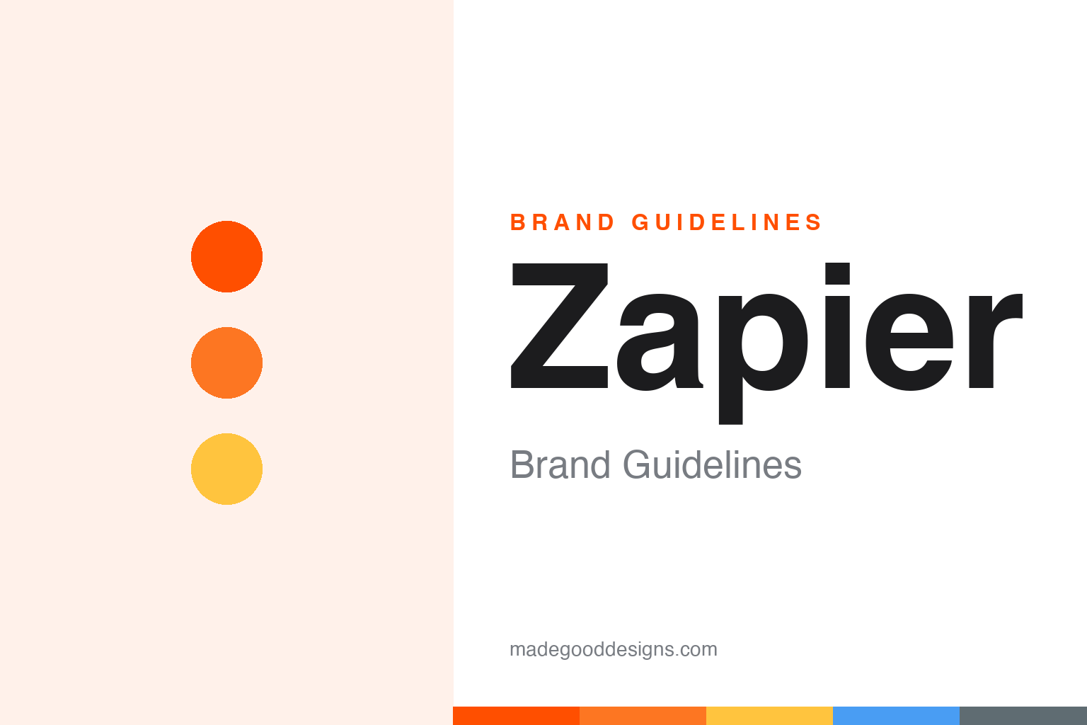
Zapier Brand Guidelines
The orange of an astronaut’s suit, on the brand that quietly wires the internet’s apps together.
Aa
Two constants: a hot international orange and a clean grotesque display. Abstract homage — not the Zapier wordmark.
The colour of new possibilities
Zapier connects the apps you already use — invisible plumbing that needed a very visible colour.
Zapier automates work by linking thousands of apps into “zaps,” which means the product itself is largely invisible — it runs in the background so you don’t have to. A brand for invisible plumbing has to work hard to feel alive, and Zapier’s answer is a single, unmissable orange. The 2022 refresh reframed it as “international orange” — the same high-visibility hue used on astronauts’ suits and the Golden Gate Bridge — explicitly to signal exploration and “new possibilities.” It’s warmth and optimism doing the job the product can’t do on screen.
The company was founded in 2011 by Wade Foster, Bryan Helmig and Mike Knoop as a side project in Columbia, Missouri, before Y Combinator and a public launch in 2012. Its current identity treats the wordmark as a flexible “platform” that can hold imagery and stories rather than a single fixed emblem — a fitting idea for a product that’s all about connecting other things.
Colour
Zapier’s orange is loud, friendly and specific. Click a swatch to copy the hex.
The signature is Zap Orange #FF4F00, the value on Zapier’s own brand site (you’ll see #FF4A00 on some aggregators — a near-identical variant). Around it sits a warm, approachable supporting set: Pumpkin #FD7622, Sunglow #FFC43E, a cadet grey #5F6C72, a Picton blue #499DF3 and a teal. The orange carries the personality — energetic, non-intimidating, a deliberate softening of a technical product — while the cooler supports keep long pages readable. It’s a palette built to make automation feel friendly rather than forbidding.
Like most high-visibility oranges, Zap Orange #FF4F00 is a brilliant brand colour and a poor body-text colour — on white it sits right at the edge of legibility, so Zapier uses it for the wordmark, buttons, illustration and big statements rather than paragraphs. That’s the discipline to copy: let the orange own the loud moments and lean on the cadet grey #5F6C72 and near-black for the words people actually read, bringing in Picton blue #499DF3 and the teal as cooler, calmer counterweights. The pumpkin and sunglow shades extend the warm family for gradients and accents without ever competing with the primary. Handled this way the palette does its real job — turning invisible, intimidating plumbing into something that looks approachable, optimistic and unmistakably Zapier the moment it loads.
Typography
The type system is where the 2022 rebrand got precise — three faces, clearly cast.
Post-rebrand, Zapier pairs Degular as its primary display and sans, GT Alpina as an editorial serif for contrast and warmth, and Inter for interface and body text. These are licensed retail typefaces rather than a bespoke face — a pragmatic, modern choice that gives the brand range without the cost of commissioning type. Degular’s clean, slightly friendly grotesque suits the approachable orange; GT Alpina’s serif adds a human, editorial note when the brand wants to sound thoughtful rather than purely functional.
Aa Zz 24
A friendly grotesque for display, a serif for warmth, Inter for UI. (Specimen set in Familjen Grotesk, a clean grotesque in the spirit of Zapier’s Degular.)
The Z that never shipped
The best-known story from Zapier’s rebrand is about a logo that had to be thrown away.
Zapier’s 2022 identity fully launched on July 6, 2022, but its most-told story is what didn’t make it. The near-final concept reportedly centred on a lightning-bolt “Z” — until, during Russia’s invasion of Ukraine, the letter “Z” became a pro-war symbol. The team scrapped the mark and rebuilt the identity in roughly three weeks, in-house with help from agency Instrument. It’s a sharp reminder that a logo doesn’t live in a vacuum: a symbol’s meaning can be rewritten by the world overnight, and a responsible brand has to be willing to walk away from good work.
One last, human detail the brand insists on: it’s pronounced “zap-ee-er,” as in “happier,” not “zay-pier.” That friendliness — a warm name, a warm colour, a mission to “make automation work for everyone” — is the whole point. Zapier took a deeply technical category and made it feel welcoming, proving that even background infrastructure deserves a brand with a smile. And the discarded lightning-“Z” leaves a lasting lesson for any designer: build an identity flexible enough to survive a change of heart, because the strongest brands are the ones willing to let a good idea go when the world gives them a reason to.
Explore & save
Keep Zapier’s identity on hand — save it to a board in the Made Good inspiration library.
Zapier identity set
Pin the international-orange palette and the type spirit to your own board.
Source & notes
Frequently Asked Questions
What font can I use to match the Zapier look?
This guide describes Zapier’s type as “A friendly grotesque for display, a serif for warmth, Inter for UI”. Its type specimen is set in Familjen Grotesk from Google Fonts as a stand-in; Familjen Grotesk is not Zapier’s own lettering.
What colours are in the Zapier palette?
This guide’s Zapier palette is Zap Orange #FF4F00, Pumpkin #FD7622, Sunglow #FFC43E, Picton Blue #499DF3 and Cadet #5F6C72. It cites Zapier’s brand resources for Zap Orange #FF4F00.


