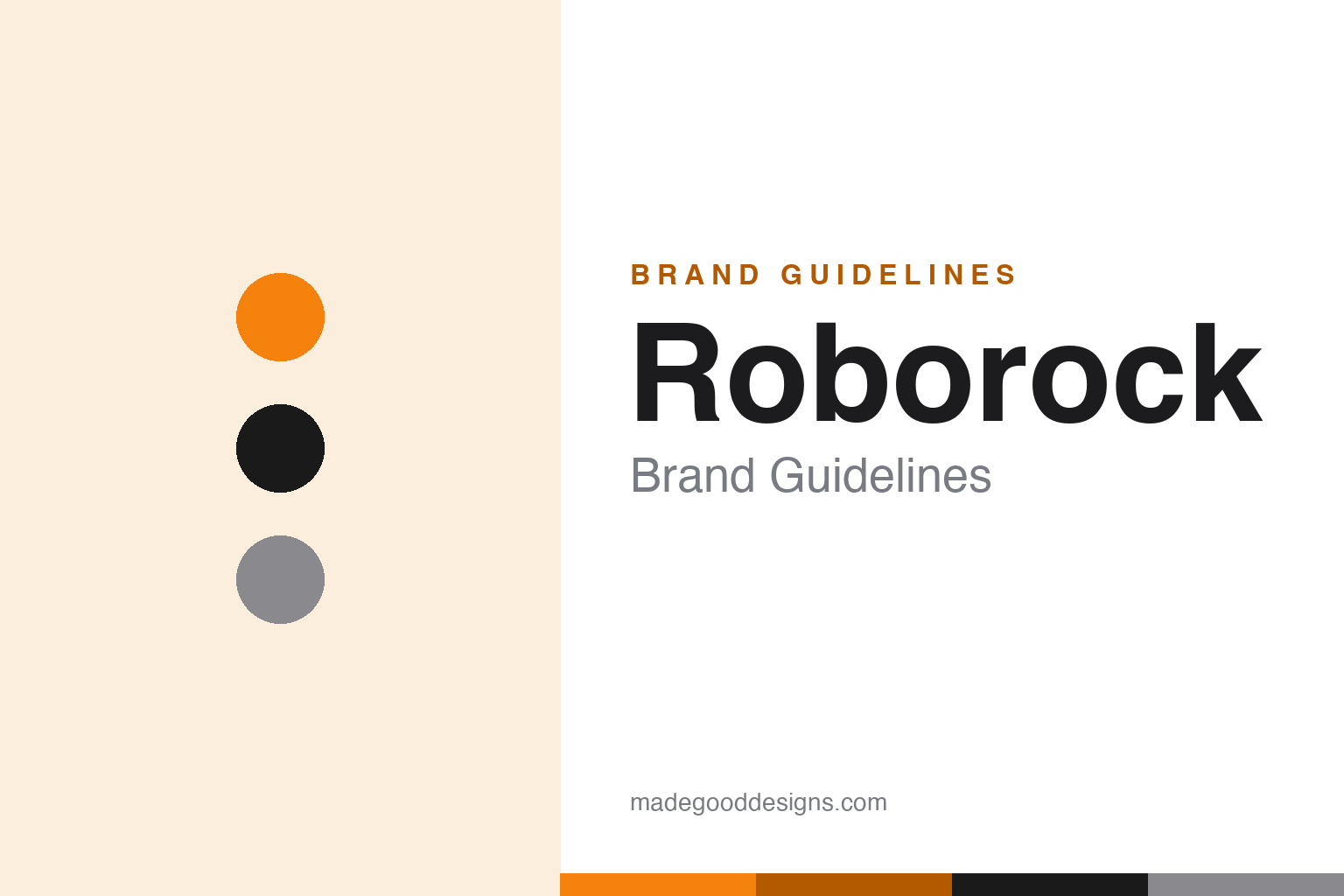
Roborock Brand Guidelines
From a Xiaomi ecosystem partner to the world’s number-one robot vacuum — clean, modern, and independent.
Aa
Two constants: a black/white base with an orange accent and a geometric sans. Abstract homage — not the Roborock wordmark.
The partner that overtook the pioneer
Roborock rose from Xiaomi’s ecosystem.
Roborock is a lesson in an ecosystem partner outgrowing its origins. It was founded in 2014 in Beijing by Richard Chang, and quickly took a Series A investment from Xiaomi, joining Xiaomi’s “ecological chain” of ecosystem partner companies. Its first product was the Mi Home Robotic Vacuum, built for Xiaomi’s Mi brand — before Roborock launched its own-brand products. (An important myth to avoid: Roborock is not owned by Xiaomi — Xiaomi is an early/minority investor; Roborock is an independent, publicly-listed company.) (Honest caveats: no official brand hex is published, so the colours below are observed, and the wordmark typeface is undocumented.)
Roborock makes premium robot vacuums and mops, known for strong LiDAR navigation and self-emptying/self-washing docks. And it did something remarkable: it overtook iRobot/Roomba to become the world’s #1 robot-vacuum brand, ranking first globally in both sales volume and revenue in 2024, as annual revenue topped RMB 10 billion. The pioneer (iRobot) invented the category; the challenger (Roborock) took the lead — a classic story of a fast, focused newcomer out-innovating the incumbent.
On ownership, Roborock IPO’d on Shanghai’s STAR Market in 2020 (ticker 688169) — the first Xiaomi-supply-chain company on that board — and operates as an independent, listed company with Xiaomi-affiliated entities holding only a minority stake. The identity matches its modern, premium products: a clean lowercase “roborock” wordmark, geometric and rendered mostly in black and white, with an orange/amber accent on newer branding. A challenger that became the leader.
Colour
Roborock lives in black, white and orange. Click a swatch to copy the hex.
Roborock’s palette is a clean black-and-white base with an orange/amber accent. The monochrome base reads as modern, premium and technical — matching high-end robot vacuums with sophisticated navigation and sleek docks — while the orange adds warmth, energy and a distinctive point of focus that sets Roborock apart in a category full of plain white appliances. It’s a minimal, confident scheme that signals precision and quality without feeling cold, fitting a brand that competes on advanced engineering and design. The honest caveat: Roborock publishes no accessible official brand hex — the orange and the base tones here are observed approximations, not first-party values.
The lesson is a clean base with a warm accent. Roborock’s black-and-white-with-orange feels premium and technical yet distinctive. For designers, it’s a reminder that a minimal base plus one warm accent can stand out in a bland category. The takeaways: keep the base clean and premium for high-end tech (black and white); add one warm, ownable accent for distinction (the orange); and treat specific hexes as approximate when no official spec is published.
Typography
The wordmark is a geometric sans — clean and modern.
Roborock’s geometric sans wordmark — a clean lowercase “roborock” with slightly rounded terminals — is clean and modern. The even, contemporary letterforms read as precise, premium and tech-forward, matching sophisticated robot vacuums prized for their navigation and engineering, and the lowercase keeps it approachable rather than corporate. In a mostly black-and-white treatment with an orange accent, the type feels sleek and confident — exactly the modern, high-end personality of a brand that out-innovated the category’s pioneer. It’s minimal and refined rather than decorative. (Because the exact face is custom and undocumented, the honest description is “a geometric sans,” not a named font.) The type behaves like the brand: clean, modern and premium.
Aa
A geometric sans — clean and modern. (Specimen set in Jost, a geometric sans in the spirit of the Roborock wordmark; the real face is undocumented.)
The challenger’s playbook
Roborock beat the incumbent by focusing.
Roborock is a lesson in how a focused challenger overtakes a category pioneer. iRobot invented the robot vacuum, but Roborock — younger, faster and laser-focused — out-innovated it on navigation, self-cleaning docks and features, and rode a strong ecosystem start into global leadership. It’s the mirror image of the iRobot story: where the pioneer stumbled, the challenger surged, becoming #1 worldwide. Crucially, Roborock built its own brand and independence rather than staying a white-label supplier, and its clean, premium identity signalled that it belonged at the high end. It’s proof that in a maturing category, relentless product focus and a distinct brand can let a newcomer leapfrog the very company that created the market.
For designers and brand-builders, Roborock offers a clear takeaway: a focused challenger can overtake a pioneer by out-innovating and building its own strong, independent brand. The lessons: compete on genuine product advances (LiDAR navigation, self-washing docks); establish an independent identity rather than staying a white-label maker (the “roborock” brand); and use a clean, premium look to signal quality (black-and-white with orange). It’s also a reminder to keep the facts precise — Roborock was founded in 2014 in Beijing by Richard Chang, started in Xiaomi’s ecosystem (Xiaomi is a minority investor, not the owner), IPO’d on the STAR Market in 2020, and overtook iRobot to become the #1 global robot-vacuum brand by 2024. Roborock ran the challenger’s playbook — proof that focus and a strong brand can beat the pioneer.
Explore & save
Keep Roborock’s identity on hand — save it to a board in the Made Good inspiration library.
Roborock identity set
Pin the black-and-orange palette and the geometric-sans spirit to your own board.