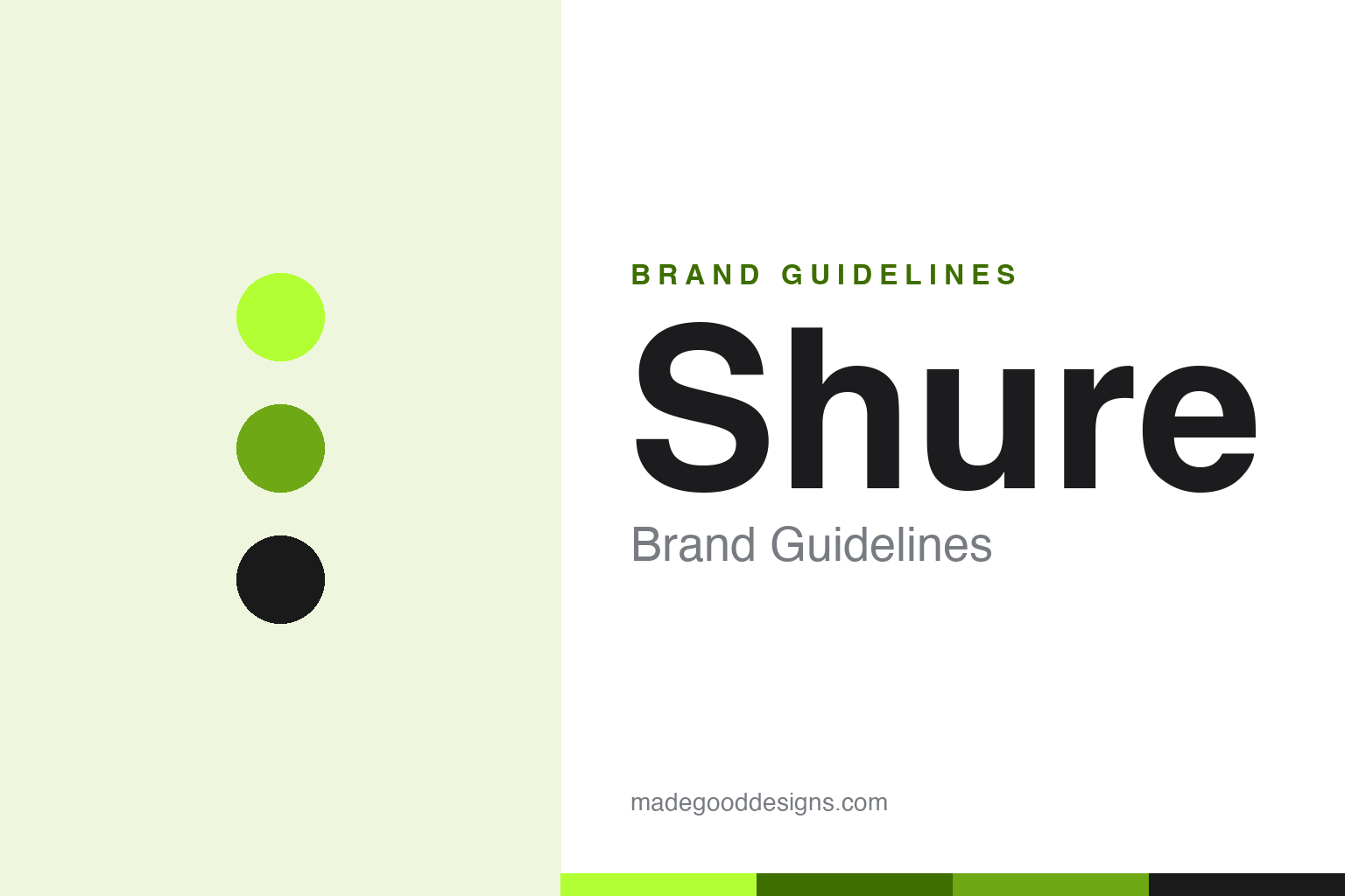
Shure Brand Guidelines
The microphone brand on stages worldwide — the SM58 you can drop, and an electric-green wordmark.
Aa
Two constants: an electric-green palette and a bold italic sans. Abstract homage — not the Shure wordmark.
The microphone on every stage
Shure sets the mic standard.
Shure is a lesson in becoming the trusted standard through durability and consistency. It was founded in 1925 in Chicago by Sidney N. Shure as “The Shure Radio Company,” a one-man operation selling radio-parts kits; when his brother joined it became “Shure Brothers.” A century on, it’s still privately held and family-controlled, headquartered near Chicago (Niles, Illinois). (Honest caveats: the electric-green identity dates to a 2019 rebrand and no official public hex is confirmed, so the green below is approximate; the wordmark typeface is a custom, undocumented letterform.)
Shure is legendary for its microphones. The Unidyne Model 55 (1939) — the art-deco chrome shape everyone pictures as “the microphone” — was the world’s first single-element directional dynamic mic (it’s nicknamed the “Elvis mic,” though a myth to avoid is that it was made for Elvis). The SM57 and SM58 (mid-1960s) became the industry-standard dynamic mics — the SM58 the ubiquitous live-vocal mic, the SM57 for instruments and amps — and the SM7 → SM7B is the beloved broadcast, podcast and studio mic (Michael Jackson’s Thriller vocals were recorded on the SM7, its predecessor).
The brand’s reputation is built on legendary ruggedness: the SM58 is famous for surviving being dropped (and worse — Shure has run torture tests hammering nails, freezing and running one over with a car). It’s the mic on stages worldwide, and Shure also makes wireless systems and in-ear monitors. The identity, refreshed in 2019, is a bold, italicised “SHURE” wordmark in an electric, lime-ish green — energetic and distinctive against a category full of black gear. A century-old standard-bearer of sound.
Colour
Shure lives in electric green. Click a swatch to copy the hex.
Shure’s current identity centres on an electric, lime-ish green (from its 2019 rebrand), with black and white. The green reads as energetic, modern and distinctive — a bold, unexpected choice in an audio-gear category dominated by black and silver — and it makes the brand pop on stages, packaging and screens. It signals vitality and confidence, refreshing a century-old company with a contemporary, high-energy accent while the products themselves stay classic. It’s a striking, ownable colour that stands apart from rivals. The honest caveat: no official public brand hex is confirmed — the electric green here (commonly cited near #B2FF33) is an observed approximation, not a first-party value.
The lesson is an unexpected, ownable colour refreshes a heritage brand. Shure’s electric green stands out in a black-gear category and modernises a 100-year-old name. For designers, it’s a reminder that a bold colour choice can rejuvenate heritage without changing the products. The takeaways: choose a distinctive colour that rivals don’t own (the electric green); use it to modernise a heritage brand while keeping the products classic; and treat specific hexes as approximate when no official spec is published.
Typography
The wordmark is a bold italic sans — energetic and confident.
Shure’s bold italic sans wordmark — “SHURE” in electric green, from its 2019 rebrand — is energetic and confident. The strong, slanted letterforms read as dynamic, modern and self-assured, giving a century-old audio company a contemporary, forward-leaning feel, and the italic adds a sense of motion and energy that suits live performance and music. In the electric green, the type feels vibrant and distinctive rather than staid — a smart way to keep a heritage brand feeling current. It’s bold and lively while the products stay classic and dependable. (Because the exact face is a custom, undocumented letterform, the honest description is “a bold italic sans,” not a named font.) The type behaves like the refreshed brand: energetic, confident and modern.
Aa
A bold italic sans — energetic and confident. (Specimen set in Kanit, a bold sans in the spirit of the 2019 Shure wordmark; the real face is a custom letterform.)
Trust built on toughness
Shure’s durability made it the standard.
Shure is a lesson in how reliability becomes a brand’s deepest equity. Musicians and engineers reach for an SM58 not because it’s flashy but because it always works — it survives drops, tours, sweat and abuse, and sounds consistent every time. That legendary toughness, proven over decades on stages worldwide, turned Shure into the default, trusted standard: the safe choice, the industry benchmark. It’s the same lesson as other reliability-led brands — when people can depend on you completely, that trust compounds into market leadership. Shure then wrapped this century of dependability in a fresh, energetic green identity to stay modern, without changing the rugged products that earned the trust in the first place.
For designers and brand-builders, Shure offers a clear takeaway: reliability and durability, proven over time, can become a brand’s core equity — and a fresh identity can modernise it. The lessons: earn trust through consistent, dependable products (the rugged SM58); let that reputation make you the default standard; and refresh the identity (the 2019 green) to stay current without disturbing what works. It’s also a reminder to keep the facts precise — Shure was founded in 1925 in Chicago by Sidney Shure, is still private/family-controlled, made the iconic Unidyne 55 (1939) and the standard-setting SM57/SM58 and SM7B, is renowned for ruggedness, and uses an electric-green “SHURE” wordmark from its 2019 rebrand. Shure’s trust is built on toughness — proof that dependability can be a brand’s strongest asset.
Explore & save
Keep Shure’s identity on hand — save it to a board in the Made Good inspiration library.
Shure identity set
Pin the green palette and the italic-sans spirit to your own board.