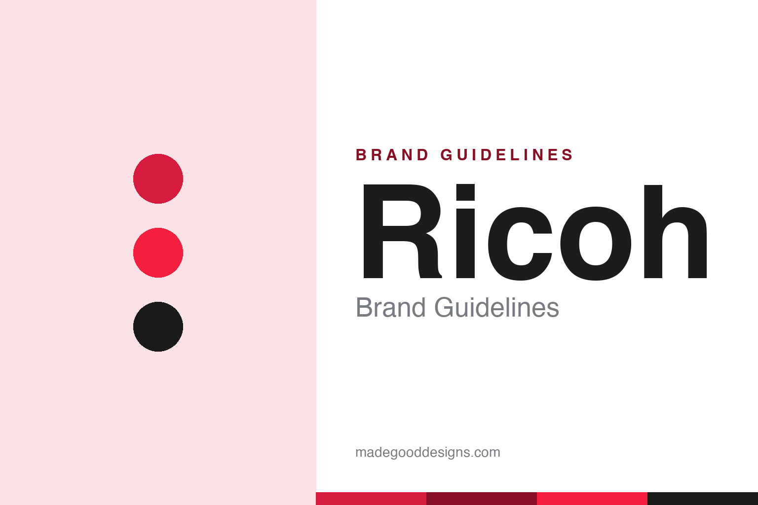
Ricoh Brand Guidelines
An office-imaging giant with a cult camera — the pocketable GR, Pentax, and a red wordmark.
Aa
Two constants: a red palette and a bold sans. Abstract homage — not the Ricoh wordmark.
An office giant with a cult camera
Ricoh is huge in imaging, beloved for the GR.
Ricoh is a lesson in a giant B2B company with a beloved cult product. It was founded in 1936 in Japan, spun from the sensitized-paper division of Riken (Japan’s Institute of Physical and Chemical Research) as Riken Kankoshi Co., under founder Kiyoshi Ichimura — the name deriving from “Riken.” (A myth to avoid: “Ricoh” is not an English acronym — it comes from Riken.) It grew into a maker of cameras and, above all, office imaging — copiers, printers, fax machines and multifunction devices. (Honest caveats: no official public brand hex is published, so the red below is approximate, and the wordmark typeface is undocumented.)
Today Ricoh is primarily a huge B2B office-imaging and document-management company — but among photographers it’s beloved for a small, cult part of its business: the GR series. The film GR1 (1996) — a pocketable camera with a sharp fixed 28mm lens — became a street-photography favourite, and the line evolved into the large-sensor APS-C Ricoh GR, widely called the ultimate discreet, pocketable street camera, with a genuine cult following.
Ricoh also owns Pentax: it acquired the camera brand from Hoya in 2011, and its camera division, Ricoh Imaging, makes both Ricoh (GR) and Pentax (DSLRs, plus the Film Camera Project’s new Pentax 17). The identity is a bold red “RICOH” wordmark (current mark from 2005), with the tagline “imagine. change.” (added 2012). (A myth to avoid: the standard mark is a red wordmark, not “gray letters with a red o.”) A giant in imaging — with a camera photographers adore.
Colour
Ricoh lives in red. Click a swatch to copy the hex.
Ricoh’s palette is anchored by a bold red, with black and white. The red reads as confident, energetic and established — a strong, recognisable corporate colour appropriate for a major global technology and imaging company, and it carries decades of brand recognition, especially in the office-equipment world. It stands out among the blues and greys of much B2B tech, signalling a bold, established brand. It’s a simple, high-impact scheme, consistent across Ricoh’s office imaging and its cameras alike. The honest caveat: no official public brand hex is published — the red here is an observed approximation (commonly cited near #D61B3E), not a certified value; and the standard mark is a red wordmark, not “gray with a red o.”
The lesson is a bold, consistent red for a global tech brand. Ricoh’s red gives a huge B2B company a recognisable, energetic face across imaging and cameras. For designers, it’s a reminder that a bold primary, held consistently, builds recognition even for a behind-the-scenes company. The takeaways: use a bold, ownable primary for recognition (the red); keep it consistent across very different product lines (office imaging and cameras); and treat specific hexes as approximate when no official spec is published.
Typography
The wordmark is a bold sans — confident and established.
Ricoh’s bold sans wordmark — the red “RICOH” (current mark from 2005) — is confident and established. The strong, even letterforms read as solid, trustworthy and modern, matching a major global imaging and document-services company, and the boldness gives the red real presence and recognition. Paired with the tagline “imagine. change.” (added 2012), the identity feels forward-looking yet grounded. It’s straightforward and legible rather than decorative, designed to be recognised across office equipment, digital services and cameras alike. Set in the signature red, the wordmark is vivid and dependable — a corporate mark that also fronts a cult camera line. (Because the exact face is undocumented, the honest description is “a bold sans,” not a named font.) The type behaves like the brand: confident, established and modern.
Aa
A bold sans — confident and established. (Specimen set in Archivo, a bold grotesque in the spirit of the Ricoh wordmark; the real face is undocumented.)
A cult product inside a giant
Ricoh’s GR punches above its size.
Ricoh is a lesson in how a small, beloved cult product can shape a giant’s image. Ricoh is overwhelmingly a B2B office-imaging company — copiers and printers, not cameras — yet among enthusiasts, its brand is defined by the GR: a niche, cult camera with devoted fans far out of proportion to its share of the business. That’s a valuable dynamic: a passionately-loved product (the GR) gives an otherwise faceless B2B giant warmth, credibility and cultural cachet it could never buy through office equipment alone. Owning Pentax adds to that heritage. It’s proof that a small, genuinely-beloved product can punch far above its commercial weight in shaping how a large company is perceived — a halo worth protecting.
For designers and brand-builders, Ricoh offers a clear takeaway: a small, genuinely-beloved cult product can give a large, faceless company warmth and cultural cachet. The lessons: nurture a passionately-loved product even if it’s a small share of revenue (the GR); let it humanise and add credibility to the larger brand; and keep a consistent identity across the giant and the cult product (the red wordmark). It’s also a reminder to keep the facts precise — Ricoh was founded in 1936 (from Riken), is primarily a B2B office-imaging company, is beloved for the GR street cameras, owns Pentax (acquired from Hoya in 2011) via Ricoh Imaging, and uses a red wordmark with the “imagine. change.” tagline. Ricoh’s GR punches above its size — proof that a cult product can shape a giant’s image.
Explore & save
Keep Ricoh’s identity on hand — save it to a board in the Made Good inspiration library.
Ricoh identity set
Pin the red palette and the bold-sans spirit to your own board.