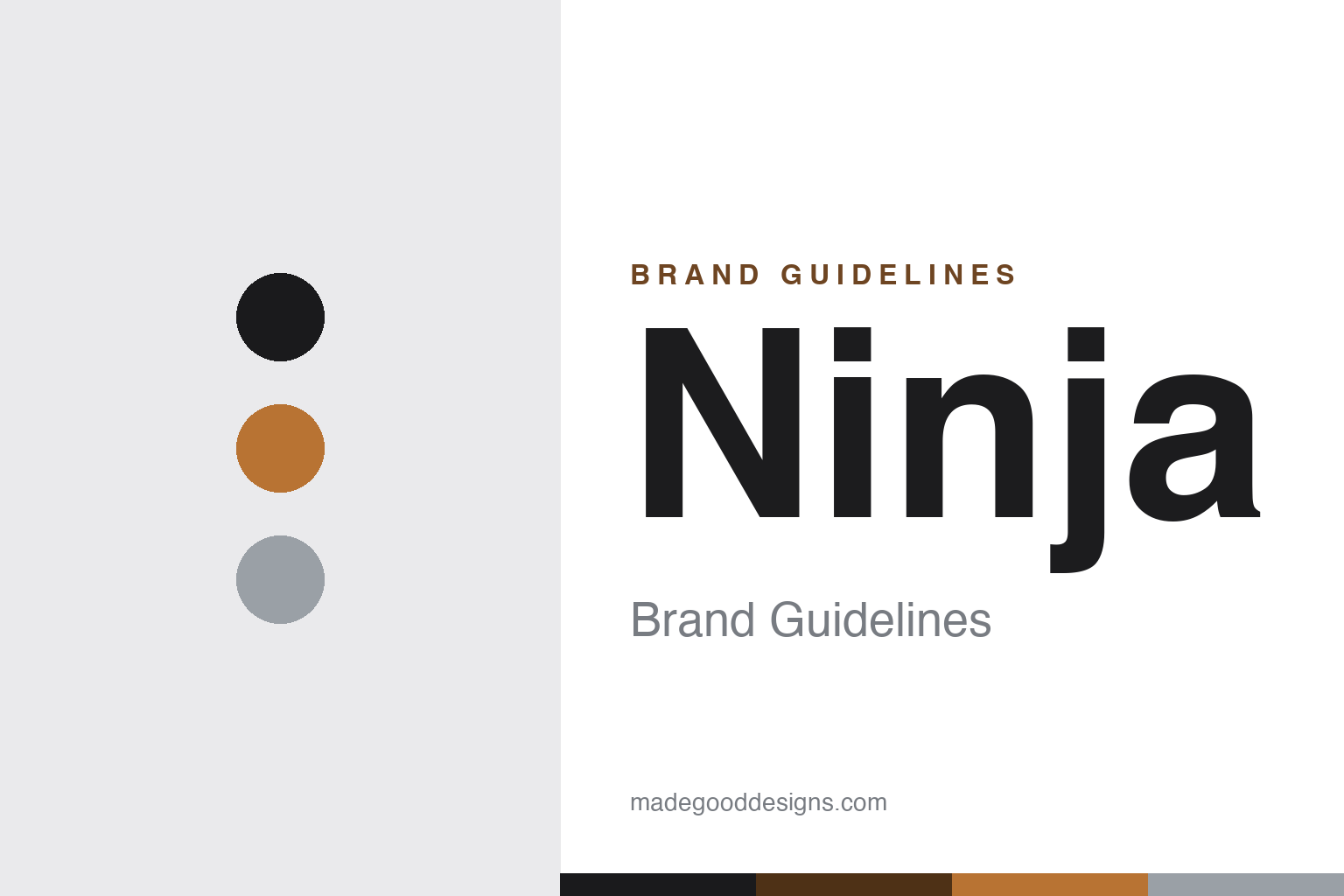
Ninja Brand Guidelines
Fast, feature-packed, viral — a kitchen brand built on rapid iteration, from the Foodi to the CREAMi.
Aa
Two constants: a bold black-and-metallic palette and a sharp, tech sans. Abstract homage — not the Ninja wordmark.
The fast-iterating kitchen brand
Ninja out-iterated the kitchen.
Ninja is a lesson in speed and marketing in a mature category. Ninja is the kitchen-appliance brand of SharkNinja, Inc. (headquartered in Needham, Massachusetts), which traces to Euro-Pro, a family business Mark Rosenzweig of Montreal incorporated in 1994 (moving to Needham in 2003). The company runs two consumer brands: Shark (home cleaning and beauty, launched 2007) and Ninja (kitchen appliances, launched 2009) — and renamed itself SharkNinja in 2015. (Two honest notes: no official brand hex is published, and the wordmark typeface is undocumented.)
Ninja’s edge is fast, feature-packed product iteration and marketing. It floods the kitchen with affordable, cleverly-featured appliances and iterates quickly on what sells: the Nutri Ninja single-serve blenders, the Ninja Foodi (a multi-cooker that combined pressure-cooking and air-frying — note Foodi is a product line, not the whole brand), air fryers, indoor grills, coffee systems, and the Ninja CREAMi ice-cream maker, which became a social-media and TikTok phenomenon. Where premium rivals move slowly, Ninja ships more, faster, at accessible prices — and markets it hard.
The corporate story turned a milestone in 2023: SharkNinja completed its separation from JS Global Lifestyle (a Hong-Kong-listed holding company that had majority-owned it) and became an independent public company on the New York Stock Exchange (ticker SN) on 31 July 2023 — a spin-off, not a conventional IPO. (An honest clarification: SharkNinja is US-headquartered; it was majority-owned by a Hong-Kong-listed company until 2023, so “a Chinese company” is inaccurate.) CEO Mark Barrocas leads it (a different person from founder Mark Rosenzweig). The identity is bold and modern — a Ninja wordmark, black-and-metallic packaging. The fast-iterating kitchen brand.
Colour
Ninja lives in bold black and metallic. Click a swatch to copy the hex.
Ninja’s identity reads as bold, modern and dynamic — packaging that skews to a strong black base with metallic accents (coppers, teals and steel that vary by product line). The look is energetic and tech-forward, matching a brand built on feature-packed, high-performance appliances and aggressive marketing: it feels powerful and contemporary rather than heritage or homey. The metallic accents signal capability and a slightly premium edge on accessible products. The honest caveat: Ninja publishes no official brand hex, so the black and copper here are an original, unofficial interpretation of its black-and-metallic packaging, not first-party values.
The lesson is a bold black-and-metallic palette can signal high-performance modernity. Ninja’s look feels powerful and current, matching feature-packed appliances. For designers, it’s a reminder that a strong dark base with metallic accents can make accessible products feel capable and premium. The takeaways: use a bold dark base for a high-performance feel (black); add metallic accents for a premium edge; and treat specific hexes as unofficial when the palette varies by product line.
Typography
The wordmark is a sharp, tech sans — bold and modern.
Ninja’s identity carries a sharp, modern, dynamic spirit — a bold wordmark whose crisp, tech-forward letterforms read as powerful, contemporary and capable. The sharp type matches a brand built on feature-packed appliances and fast iteration, and it signals performance and modernity rather than heritage or homeliness. Set against a black-and-metallic palette, the type feels energetic and high-tech — exactly the powerful, of-the-moment personality Ninja cultivates. It’s sharp and modern rather than soft or traditional, mirroring the high-performance products. Because the exact wordmark face isn’t publicly documented, the honest description is “a sharp tech sans spirit,” not a named font. The type behaves like the brand: bold, modern and dynamic.
Aa
A sharp tech sans spirit — bold and modern. (Specimen set in Chakra Petch, a sharp tech sans in the spirit of the Ninja identity; the real face is undocumented.)
Speed as strategy
Ninja made speed its advantage.
Ninja is a lesson in speed and marketing as the competitive edge. The kitchen-appliance category is old and crowded, full of heritage names — so Ninja competed on velocity: identify a trend or a frustration, ship an affordable, feature-packed product fast, market it aggressively, and iterate relentlessly on what resonates. That’s how it turned category after category into hits (the Foodi multi-cooker, air fryers, the CREAMi ice-cream maker that went viral), often reaching mainstream buyers before slower premium rivals reacted. Backing it is a real operational engine — SharkNinja’s product-development and go-to-market machine — that treats appliances almost like fast-moving consumer tech. The lesson is that in a mature category, being faster and louder — rapid iteration plus heavy, savvy marketing at accessible prices — can beat heritage and prestige. It’s a modern, velocity-driven playbook that carried a vacuum-maker’s spin-off onto the NYSE. Move fast, market hard, and speed becomes the strategy.
For designers and brand-builders, Ninja offers a clear takeaway: speed of iteration plus strong marketing can beat heritage in a mature category. The lessons: ship fast and iterate on what sells (the constant new appliances); make products feature-packed and accessible (affordable innovation); and market aggressively to reach the mainstream first (the viral CREAMi). It’s also a reminder to keep the facts precise — Ninja is SharkNinja’s kitchen brand, rooted in Euro-Pro (1994), separated from JS Global to list on the NYSE (SN) in 2023, and is US-headquartered. Ninja made speed its advantage — proof that velocity can be a strategy.
Explore & save
Keep Ninja’s identity on hand — save it to a board in the Made Good inspiration library.
Ninja identity set
Pin the black-and-metallic palette and the tech-sans spirit to your own board.