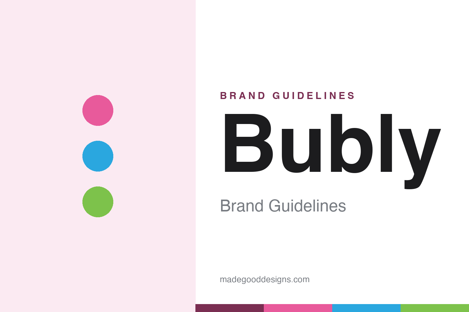
bubly Brand Guidelines
Sparkling water that cracks a smile.
Aa
Two constants: a bright, per-flavour palette and a rounded, lowercase wordmark. Abstract homage — not the bubly wordmark, smile mark or can art.
The water that winks
bubly turned sparkling water into a joke — a good one.
bubly is a lesson in personality as product. Launched in 2018 by PepsiCo as its answer to LaCroix, it is an unsweetened flavoured sparkling water — zero calories, zero sugar, and, unusually, no sweeteners at all — that competes almost entirely on charm. Where the category was earnest, bubly decided to be cheeky.
The charm is built in. Every flavour gets its own smile printed on the can, the pull-tabs and messages read like a friendly text (“hey u,” “hiii,” “yo,” “aloha”), and the launch rallied around the hashtag #CrackASmile. It went national at Super Bowl LIII in 2019 with a gag built on singer Michael Bublé insisting the water was named after him — the whole joke riding on “buh-blee” versus “boo-BLAY.”
(Honest notes: it is spelled “bubly” with one b and said “buh-blee” — the Bublé ad plays on that confusion; it is a manufactured carbonated water, not a natural mineral spring; and bubly Bounce, Burst and POP are separate sub-lines — caffeine, juice and soda — not the core sparkling water. No official brand hex is published.)
Colour
bubly lives in a bright, per-flavour rainbow. Click a swatch to copy the hex.
bubly’s identity is bright, playful and colour-coded — a bubly pink, a splash blue, a lime green, a cream, and an ink. There is no single brand colour; instead each flavour owns a vivid hue, so a shelf of bubly reads as a cheerful rainbow rather than one logo. It signals fun and approachability, not premium restraint. The honest caveat: with no published brand hex, these tones are an original, unofficial interpretation, not first-party values.
The lesson is a colour system can be the brand. bubly’s world is a spectrum, held together by one shape language and one smile. For designers, it is a reminder that when a product line is wide, a consistent framework filled with bold per-variant colour can feel unified and lively at once. The takeaways: let each variant own a colour; unify with a single wordmark and device; and treat any single hex as unofficial — using a deep berry for small text so the brights stay loud.
Typography
The wordmark spirit is a rounded, lowercase sans — friendly and soft.
bubly’s identity carries a friendly, informal, upbeat spirit — a lowercase “bubly” wordmark set in a rounded, geometric sans, with a smile tucked into the packaging. A soft, rounded sans captures the mood: it is warm and unpretentious, the register of a brand that talks to you in lowercase and puts “hiii” on the tab. Set against bright, candy-clear colour, the rounded type feels approachable and fun — exactly the wink-and-smile personality bubly carries. It is playful rather than premium, mirroring a can that greets you. (bubly’s real wordmark, the smile device and the punny cans are trademarks and trade dress we describe but do not reproduce; the on-pack face is a customised cut of F37 Ginger, which we note rather than assert as our own.) Because the specific mark is not ours to use, the honest description is “a rounded, lowercase spirit,” not the bubly logo. The type behaves like the brand: soft, cheerful and disarming.
bubly aa
A rounded, lowercase spirit — friendly and soft. (Specimen set in Fredoka, a rounded sans; NOT the bubly logo, which is a trademark.)
Winning a plain category on tone of voice
bubly stands for the wink.
bubly is a lesson in tone of voice as a differentiator. In a category of nearly identical products — flavoured, fizzy, zero-calorie — it did not win on the water; it won on how it talks. The lowercase name, the smile, the “hey u” on the tab and a Super Bowl pun turned a commodity into a brand people find likeable. The differentiator is warmth: bubly feels like a friend, not a beverage.
For designers and brand-builders, bubly offers a clear takeaway: personality can carry a plain product. The lessons: build a colour system wide enough for a big line but unified by one device; write in a human, playful voice and let it show on the pack; and use humour (a smile, a pun) as real brand equity. It is also a reminder to stay accurate: bubly is unsweetened with no sweeteners at all, it is manufactured carbonated water rather than a mineral spring, and its Bounce/Burst/POP lines are separate — with the palette here an unofficial interpretation. bubly cracked a smile — proof that charm can be a strategy.
Explore & save
Keep bubly’s identity on hand — save it to a board in the Made Good inspiration library.
bubly identity set
Pin the bright per-flavour palette and the rounded, lowercase spirit to your own board.