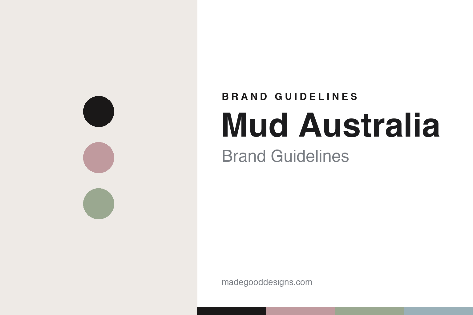
Mud Australia Brand Guidelines
The colour in the clay.
Aa
Two constants: a dusty-rose-and-sage palette and a soft sans register. Abstract homage — not the Mud Australia pieces or packaging.
The colour in the clay
Mud tints the porcelain body itself.
Mud Australia is a lesson in colour as identity. Founded in 1994 by Shelley Simpson and handmade in Sydney, it turned a curated palette into the whole brand.
Its identity is coloured slip-cast porcelain. Mud slip-casts fine porcelain into simple, pure forms — but the signature is that the colour is tinted into the clay body itself, at the slip stage, across a curated range of around nineteen soft, custom-mixed hues. It isn’t a surface glaze on white; the colour goes all the way through, giving a soft, satin depth. The palette is the product: a shelf of muted porcelain in dusty, considered tones.
(Honest notes: “handmade in Australia” is precise but layered — the raw porcelain clay is imported from Limoges, France, then cast, coloured and finished by hand in Sydney. The translucency and the matte-exterior/glazed-interior contrast are the brand’s well-known reputation but weren’t re-verifiable this pass, so we hedge them; the colour count (~19) shifts over time. There’s no official brand hex — the brand markets colour names — so these tones are an unofficial interpretation. This is design commentary and does not promote any product.)
Colour
Mud lives in a dusty-rose-and-sage palette. Click a swatch to copy the hex.
Mud’s identity is soft, muted and considered — a dusty rose, an ink, a sage, a pale blue, and a chalk. The palette pairs a dusty rose with a sage — the register of colour tinted into porcelain. It signals colour and calm rather than novelty. The honest caveat: with no published brand hex, these tones are an original, unofficial interpretation, not first-party values.
The lesson is a dusty rose with a sage signals a colour-in-the-body brand. Mud’s world is a shelf of soft, muted porcelain. For designers, it is a reminder that a curated set of muted tones can be the entire identity — right for a colour-led studio. Because soft tints can fail as small text, keep type dark and let the colour live in the accents, palette and band. The takeaways: make colour the identity; put it in the body, not just the surface; curate the palette tightly; and treat any single hex as unofficial.
Typography
The register is a soft sans — muted, calm, considered.
Mud’s identity carries a muted, calm, considered spirit — a shelf of soft porcelain. A gentle, low-contrast sans captures the mood: it is quiet and soft, the register of a colour-led studio. Set in a dusty-rose-and-sage palette, the soft sans feels muted and calm — exactly the personality Mud carries. It is understated rather than loud, mirroring tinted porcelain. (Mud’s real pieces and lowercase wordmark are works we describe but do not reproduce, and the exact typeface is not ours to use.) Because it is not ours to use, the honest description is “a soft sans spirit,” shown here in a stand-in. The type behaves like the brand: muted, calm and considered.
Aa
A soft sans spirit — muted and calm. (Specimen set in Mulish, a soft low-contrast sans STAND-IN; NOT the Mud Australia packaging.)
Colour as identity
Mud stands for colour tinted into porcelain.
Mud Australia is a lesson in making colour the identity. A dusty-rose-and-sage palette, a soft sans and colour-tinted porcelain make colour the whole brand — muted, calm, considered. The colour is the differentiator. The differentiator is colour in the clay body itself.
For designers and brand-builders, Mud offers a clear takeaway: put the colour where it can’t chip off. The lessons: make colour the identity; tint the body, not just the surface; curate the palette; and be honest about the making. It is also a reminder to stay accurate: it’s a 1994 Sydney studio, the clay comes from Limoges, translucency claims are hedged, and the palette here is an unofficial interpretation. Mud made colour the brand — proof that a curated palette can be the difference.
Explore & save
Keep Mud Australia’s identity on hand — save it to a board in the Made Good inspiration library.
Mud Australia identity set
Pin the dusty-rose-and-sage palette and the soft-sans register to your own board.