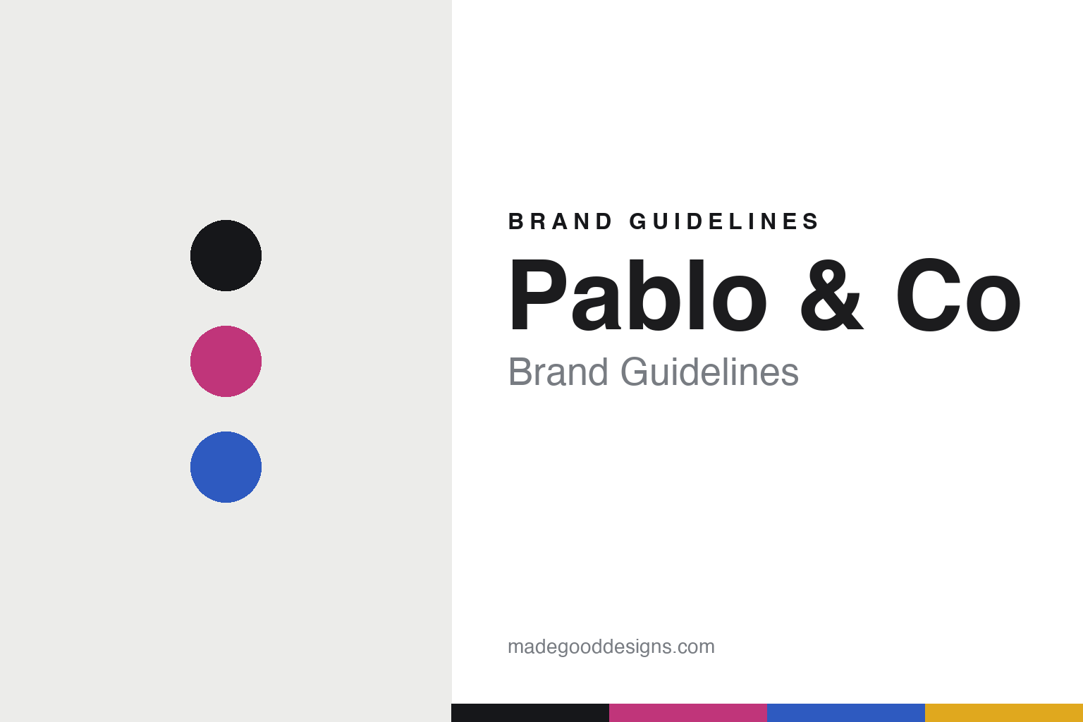
Pablo & Co Brand Guidelines
The print bandana.
Aa
Two constants: a bold-vibrant palette and a bold sans register. Abstract homage — not the Pablo & Co bandana, prints or wordmark.
The print bandana
Pablo & Co is the loud, colourful outlier.
Pablo & Co is a lesson in bold colour as the identity — the loud outlier in pet design. An Australian brand founded in 2016 in Queensland, it made its name with bright, print-led bandanas and collars.
Its identity is the print bandana. Pablo & Co’s bandanas and collars are the objects it is known for — vibrant prints, jewel-tone velvets, florals — a deliberate contrast to the muted design pet brands. Colour turned all the way up. Dog accessories as a party.
(Honest notes: Pablo & Co (Pablo & Co Boutique) is an Australian design pet brand founded in late 2016 by sisters Loren and Maddie (surnames not published; named after Loren’s dachshund, “Pablo”); its official site is pabloandco.net (not the .com sometimes cited), and it is based in Queensland — Brisbane and the Gold Coast — not Sydney. Its signature is bold, print-led bandanas and collars — vibrant prints, jewel-tone velvets, florals — a clear contrast to the muted design pet brands. Notably, it holds licensed Disney/Pixar and Warner Bros collaborations (Stitch, Mickey, Toy Story, Cars), which are high-IP-risk works we describe but never reproduce. On production, it is “designed in Australia” with no manufacturing country stated (offshore is plausible but unconfirmed), so we don’t assert one. It is independent and “Australian owned,” a sister-run business. There’s no official brand hex, and we reproduce no print, pattern or character artwork — these tones are an unofficial interpretation. This is design commentary and does not promote any product.)
Colour
Pablo & Co lives in a bold-vibrant palette. Click a swatch to copy the hex.
Pablo & Co’s identity is bold, bright and playful — a magenta, an ink, an electric blue, a yellow, and a chalk. The palette leans bold vibrant — the register of a fun, colourful, of-the-moment brand. It signals energy and joy rather than novelty. The honest caveat: with no published brand hex, these tones are an original, unofficial interpretation, not first-party values.
The lesson is a bold-vibrant palette signals a colourful outlier. Pablo & Co’s world is a loud, joyful object. For designers, it is a reminder that going bold — vibrant prints, jewel colour, cultural collaborations — is a valid position, and a striking foil to the muted pet-design norm. Because a magenta can fail as small text, keep type dark and let the colour live in the accents, palette and band. The takeaways: go loud; print boldly; collaborate; and treat any single hex as unofficial.
Typography
The register is a bold sans — playful, rounded, energetic.
Pablo & Co’s identity carries a playful, rounded, energetic spirit — a loud, joyful object. A rounded display sans captures the mood: it is cheerful and confident, the register of a fun colourful brand. Set in a bold-vibrant palette, the bold sans feels playful and rounded — exactly the personality Pablo & Co carries. It is energetic rather than quiet, mirroring vibrant prints. (Pablo & Co’s real bandana, prints and wordmark are works we describe but do not reproduce, and the exact typeface is not ours to use.) Because it is not ours to use, the honest description is “a bold sans spirit,” shown here in a stand-in. The type behaves like the brand: playful, rounded and energetic.
Aa
A bold sans spirit — playful and rounded. (Specimen set in Fredoka, a rounded display sans STAND-IN; NOT the Pablo & Co wordmark.)
Bold colour as identity
Pablo & Co stands for the print bandana.
Pablo & Co is a lesson in being the bold counterpoint. A bold-vibrant palette, a bold sans and a print bandana make loud colour the whole brand — playful, bright, energetic. The boldness is the differentiator. The differentiator is going all-in on colour and print while most design pet brands go muted.
Put to work, the identity is a deliberate foil. A designer building in this spirit would reject the muted norm and commit to vibrant prints, jewel colour and playful themes, so the brand stands out precisely by being loud. The lesson Pablo & Co teaches is that contrast is a strategy: in a field of restrained, muted pet brands, going bold — with prints, velvets and licensed collaborations — makes a brand instantly recognisable and fun.
For designers and brand-builders, Pablo & Co offers a clear takeaway: own the loud end of the spectrum. The lessons: go loud; print boldly; collaborate; and be honest about the story. It is also a reminder to stay accurate — and to correct assumptions: it is based in Queensland (Brisbane and the Gold Coast), not Sydney, and its site is pabloandco.net — the palette here is an unofficial interpretation. And it is a reminder that licensed collaborations carry real IP weight: its Disney and Warner Bros character work is protected, so we describe the strategy but reproduce none of the artwork. It is a reminder, too, that made-where honesty means admitting the unknown: it is designed in Australia with no manufacturing country stated, so we don’t assert one. Pablo & Co made the print bandana the brand — proof that bold colour can be the difference.
Explore & save
Keep Pablo & Co’s identity on hand — save it to a board in the Made Good inspiration library.
Pablo & Co identity set
Pin the bold-vibrant palette and the bold-sans register to your own board.


