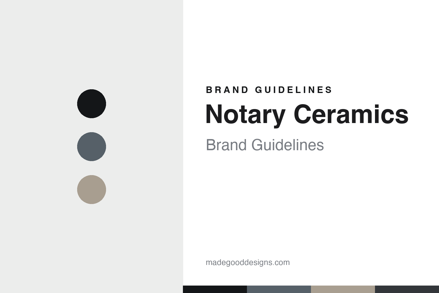
Notary Ceramics Brand Guidelines
The wheel-thrown vessel.
Aa
Two constants: a slate-and-sand palette and a minimal sans register. Abstract homage — not a Notary Ceramics piece or wordmark.
The wheel-thrown vessel
Notary Ceramics throws minimal, timeless stoneware in Portland.
Notary Ceramics is a lesson in minimal wheel-throwing as the identity. An American studio in Portland, Oregon, it throws quiet, timeless stoneware — pared back to the essentials.
Its identity is the wheel-thrown vessel. Notary’s minimal, functional wheel-thrown stoneware and porcelain — muted matte glazes, clean forms — is the work it is known for. Clay, reduced to the essential. The vessel, made calm.
(Honest notes: Notary Ceramics — Notary Ceramics LLC — is an American ceramics studio in Portland, Oregon, in the Sellwood neighbourhood, founded by Sarah Van Raden, a former photo stylist who became a potter. On dating: she began throwing at home around 2015 and opened her brick-and-mortar studio in 2017, so we date it to around 2015, not the earlier year sometimes cited. Its signature is minimal, functional, wheel-thrown work — timeless stoneware and porcelain in muted matte glazes, from tableware and vessels to a handmade ceramic lighting line; the name “Notary” evokes notarising, or authenticating, an original, a fitting frame for a potter hand-throwing each piece. On production, it is genuinely made in the studio’s own Portland workshop, hand-thrown from Pacific Northwest clays and made to order, though it is now a small team rather than a one-person shop. It is independent and founder-led. Its collection names and its retailer collaborations are IP we describe but don’t reproduce. There’s no official brand hex — these tones are an unofficial interpretation. This is design commentary and does not promote any product.)
Colour
Notary Ceramics lives in a slate-and-sand palette. Click a swatch to copy the hex.
Notary Ceramics’ identity is minimal, quiet and refined — a slate, an ink, a sand, a graphite, and a chalk. The palette leans slate and sand — the register of muted matte glazes on pared-back stoneware. It signals restraint and craft rather than novelty. The honest caveat: with no published brand hex, these tones are an original, unofficial interpretation, not first-party values.
The lesson is a slate-and-sand palette signals minimal stoneware. Notary’s world is a minimal, quiet, refined object. For designers, it is a reminder that restraint — a timeless, pared-back vessel — can be the whole identity, and that a muted, neutral palette signals that calm. Because a mid slate can fail as small text, keep type dark and let the colour live in the accents, palette and band. The takeaways: reduce to essentials; keep it timeless; throw it by hand; and treat any single hex as unofficial.
Typography
The register is a minimal sans — quiet, clean, timeless.
Notary Ceramics’ identity carries a quiet, clean, timeless spirit — a minimal, hand-thrown object. A clean, minimal sans captures the mood: it is calm and understated, the register of pared-back craft. Set in a slate-and-sand palette, the minimal sans feels quiet and clean — exactly the personality Notary carries. It is timeless rather than trendy, mirroring a wheel-thrown vessel. (Notary’s real pieces and wordmark are works we describe but do not reproduce, and the exact typeface is not ours to use.) Because it is not ours to use, the honest description is “a minimal sans spirit,” shown here in a stand-in. The type behaves like the brand: quiet, clean and timeless.
Aa
A minimal sans spirit — quiet and clean. (Specimen set in Manrope, a minimal sans STAND-IN; NOT the Notary Ceramics wordmark.)
Minimal wheel-throwing as identity
Notary Ceramics stands for the wheel-thrown vessel.
Notary Ceramics is a lesson in making restraint the identity. A slate-and-sand palette, a minimal sans and a wheel-thrown vessel make pared-back craft the whole brand — minimal, quiet, timeless. The restraint is the differentiator. The differentiator is discipline: hand-thrown stoneware reduced to its essentials, in muted matte glazes, made in the studio’s own Portland workshop.
Put to work, the identity is restraint as design. A maker building in this spirit would strip a vessel to its simplest useful form, choose quiet glazes, and keep the making by hand, so the object is timeless rather than fashionable — and reads as authentic, an original each time. The lesson Notary teaches is that restraint plus real craft can build a brand: minimal forms, in-house throwing, and a quiet, timeless design language give it an identity that never dates. The calm is the point, and the hand-thrown authenticity — fittingly, its name evokes authenticating an original — is the proof.
For designers and brand-builders, Notary offers a clear takeaway: let restraint carry the object. The lessons: reduce to essentials; keep it timeless; throw it by hand; and be honest about the story. It is also a reminder to stay accurate: it dates to around 2015 (with its studio opening in 2017), and it is now a small team rather than a one-person shop — the palette here is an unofficial interpretation. And it is a reminder that made-where honesty can be a genuine boast: Notary is hand-thrown in its own Portland studio, and that is worth stating plainly. Notary Ceramics made the wheel-thrown vessel the brand — proof that restraint can be the difference.
Explore & save
Keep Notary Ceramics’s identity on hand — save it to a board in the Made Good inspiration library.
Notary Ceramics identity set
Pin the slate-and-sand palette and the minimal-sans register to your own board.