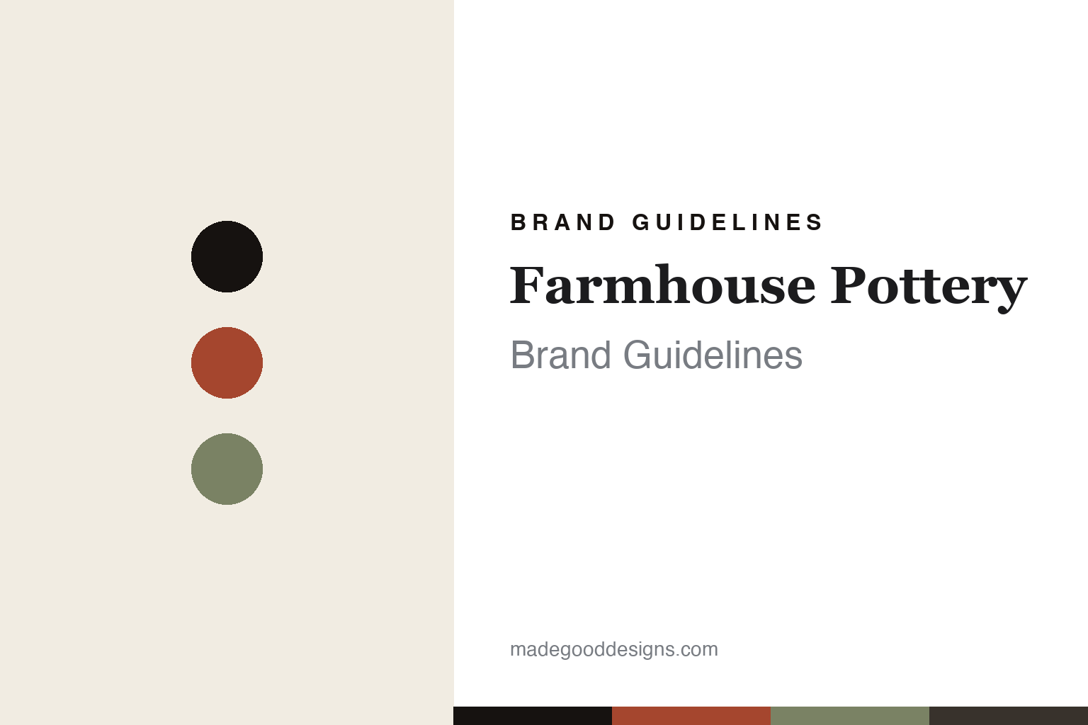
Farmhouse Pottery Brand Guidelines
The farmhouse table.
Aa
Two constants: a barn-red-and-sage palette and a rustic serif register. Abstract homage — not a Farmhouse Pottery piece or wordmark.
The farmhouse table
Farmhouse Pottery throws rustic-modern stoneware in Woodstock, Vermont.
Farmhouse Pottery is a lesson in a rustic-modern aesthetic as the identity. An American studio in Woodstock, Vermont, it makes hand-thrown stoneware for a modern farmhouse table — creamware simplicity, made by hand.
Its identity is the farmhouse table. Farmhouse Pottery’s wheel-thrown crocks, pitchers, bowls and dinnerware — mostly white and pale glazes, warm and useful — are the work it is known for. Clay for the American table. Farmhouse, made well.
(Honest notes: Farmhouse Pottery is an American ceramics studio in Woodstock, Vermont, founded by James Zilian and his then-wife Zoe Zilian — its founding is given as around 2012, with some sources citing 2008, so we hedge it, and its flagship opened in 2014 in a repurposed thirty-thousand-square-foot former bible bindery. Its signature is a rustic-modern American farmhouse aesthetic — predominantly creamware and pale glazes on wheel-thrown functional stoneware, from bowls and pitchers to crocks and dinnerware, plus décor, candles, lighting and wooden goods; James was a lead designer at Simon Pearce for around nine years before founding it. On production, its ceramics are genuinely hand-thrown in its own Woodstock studio, billed as one of America’s largest studio potteries, with a team of potters and daily open-studio demonstrations, so “handmade in Vermont” holds for the pottery — though the sourcing of its wood and textile goods isn’t documented, so we don’t assume all of it is Vermont-made. It is independent and founder-led. One note: Zoe co-founded it but is James’s former wife, so we don’t imply a current couple-run business. Its collections, like its Beehive Crock, are IP we describe but don’t reproduce. There’s no official brand hex — these tones are an unofficial interpretation. This is design commentary and does not promote any product.)
Colour
Farmhouse Pottery lives in a barn-red-and-sage palette. Click a swatch to copy the hex.
Farmhouse Pottery’s identity is rustic, warm and honest — a barn red, an ink, a sage, a graphite, and a cream. The palette leans barn red and sage — the register of a Vermont farmhouse and its pale, creamy glazes. It signals craft and warmth rather than novelty. The honest caveat: with no published brand hex, these tones are an original, unofficial interpretation, not first-party values.
The lesson is a barn-red-and-sage palette signals a farmhouse table. Farmhouse Pottery’s world is a rustic, warm, honest object. For designers, it is a reminder that an aesthetic — a clear, consistent rustic-modern world — can be the whole identity, and that an earthy, agrarian palette signals that warmth. Because a mid barn red can fail as small text, keep type dark and let the colour live in the accents, palette and band. The takeaways: commit to an aesthetic; throw it by hand; keep it warm; and treat any single hex as unofficial.
Typography
The register is a rustic serif — warm, characterful, honest.
Farmhouse Pottery’s identity carries a warm, characterful, honest spirit — a rustic, hand-made object. A soft, rustic serif captures the mood: it is warm and characterful, the register of a farmhouse aesthetic. Set in a barn-red-and-sage palette, the rustic serif feels warm and honest — exactly the personality Farmhouse Pottery carries. It is characterful rather than plain, mirroring a hand-thrown crock. (Farmhouse Pottery’s real pieces and wordmark are works we describe but do not reproduce, and the exact typeface is not ours to use.) Because it is not ours to use, the honest description is “a rustic serif spirit,” shown here in a stand-in. The type behaves like the brand: warm, characterful and honest.
Aa
A rustic serif spirit — warm and characterful. (Specimen set in Fraunces, a rustic serif STAND-IN; NOT the Farmhouse Pottery wordmark.)
A rustic-modern aesthetic as identity
Farmhouse Pottery stands for the farmhouse table.
Farmhouse Pottery is a lesson in making an aesthetic the identity. A barn-red-and-sage palette, a rustic serif and a hand-thrown crock make the farmhouse table the whole brand — rustic, warm, honest. The aesthetic is the differentiator. The differentiator is a complete, consistent world: rustic-modern American farmhouse, in creamware and pale glazes, hand-thrown in an own Vermont studio.
Put to work, the identity is an aesthetic as design. A studio building in this spirit would define a clear world — here, the modern farmhouse — and hold to it across every product and every image, keeping the making by hand so the story is real rather than styled. The lesson Farmhouse Pottery teaches is that a coherent aesthetic plus genuine craft can build a brand: a recognisable rustic-modern look, an own studio, and a warm, characterful design language give it an identity that resonates well beyond Vermont. The aesthetic is the promise, and the hand-throwing is the proof.
For designers and brand-builders, Farmhouse Pottery offers a clear takeaway: commit to a complete aesthetic, and make it by hand. The lessons: define the world; throw it by hand; keep it consistent; and be honest about the story. It is also a reminder to stay accurate: its founding is best hedged around 2012 (some say 2008), and while its pottery is genuinely made in Vermont, its wood and textile goods’ sourcing isn’t documented — the palette here is an unofficial interpretation. And it is a reminder that made-where honesty can be a genuine boast: Farmhouse Pottery’s ceramics are hand-thrown in its own Vermont studio, and that is worth stating plainly. Farmhouse Pottery made the farmhouse table the brand — proof that an aesthetic can be the difference.
Explore & save
Keep Farmhouse Pottery’s identity on hand — save it to a board in the Made Good inspiration library.
Farmhouse Pottery identity set
Pin the barn-red-and-sage palette and the rustic-serif register to your own board.


