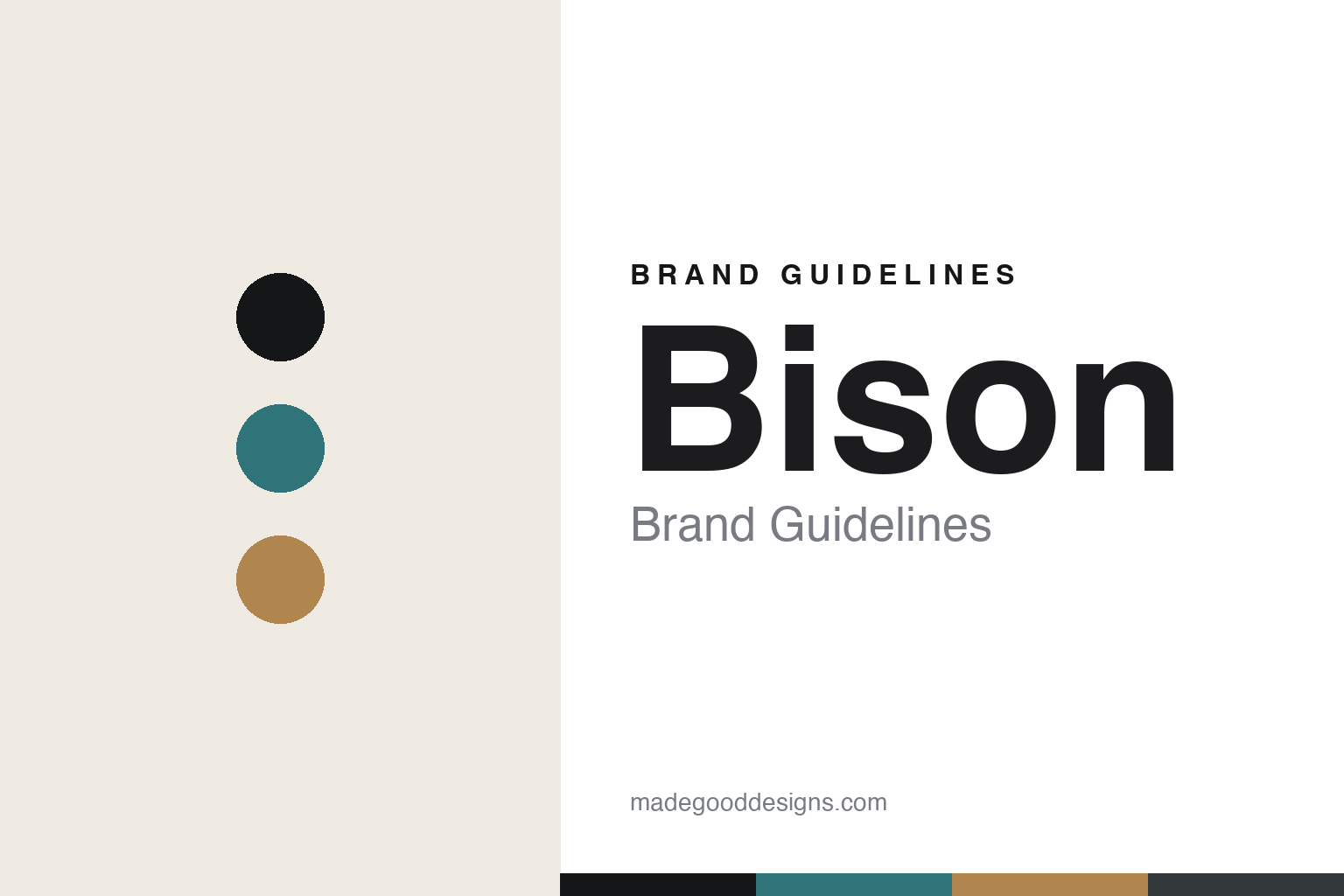
Bison Brand Guidelines
The coloured table.
Aa
Two constants: a teal-and-ochre palette and a modern sans register. Abstract homage — not a Bison piece or wordmark.
The coloured table
Bison sets the table in simple forms and pure, considered colour.
Bison is a lesson in pure colour as the identity. An Australian brand from Canberra, it makes pared-back tableware in simple forms and clear, considered colour — an archaeologist’s eye applied to the everyday.
Its identity is the coloured table. Bison’s simple stoneware forms in a broad, pure colour palette — quietly considered, warm — are the work it is known for. Form reduced, colour chosen. The table, in a palette.
(Honest notes: Bison — now “bisonhome” — is an Australian tableware brand from Canberra, founded in 1997 by Brian Tunks, who trained in ancient history and archaeology and worked on Middle-Eastern digs before becoming a potter, hence the “archaeologist turned potter” story and a logo drawn from Altamira cave paintings. Its signature is pure colour on pared-back forms — simple lines and a broad glaze palette that fuses ancient Middle-Eastern pottery, Scandinavian minimalism and Asian ceramics — and it supplies cafés and restaurants; the “world’s most beautiful ashtray” tagline is a brand and press claim rather than a certified fact. On production, an important and honest nuance: it was originally all made in its own Canberra (Pialligo) kilns, but as it grew, manufacturing moved offshore — its own pages cite studios in Thailand, Indonesia and India — while design stays in Canberra, so we don’t claim it is handmade in Australia across the range. It is founder-led and independent, with Brian Tunks as creative director. It is now a broader homewares brand of ceramics and glass. Its logo, its glaze names and its collections are IP we describe but don’t reproduce. There’s no official brand hex — these tones are an unofficial interpretation. This is design commentary and does not promote any product.)
Colour
Bison lives in a teal-and-ochre palette. Click a swatch to copy the hex.
Bison’s identity is pared-back, warm and considered — a teal, an ink, an ochre, a graphite, and an oat. The palette leans teal and ochre — the register of pure, earthy colour on simple forms. It signals colour and restraint rather than novelty. The honest caveat: with no published brand hex, these tones are an original, unofficial interpretation, not first-party values.
The lesson is a teal-and-ochre palette signals pure colour. Bison’s world is a pared-back, warm, considered object. For designers, it is a reminder that a combination — simple forms and a carefully chosen colour palette — can be the whole identity, and that an earthy, pure palette signals that restraint. Because a mid teal can fail as small text, keep type dark and let the colour live in the accents, palette and band. The takeaways: simplify the form; choose the colour carefully; keep it warm; and treat any single hex as unofficial.
Typography
The register is a modern sans — clean, warm, considered.
Bison’s identity carries a clean, warm, considered spirit — a pared-back, colourful object. A clean, modern sans captures the mood: it is calm and warm, the register of considered simplicity. Set in a teal-and-ochre palette, the modern sans feels clean and warm — exactly the personality Bison carries. It is considered rather than plain, mirroring a simple, coloured form. (Bison’s real pieces, glazes and wordmark are works we describe but do not reproduce, and the exact typeface is not ours to use.) Because it is not ours to use, the honest description is “a modern sans spirit,” shown here in a stand-in. The type behaves like the brand: clean, warm and considered.
Aa
A modern sans spirit — clean and warm. (Specimen set in Manrope, a clean modern sans STAND-IN; NOT the Bison wordmark.)
Pure colour as identity
Bison stands for the coloured table.
Bison is a lesson in making colour the identity. A teal-and-ochre palette, a modern sans and a simple form make pure colour the whole brand — pared-back, warm, considered. The colour is the differentiator. The differentiator is restraint plus a palette: forms reduced to their essentials, then given a broad, carefully chosen range of pure, warm colours.
Put to work, the identity is colour and restraint as design. A brand building in this spirit would simplify its forms so the colour can lead, curate a palette with a clear point of view, and keep the aesthetic consistent as it grows. The lesson Bison teaches is that a colour language and a considered simplicity can build a brand: pared-back forms, a recognisable palette, and a calm, modern design language give it an identity that reads across a whole table. The colour is the signature — though, honestly, the making has changed with scale.
For designers and brand-builders, Bison offers a clear takeaway: let colour and restraint carry the table. The lessons: simplify the form; curate the colour; keep it consistent; and be honest about the story. It is also a reminder to be candid about made-where: while Bison began entirely in Canberra, its manufacturing has largely moved offshore, so we don’t claim it is handmade in Australia across the range — the design stays in Canberra, and the palette here is an unofficial interpretation. Bison made the coloured table the brand — proof that colour can be the difference.
Explore & save
Keep Bison’s identity on hand — save it to a board in the Made Good inspiration library.
Bison identity set
Pin the teal-and-ochre palette and the modern-sans register to your own board.


