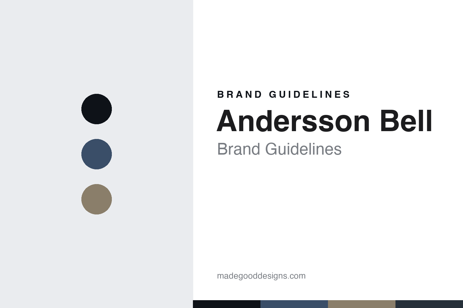
Andersson Bell Brand Guidelines
Two worlds, one wardrobe.
Aa
Two constants: an indigo-and-sand palette and a modern grotesque register. Abstract homage — not an Andersson Bell piece or wordmark.
Two worlds, one wardrobe
Andersson Bell builds a Korean brand on a Scandinavian-sounding name and a two-culture collision.
Andersson Bell is a lesson in a cultural collision as the identity. A South Korean label from Seoul, it deliberately fuses two worlds — its name pairs a common Swedish surname, “Andersson,” with “Bell,” a nod to a traditional Korean temple bell — and that meeting of Korea and Scandinavia is the belief the whole brand is built on.
Its identity is two worlds, one wardrobe. Andersson Bell’s unisex, collaboration-driven contemporary streetwear — military surplus, denim, workwear, deconstruction — carried under a name that sounds Nordic but is Korean, is the work it is known for. Two cultures, one label.
(Honest notes, because the name misleads people. Andersson Bell is a South Korean brand based in Seoul, founded in 2014 by Dohun Kim — not, as is sometimes wrongly written, “Dohn Kwan” or “Kim Ferry.” Despite the Scandinavian-sounding name, it is unambiguously a Korean label; the name itself encodes the brand’s idea, joining a Swedish surname with a Korean temple bell. Its signature is unisex, contemporary Korean streetwear rooted in Seoul’s vintage districts — military surplus, denim, workwear and reworking — and it is heavily collaboration-driven. On where it shows, an important correction: its international runway home is Milan, on the Milan Fashion Week calendar, not Paris. On production, it is made in South Korea, though we frame that as its Korean-made mainline rather than an audited absolute. On ownership, it is independent and founder-led, run by Dohun Kim with a separate CEO business partner, with no group or investor parent. Its collaborators’ marks — brands like Crocs, Levi’s, Asics and Wrangler — are third-party IP we describe but never reproduce, and where it references real historical figures, we do so accurately and with respect. There is no official brand hex, so these tones are an unofficial interpretation. This is design commentary and does not promote any product.)
Colour
Andersson Bell lives in an indigo-and-sand palette. Click a swatch to copy the hex.
Andersson Bell’s identity is cool, worn-in and considered — an indigo, an ink, a sand, a graphite, and a paper. The palette leans indigo and sand: the register of vintage denim and military surplus, tempered by a Nordic calm. It signals a meeting of two sensibilities rather than one loud statement. The honest caveat: with no published brand hex, these values are an original, unofficial interpretation, not first-party colours.
The lesson is an indigo-and-sand palette signals a two-culture collision. Andersson Bell’s world is a cool, worn-in, considered object. For designers, it is a reminder that a palette can hold two ideas at once — a Korean streetwear energy and a Scandinavian restraint — without either cancelling the other. Because a mid indigo can fail as small text, keep type dark and let the colour live in the accents, palette and band. The takeaways: fuse two worlds; keep the palette grounded; let the collision be the point; and treat any single hex as unofficial.
Typography
The register is a modern grotesque — clean, unisex, contemporary.
Andersson Bell’s identity carries a clean, unisex, contemporary spirit — a considered object, not a loud one. A modern grotesque captures the mood: neutral, legible and current, the register of a label that speaks to everyone. Set in an indigo-and-sand palette, the modern grotesque feels calm and contemporary — exactly the personality Andersson Bell carries. It is understated rather than decorative, mirroring a reworked, unisex garment. (Andersson Bell’s real garments, wordmark and collaborators’ marks are things we describe but do not reproduce, and the exact typeface is not ours to use.) Because it is not ours to use, the honest description is “a modern-grotesque spirit,” shown here in a stand-in. The type behaves like the brand: clean, unisex and contemporary.
Aa
A modern-grotesque spirit — clean and unisex. (Specimen set in Space Grotesk, a modern-grotesque STAND-IN; NOT the Andersson Bell wordmark.)
A collision as identity
Andersson Bell stands for two worlds, one wardrobe.
Andersson Bell is a lesson in making a cultural collision the identity. An indigo-and-sand palette, a modern grotesque and a Korean-meets-Scandinavian idea make two worlds the whole brand — cool, worn-in and unisex. The collision is the differentiator. The differentiator is holding two identities in one — a Korean label wearing a Nordic name — and letting that tension shape everything from the wordmark to the wardrobe.
Put to work, the identity is a collision as design. A house building in this spirit would find two genuine reference points and fuse them honestly, letting the friction between them create something neither could alone, so the customer buys into a point of view rather than a single origin. The lesson Andersson Bell teaches is that a real cultural collision plus a clean, consistent design language can build a brand: the two-world idea gives it distinctiveness, and the restraint keeps it coherent. The collision is the personality, and the consistency is the proof.
For designers and brand-builders, Andersson Bell offers a clear takeaway: fuse two worlds and mean it. The lessons: pick two honest references; let them collide; keep the design clean; and be honest about the story. It is also a reminder to stay accurate: Andersson Bell was founded in 2014 by Dohun Kim, it is a Korean brand despite its Scandinavian-sounding name, it shows in Milan rather than Paris, and it is made in South Korea — the palette here is an unofficial interpretation, and its collaborators’ marks are described but never reproduced. Andersson Bell made a two-world collision the brand — proof that a meeting of cultures can be the difference.
Explore & save
Keep Andersson Bell’s identity on hand — save it to a board in the Made Good inspiration library.
Andersson Bell identity set
Pin the indigo-and-sand palette and the modern-grotesque register to your own board.