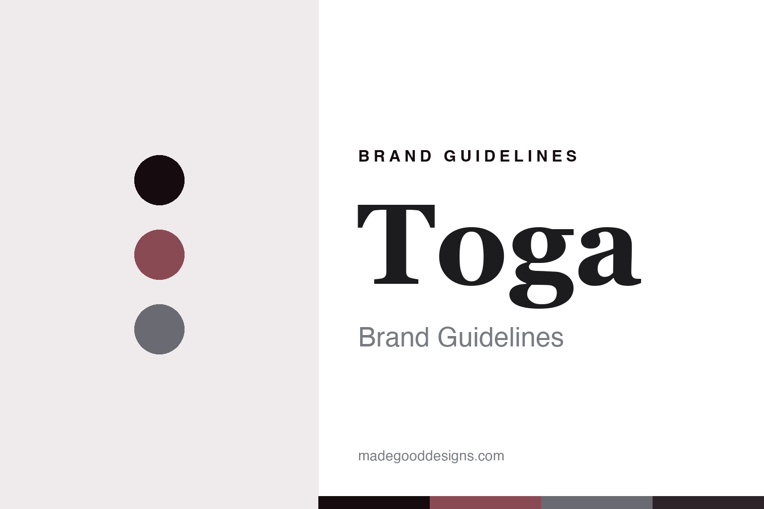
Toga Brand Guidelines
Contradiction as the cut.
Aa
Two constants: a burgundy-and-steel palette and a characterful serif register. Abstract homage — not a Toga piece, hardware or wordmark.
Contradiction as the cut
Toga builds a brand on collage — colliding subcultures, eras and hardware.
Toga is a lesson in contradiction as the identity. A Japanese label from Tokyo, it builds its clothes on collage — colliding Western tailoring with British subculture, folk and vintage references with a Japanese sensibility, hardware with romance — so the friction between opposites becomes the aesthetic.
Its identity is contradiction as the cut. Toga’s eclectic, era-mixing garments and its signature belted, hardware-heavy footwear — metal buckles and straps — are the work it is known for. Opposites, held together. A brand where the clash is the point.
(Honest notes, so the story stays precise. Toga is a Japanese brand based in Tokyo, founded in 1997 by Yasuko Furuta, who studied at Esmod in Japan and Paris; it is independent and founder-led, and Furuta won the ANDAM award in 2007. Its signature is hybridisation and collage — rockabilly, punk and romantic subculture crossed with Japanese craft and folk references — with belted, metal-hardware footwear as its most recognisable calling card. An important correction on where it shows: Toga began showing in Paris in 2005 but moved its runway to London Fashion Week in 2014, so its recent shows are in London, not Paris. On production, its country of manufacture is not publicly disclosed, so we do not claim “Made in Japan” as fact, even though it trades on Japanese craftsmanship. Its sub-lines — Toga Pulla, Toga Virilis and Toga Too — are puns on the names of ancient Roman togas, not separate companies. Its folk and vintage references are described respectfully rather than reproduced, its wordmark and signature hardware-shoe silhouette are IP we describe but never reproduce, and there is no official brand hex — these tones are an unofficial interpretation. This is design commentary and does not promote any product.)
Colour
Toga lives in a burgundy-and-steel palette. Click a swatch to copy the hex.
Toga’s identity is romantic, hard-edged and eclectic — a burgundy, an ink, a steel, a graphite, and a bone. The palette leans burgundy and steel: the register of romance meeting metal hardware, exactly the contradiction the brand lives on. It signals collage and tension over a single clean mood. The honest caveat: with no published brand hex, these values are an original, unofficial interpretation, not first-party colours.
The lesson is a burgundy-and-steel palette signals a collage identity. Toga’s world is a romantic, hard-edged, eclectic object. For designers, it is a reminder that a palette can carry a contradiction — a soft burgundy against a cold steel — the way the brand sets romance against hardware. Because a mid burgundy can fail as small text, keep type dark and let the colour live in the accents, palette and band. The takeaways: embrace contradiction; let the palette hold the tension; keep the collage coherent; and treat any single hex as unofficial.
Typography
The register is a characterful serif — eclectic, expressive, a little punk.
Toga’s identity carries an eclectic, expressive, slightly punk spirit — a collage object, not a clean minimal one. A characterful serif captures the mood: idiosyncratic and a little wonky, the register of a brand that mixes eras and references. Set in a burgundy-and-steel palette, the characterful serif feels expressive and eclectic — exactly the personality Toga carries. It is idiosyncratic rather than neutral, mirroring a collaged garment. (Toga’s real garments, hardware and wordmark are things we describe but do not reproduce, and the exact typeface is not ours to use.) Because it is not ours to use, the honest description is “a characterful-serif spirit,” shown here in a stand-in. The type behaves like the brand: eclectic, expressive and a little punk.
Aa
A characterful-serif spirit — eclectic and expressive. (Specimen set in Fraunces, a characterful-serif STAND-IN; NOT the Toga wordmark or hardware design.)
A contradiction as identity
Toga stands for contradiction as the cut.
Toga is a lesson in making contradiction the identity. A burgundy-and-steel palette, a characterful serif and a collage of subcultures, eras and hardware make tension the whole brand — romantic, hard-edged and eclectic. The contradiction is the differentiator. The differentiator is refusing to resolve opposites: romance against metal, folk against punk, past against present, held together in one garment until the clash reads as a signature.
Put to work, the identity is a contradiction as design. A house building in this spirit would collect references that do not obviously belong together and fuse them with conviction, so the friction becomes the look, and the customer buys into a distinctive tension rather than a single tidy mood. The lesson Toga teaches is that an embraced contradiction plus real craft can build a brand: the collage gives it a recognisable strangeness, and the making keeps it from feeling arbitrary. The contradiction is the personality, and the craft is the proof.
For designers and brand-builders, Toga offers a clear takeaway: let opposites collide and don’t resolve them. The lessons: gather clashing references; fuse them with craft; keep the palette in tension; and be honest about the story. It is also a reminder to stay accurate: Toga was founded in 1997 in Tokyo by Yasuko Furuta, it shows at London Fashion Week rather than Paris in its recent seasons, its sub-lines are Roman-toga puns, and its country of manufacture is not publicly disclosed — the palette here is an unofficial interpretation, and its hardware-shoe signature is described but never reproduced. Toga made contradiction the brand — proof that a clash can be the difference.
Explore & save
Keep Toga’s identity on hand — save it to a board in the Made Good inspiration library.
Toga identity set
Pin the burgundy-and-steel palette and the characterful-serif register to your own board.