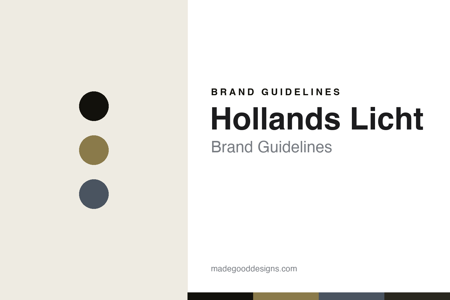
Hollands Licht Brand Guidelines
The light of Holland.
Aa
Two constants: a daylight-and-shadow palette and a neutral grotesque register. Abstract homage — not a Hollands Licht fixture or wordmark.
The light of Holland
Hollands Licht makes understated Dutch lighting built on the play of light and shadow.
Hollands Licht is a lesson in a cultural idea of light as the identity. A Dutch lighting label from Amsterdam, its name means “the light of Holland” — the celebrated luminous quality of the Dutch sky, painted by the Golden Age masters — and it builds understated, timeless fixtures around a deliberate play of light and shadow.
Its identity is the light of Holland. Hollands Licht’s restrained, material-led lamps, made largely with Dutch designers, are the work it is known for. Light, made cultural. A brand that treats light itself as a Dutch subject.
(Honest notes, so the story stays precise. Hollands Licht is a Dutch brand founded in 2005 in Amsterdam — and an important ownership point: it is not an independent studio but an in-house label of Eikelenboom, a lighting importer and distributor established in 1968 whose core business is agenting other, international lighting brands; Hollands Licht is Eikelenboom’s Dutch-designer, design-authored label, and its founding impulse was tied to acquiring Benno Premsela’s 1982 Lotek floor lamp. Its signature is timeless, understated Dutch design built on the play of light and shadow, evoking the Golden Age painters’ “Hollands licht,” and it works largely exclusively with Dutch designers, established and emerging. On production, it aims to make around 90% of its products in the Netherlands, sourcing as close to home as possible — an aspiration rather than a guarantee, and some components are imported, such as the Czech mouth-blown glass in its Limpid Lights series — so we frame it as largely made in the Netherlands with some European components. Its designers’ named designs — Benno Premsela’s Lotek, Ernst Koning’s Timber, studio VANTOT’s Limpid Lights — are their IP, described but never reproduced; the name should not be confused with the unrelated Jan Andriesse artwork or the 2003 documentary of the same name, and there is no official brand hex. This is design commentary and does not promote any product.)
Colour
Hollands Licht lives in a daylight-and-shadow palette. Click a swatch to copy the hex.
Hollands Licht’s identity is quiet, tonal and atmospheric — a daylight, an ink, a shadow blue, a graphite, and a linen. The palette leans daylight and shadow: the register of Dutch skylight and the play of light against dark. It signals atmosphere and restraint over statement. The honest caveat: with no published brand hex, these values are an original, unofficial interpretation, not first-party colours.
The lesson is a daylight-and-shadow palette signals a light-and-shadow identity. Hollands Licht’s world is a quiet, tonal, atmospheric object. For designers, it is a reminder that a palette can carry an idea — that a brand about the quality of light naturally reads in the warm daylight and cool shadow of a Dutch painting. Because a mid daylight ochre can fail as small text, keep type dark and let the colour live in the accents, palette and band. The takeaways: build on an idea of light; keep the palette tonal; work with your own designers; and treat any single hex as unofficial.
Typography
The register is a neutral grotesque — understated, timeless, clean.
Hollands Licht’s identity carries an understated, timeless, clean spirit — a quiet object, not a loud one. A neutral grotesque captures the mood: plain, calm and modern, the register of understated Dutch design. Set in a daylight-and-shadow palette, the neutral grotesque feels understated and timeless — exactly the personality Hollands Licht carries. It is restrained rather than expressive, mirroring a quiet, material-led lamp. (Hollands Licht’s real fixtures, its designers’ works and its wordmark are things we describe but do not reproduce, and the exact typeface is not ours to use.) Because it is not ours to use, the honest description is “a neutral-grotesque spirit,” shown here in a stand-in. The type behaves like the brand: understated, timeless and clean.
Aa
A neutral-grotesque spirit — understated and timeless. (Specimen set in Archivo, a neutral-grotesque STAND-IN; NOT the Hollands Licht wordmark or any lamp design.)
A cultural light as identity
Hollands Licht stands for the light of Holland.
Hollands Licht is a lesson in making a cultural idea of light the identity. A daylight-and-shadow palette, a neutral grotesque and understated Dutch-designed lamps make “the light of Holland” the whole brand — quiet, tonal and atmospheric. The idea is the differentiator. The differentiator is a cultural concept — the celebrated quality of Dutch light — carried through restrained fixtures that treat light and shadow as the subject.
Put to work, the identity is a cultural idea as design. A label building in this spirit would root itself in a genuine cultural concept and let it shape the work — the mood, the materials, the designers — so the customer buys into an idea and a place, not just a lamp. The lesson Hollands Licht teaches is that a real cultural idea plus restrained, home-grown design can build a brand: the concept gives it meaning, and the Dutch-designer focus gives it authenticity — with each designer credited, and the ownership described honestly. The idea is the personality, and the restraint is the proof.
For designers and brand-builders, Hollands Licht offers a clear takeaway: build on a cultural idea you can own. The lessons: root the brand in a real concept; keep the design restrained; work with your own designers; and be honest about the story. It is also a reminder to stay accurate: Hollands Licht was founded in 2005 in Amsterdam, it is an in-house label of the distributor Eikelenboom rather than an independent studio, and it aims to make around 90% of its products in the Netherlands (with some imported components) rather than everything — its designers’ lamps, like Benno Premsela’s Lotek, are described but never reproduced, and the palette here is an unofficial interpretation. Hollands Licht made the light of Holland the brand — proof that a cultural idea can be the difference.
Explore & save
Keep Hollands Licht’s identity on hand — save it to a board in the Made Good inspiration library.
Hollands Licht identity set
Pin the daylight-and-shadow palette and the neutral-grotesque register to your own board.