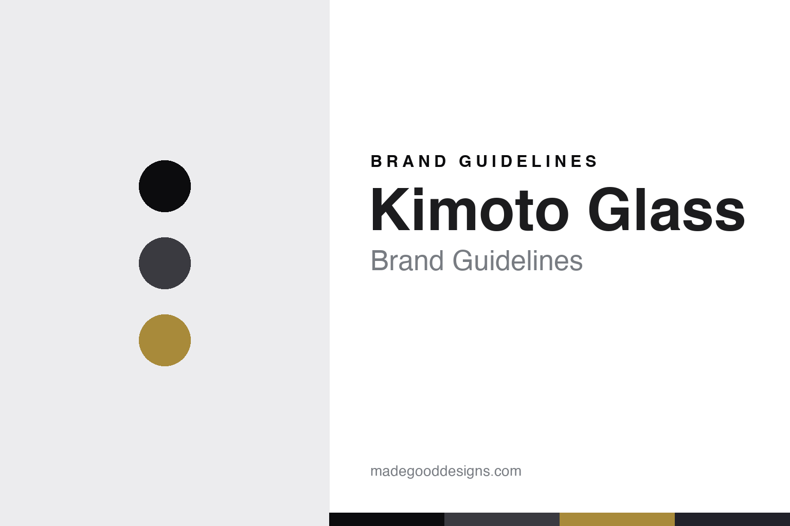
Kimoto Glass Brand Guidelines
Edo kiriko in black.
Aa
Two constants: a charcoal-and-gold-cut palette and a modern minimal register. Abstract homage — not a Kimoto vessel, cut or wordmark.
Edo kiriko in black
Kimoto Glass reinvented Edo kiriko cut glass in deep, modern black.
Kimoto Glass is a lesson in a modern reinvention as the signature. A Tokyo glass house working in the Edo kiriko cut-glass tradition, it took a craft known for ornate, coloured, clear-based cutting and reimagined it in deep black — its KUROCO line applies a jet-black overlay with pared-down, straight-line geometric cuts, a deliberately contemporary departure.
Its identity is Edo kiriko in black. Kimoto Glass’s all-black, minimally cut spirits and sake glassware is the work it is known for. A tradition, made modern in black. A house that turned an old craft toward the present.
(Honest notes, so the story stays precise. Kimoto Glass — 木本硝子 — was founded in 1931 (incorporated in 1959), is an independent, family-named firm led by president Seiichi Kimoto, and is based in Tokyo’s Taito ward, in the Kojima district — not Asakusa. An important nuance: Kimoto is a planner, producer and wholesaler, not an in-house cutting or blowing workshop — it designs and brands its glass and produces it through partnered glass factories and cutting artisans in Tokyo, so we describe it as a heritage planner-and-design house rather than a kiln or atelier. We also don’t assert that Seiichi Kimoto is the “third-generation” president, which is commonly said but unverified. On heritage: Edo kiriko and Edo glass are protected traditional-craft categories — Edo kiriko was designated a Tokyo craft in 1985 and a national one in 2002 — so Kimoto works within the tradition and does not own it; its own KUROCO black design language is the distinctive, defensible thing. Its collaborations — with Suntory’s Yamazaki, Barneys, Disney and Star Wars, and nendo for Seibu — are those partners’ IP, described but never reproduced. There is no official brand hex — these tones are an unofficial interpretation. This is design commentary and does not promote any product.)
Colour
Kimoto Glass lives in a charcoal-and-gold-cut palette. Click a swatch to copy the hex.
Kimoto Glass’s identity is dark, refined and modern — a charcoal, an ink, a gold cut, a graphite, and an ash. The palette leans charcoal and gold cut: the register of black glass caught by a cut of light. It signals modern restraint over ornament. The honest caveat: with no published brand hex, these values are an original, unofficial interpretation, not first-party colours.
The lesson is a charcoal-and-gold-cut palette signals a modern-craft identity. Kimoto Glass’s world is a dark, refined, modern object. For designers, it is a reminder that a near-black palette with a single cut of warmth can carry a brand that modernises a heritage craft — black for the departure, a gold cut for the tradition beneath. Because a charcoal can fail as small text, keep type dark and let the colour live in the accents, palette and band. The takeaways: modernise a tradition; keep the palette dark; let one cut catch the light; and treat any single hex as unofficial.
Typography
The register is a modern minimal — dark, precise, contemporary.
Kimoto Glass’s identity carries a dark, precise, contemporary spirit — a modern object, not an ornate one. A modern minimal sans captures the mood: clean, exact and confident, the register of a straight-line cut in black glass. Set in a charcoal-and-gold-cut palette, the modern minimal feels dark and precise — exactly the personality Kimoto Glass carries. It is contemporary rather than traditional, mirroring a pared-down black Edo kiriko cut. (Kimoto’s real vessels, cuts and wordmark are things we describe but do not reproduce, and the exact typeface is not ours to use.) Because it is not ours to use, the honest description is “a modern-minimal spirit,” shown here in a stand-in. The type behaves like the brand: dark, precise and contemporary.
Aa
A modern-minimal spirit — dark and precise. (Specimen set in Manrope, a modern-minimal STAND-IN; NOT the Kimoto Glass wordmark or any cut design.)
A modern reinvention as signature
Kimoto Glass stands for Edo kiriko in black.
Kimoto Glass is a lesson in making a modern reinvention the signature. A charcoal-and-gold-cut palette, a modern minimal and black, minimally cut glass make a reinvented craft the whole brand — dark, refined and modern. The reinvention is the differentiator. The differentiator is taking an ornate, coloured tradition and rendering it in restrained black — a contemporary Edo kiriko that reads as design, not just heritage.
Put to work, the identity is reinvention as design. A house building in this spirit would honour a real tradition while pushing it somewhere new, letting a single bold move — here, black — carry the modernisation, so the customer buys into heritage and contemporaneity at once. The lesson Kimoto Glass teaches is that a respected tradition plus a genuine modern idea can build a brand: the Edo kiriko craft gives it depth, and the black KUROCO language gives it a signature — with the craft credited, not claimed. The reinvention is the personality, and the tradition is the proof.
For designers and brand-builders, Kimoto Glass offers a clear takeaway: modernise a tradition you respect. The lessons: honour the craft; find one bold modern move; credit the tradition; and be honest about the story. It is also a reminder to stay accurate: Kimoto Glass was founded in 1931 in Tokyo’s Taito ward (Kojima, not Asakusa), is a planner and design house producing through partnered Tokyo artisans rather than an in-house maker, and works within — not as the owner of — the protected Edo kiriko craft; its collaborations are described but never reproduced, and the palette here is an unofficial interpretation. Kimoto Glass made black Edo kiriko the brand — proof that a modern reinvention can be the difference.
Explore & save
Keep Kimoto Glass’s identity on hand — save it to a board in the Made Good inspiration library.
Kimoto Glass identity set
Pin the charcoal-and-gold-cut palette and the modern-minimal register to your own board.