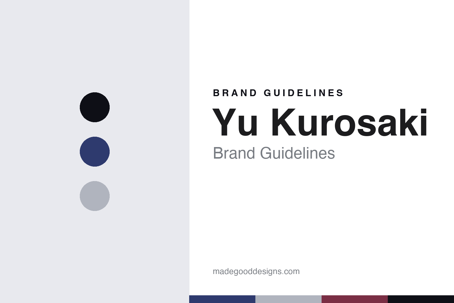
Yu Kurosaki Brand Guidelines
The contemporary Echizen blade.
Aa
Two constants: an indigo palette and a contemporary-sans register. Abstract homage — not a Yu Kurosaki blade, finish or wordmark.
The contemporary Echizen blade
Yu Kurosaki is a contemporary Echizen smith whose eponymous knife brand is made in Takefu, Japan.
Yu Kurosaki is a lesson in the contemporary smith-brand as the identity. Working in Echizen, in the Takefu knife-making area of Fukui, this is a modern maker whose eponymous brand is known for innovative, design-forward blade finishes and modern powder steels, sold worldwide. Its answer to how a modern independent knife is made is a forward one: work in a traditional forging region, but push finishes and materials into contemporary territory. A Japanese blade rooted in an old region, made new.
Its identity is the modern maker with an eponymous brand. Yu Kurosaki’s contemporary finishes, its Echizen making and its named lines are the work it is known for. An innovation, made a signature. A smith whose name is the brand.
(Honest notes, so the story stays precise. Yu Kurosaki is a contemporary Echizen smith whose knives are made in Takefu, in Fukui — the Echizen Uchi Hamono area recognised as a traditional craft region — and sold globally under named lines. We treat it as an eponymous maker-brand and keep to public commercial facts, without asserting personal biography or dates. Two honest notes: the roughly seven-hundred-year heritage belongs to the Echizen region, not to this contemporary brand, so we frame it as a modern maker working in an old region; and it uses modern powder steels and is known for distinctive hammered and rippled finishes. Those finishes and the wordmark are signature trade dress and IP, described but never reproduced, and there is no official brand hex — these tones are an unofficial interpretation. This is design commentary and does not promote any product. It is distinct from the Sakai and Tsubame-Sanjo makers covered elsewhere.)
Colour
Yu Kurosaki lives in an indigo palette. Click a swatch to copy the hex.
Yu Kurosaki’s identity is contemporary, dark and precise — an indigo, an ink, a steel grey, a wine, and a chalk. The palette leans indigo and steel: the register of a dark, textured modern blade and polished steel. It signals innovation and craft over heritage nostalgia. The honest caveat: with no published brand hex, these values are an original, unofficial interpretation, not first-party colours.
The lesson is an indigo palette signals a contemporary, made-in-Japan identity. Yu Kurosaki’s world is a modern-finished, powder-steel, made-in-Echizen object. For designers, it is a reminder that a deep indigo and a steel grey can carry a brand built on contemporary craft — the indigo of a textured finish and the grey of a ground bevel — without copying any pattern. Because these tones can fail as small text, keep type dark and let the colour live in the accents, palette and band. The takeaways: innovate on finish; keep the making in the region; separate region-heritage from brand-age; and treat any single hex as unofficial.
Typography
The register is a contemporary sans — clean, modern, precise.
Yu Kurosaki’s identity carries a clean, modern, precise spirit — a contemporary object, not a nostalgic one. A contemporary Japanese sans captures the mood: even, current and exact, the register of a modern smith-brand. Set in an indigo palette, the contemporary sans feels clean and modern — exactly the personality the brand carries. It is precise rather than ornate, mirroring a finely finished modern blade. (Yu Kurosaki’s real finishes and wordmark are things we describe but do not reproduce, and the exact typeface is not ours to use.) Because it is not ours to use, the honest description is “a contemporary-sans spirit,” shown here in a stand-in. The type behaves like the maker: clean, modern and precise.
Aa
A contemporary-sans spirit — clean and modern. (Specimen set in Murecho, a contemporary-Japanese-sans STAND-IN; NOT the Yu Kurosaki wordmark or any blade design.)
The new bladesmiths
Yu Kurosaki stands for the contemporary smith-brand.
Yu Kurosaki is a lesson in making contemporary craft the identity. An indigo palette, a contemporary sans and a modern-finished blade make one thing — an old region’s craft made new — the whole maker: contemporary, dark and precise. The innovation is the differentiator. The differentiator is a modern sensibility inside a traditional region: powder steels and distinctive finishes that read as current, made where blades have been forged for centuries.
Put to work, the identity is contemporary craft as design. A maker building in this spirit would use an old region’s skills to make something clearly of today, keep the making in that region, and be honest that the region’s heritage is not the brand’s own age. It would let a distinctive finish be the signature. A brand learning from it would treat innovation as a way to honour a tradition rather than escape it, and would keep the actual forging in the region that gives it meaning. It would say plainly it is made in Echizen, Japan. A brand learning from it would treat an old craft region as a foundation to build on rather than a costume to wear, letting the region supply the skill while the brand supplies the ideas, so the tradition is carried forward instead of merely quoted. A region keeps its craft alive only when someone gives it new work to do. The lesson Yu Kurosaki teaches is that contemporary craft can build a brand: the innovation gives it distinction, and the Echizen making gives it substance. The innovation is the personality, and the modern finish is the proof.
For designers and brand-builders, Yu Kurosaki holds the contemporary pole in this round about the new bladesmiths: make an old region’s craft new, and keep the making there. The lessons: innovate on finish; keep it in the region; separate region-heritage from brand-age; and never reproduce a protected design. It is also a reminder to stay precise: Yu Kurosaki is a contemporary Echizen smith whose eponymous brand is made in Takefu, Japan, using modern steels and finishes — with the region’s heritage kept separate from the brand’s modern age, and the palette here an unofficial interpretation. Yu Kurosaki made contemporary craft the maker — proof that making an old craft new can be the difference.
Explore & save
Keep Yu Kurosaki’s identity on hand — save it to a board in the Made Good inspiration library.
Yu Kurosaki identity set
Pin the indigo palette and the contemporary-sans register to your own board.