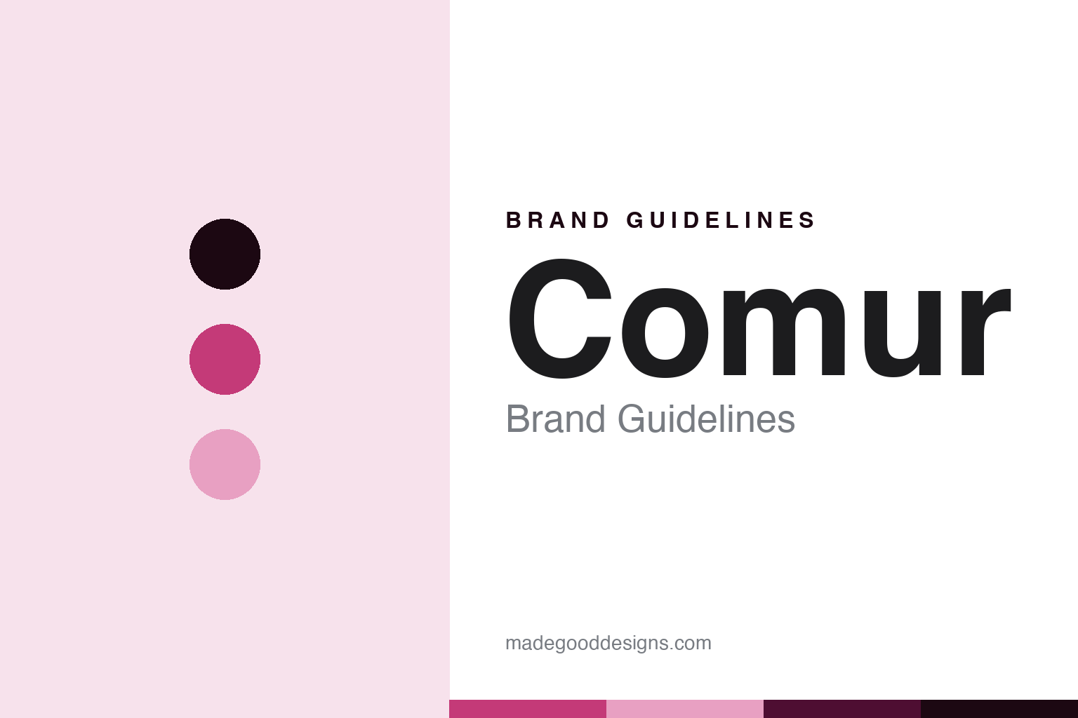
Comur Brand Guidelines
The fantastic world of the Portuguese sardine.
Aa
Two constants: a carnival-magenta palette and a carnival-sans register. Abstract homage — not a Comur product or mark.
The fantastic world of the Portuguese sardine
Comur is the 1942 Portuguese cannery turned wildly colourful, year-marked sardine spectacle.
Comur brings the round its spectacle — the Portuguese sardine cannery, dating to 1942, reborn as the Fantastic World of the Portuguese Sardine, a chain of wildly colourful, carnival-decorated shops where each tin is stamped with a year. Comur makes tinned sardines and a full conservas range, and its answer to a round about the coasts of Europe is retail theatre: the tin as a fairground souvenir. A brand, as a carnival.
Its identity is the fantastic world of the Portuguese sardine. Comur’s carnival shops, its year-marked tins and its Murtosa cannery are the story here. A brand, festive. The fantastic world of the Portuguese sardine.
(Honest notes, so the story stays precise. Comur — sold at portuguesesardine.com, with comur.com redirecting there — makes tinned sardines and a full range of tuna, mackerel, cod, shellfish and pâtés, through the theatrical retail concept the Fantastic World of the Portuguese Sardine, including a year-marked Timeless Sardines line, where customers choose a tin bearing a personal year, and a flagship in Times Square, New York. Its heritage needs care: the Comur cannery, the Fábrica de Conservas da Murtosa, was founded in 1942, but the colourful carnival retail concept is a modern relaunch, built after the group acquired Comur in 2015, so we do not overstate an unbroken 1942-to-today lineage. On where it is made — a theme of this vein — it is canned in Murtosa, in the Ria de Aveiro, in Portugal, with about a hundred women hand-working the fish. On ownership, it is owned by the Portuguese group O Valor do Tempo, led by António Quaresma, not Manuel, and we note that A Vida Portuguesa is a separate company we do not attribute to this group. Its vivid retro-carnival aesthetic, candy-stripe colour, fairground lettering, carousel fixtures and year-stamped labels, is IP we describe but do not reproduce; there is no official brand hex; these tones are an unofficial interpretation. This is design commentary.)
Colour
Comur lives in a carnival magenta. Click a swatch to copy the hex.
Comur’s identity is festive, Portuguese and candy-bright — a carnival magenta, an ink, a candy pink, a deep magenta, and a paper. The palette leans carnival magenta and candy pink: a loud, fairground register that nods to a circus-decorated shop and a year-stamped tin rather than a quiet palette. It signals a design-and-tourism spectacle. The honest caveat: with no published brand hex, these values are an original, unofficial interpretation, not first-party colours, and are not a facsimile of the shop artwork.
The lesson is a carnival magenta signals a festive, retail identity. Comur’s world is a festive, made object. For designers, it is a reminder that a carnival magenta and a candy pink can carry a food brand — the tone of a fairground. Because these tones can fail as small text, keep type dark and let the colour live in the accents, palette and band. The takeaways: make retail theatre; date the tin; be honest about a relaunch; and treat any single hex as unofficial.
Typography
The register is a carnival sans — festive, Portuguese, plain.
Comur’s identity carries a festive, Portuguese, plain spirit — a sardine spectacle, not a fashion. A carnival sans captures the mood: bold, bright and confident, the register of a fairground. Set in a carnival-magenta palette, the carnival sans feels festive and Portuguese — exactly the personality Comur carries. It is retail theatre rather than a logo, mirroring a tin and candy stripe. (Comur’s real carnival shop and tin artwork are things we describe but do not reproduce, and the exact typeface is not ours to use.) Because it is not ours to use, the honest description is “a carnival-sans spirit,” shown here in a stand-in. The type behaves like the brand: festive, Portuguese and plain.
Aa
A carnival-sans spirit — festive and Portuguese. (Specimen set in Space Grotesk, a carnival-sans STAND-IN; NOT the Comur logo.)
Around the coasts of Europe
Comur stands for the fantastic world of the Portuguese sardine.
Comur brings the round its spectacle. A carnival-magenta palette, a carnival sans and a year-marked tin make one thing — the fantastic world of the Portuguese sardine — the whole identity: festive, Portuguese and candy-bright. The carnival shops are the spectacle, and the year-marked tin is the souvenir. The point is a 1942 Portuguese cannery reborn as a wildly colourful retail world where the tin is a fairground keepsake.
Put to work, the identity is retail theatre told straight, as design. A maker in this spirit would make retail theatre, date the tin, and be honest about a relaunch. A reader in this spirit would keep the facts right: the Comur cannery, in Murtosa, dates to 1942, but the carnival retail concept is a post-2015 relaunch after the group acquired it; it makes sardines and a full conservas range through the Fantastic World shops, with a year-marked Timeless Sardines line and a Times Square flagship; it is canned in Murtosa, in the Ria de Aveiro, by about a hundred women; and it is owned by the Portuguese group O Valor do Tempo, led by António Quaresma, with A Vida Portuguesa a separate company. Comur brings the round its Portuguese chapter and its most design-forward retail idea. The honest editorial moves are to separate the 1942 cannery from the post-2015 carnival brand, to canned-in-Murtosa, to name O Valor do Tempo and António Quaresma, and to not reproduce the carnival artwork. The lesson Comur teaches is that retail theatre can be a whole identity, and honesty about the relaunch keeps it credible.
For designers and brand-builders, Comur continues around the coasts of Europe: make retail theatre — and be honest about a relaunch. The lessons: turn a shop into a spectacle; make the tin a dated souvenir; separate a heritage cannery from a modern relaunch; name the group and the person behind it; and never reproduce a carnival artwork. It is also a reminder to stay precise: Comur is the 1942 Portuguese cannery turned wildly colourful, year-marked sardine spectacle — with the palette here an unofficial interpretation. Read that way, Comur is less a tin than a carousel: a Portuguese sardine as a fairground keepsake. The lesson for a brand is that retail theatre and honest heritage reinforce each other, and dating the relaunch keeps the story earned. Comur made the-fantastic-world-of-the-Portuguese-sardine the identity — proof that a carnival can define a brand.
Explore & save
Keep Comur’s identity on hand — save it to a board in the Made Good inspiration library.
Comur identity set
Pin the carnival-magenta palette and the carnival-sans register to your own board.