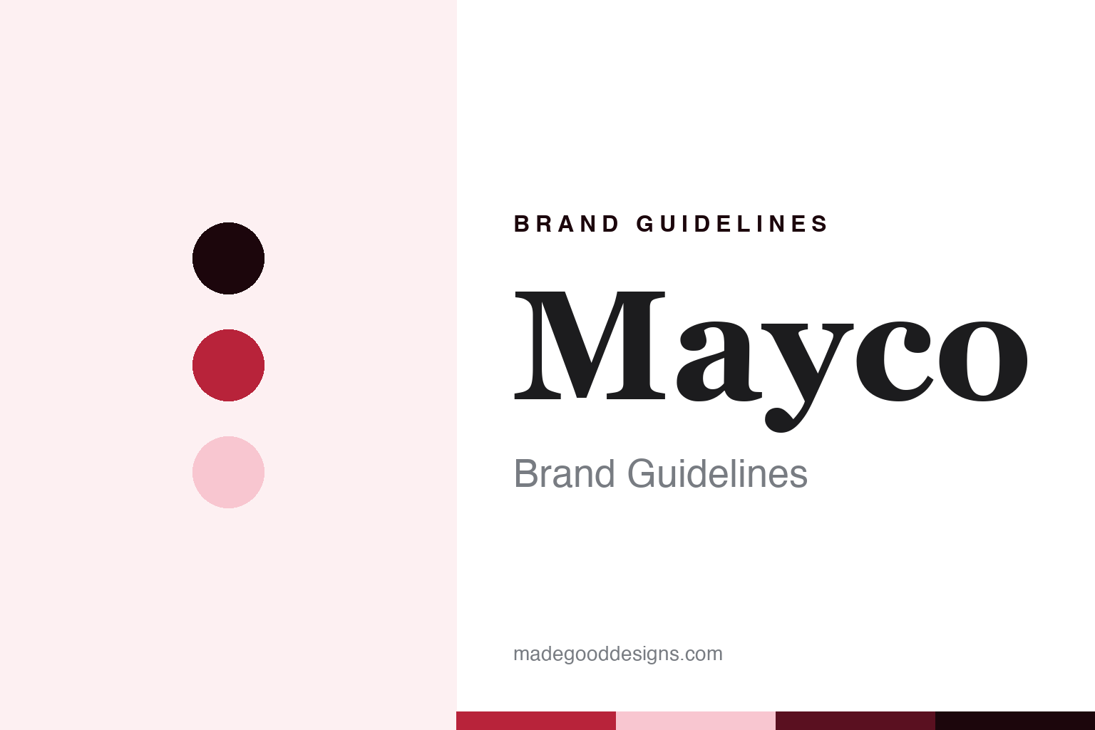
Mayco Brand Guidelines
The glaze maker that retired the word “safe.”
Aa
Two constants: a flame-red palette and a script-italic register. Abstract homage — not a Mayco product or mark; no jar, seal or logo is reproduced.
From California to a Columbus suburb
A colour company that changed owners from the inside.
Mayco dates itself to 1954 — its tagline is “America’s Finest Colors since 1954” — and its 2020 press release adds that it was founded that year “in California.” An older investor’s page gives 1952, and we found no founder’s name, so we give Mayco’s own year. It “has been based in Hilliard, Ohio, a suburb of Columbus, since the early 1970s.”
Its corporate history runs through consolidation. A page from its former investor, Seneca Capital, says that a company called Coloramics “was formed in late 1997 by the acquisition of two ceramic industry leaders, Mayco Colors, Inc., and Ceramichrome, Inc.” — the latter founded in 1936, and so older than Mayco itself — with both lines made in Hilliard. The legal company today is Coloramics, LLC, doing business as Mayco Colors.
The current owners came from inside the company. Mayco says: “Mayco is currently owned by Colleen Carey Brennan and her husband, Kevin. Colleen joined Mayco in the early-90s as the Controller and was promoted to CFO, COO and then CEO in 2001. In 2011, she and her husband purchased the company from Bob Umhoefer (at 100 years of age) and his investment partner, Seneca Capital.” Their son and daughter-in-law work in the business. The company was, in other words, bought by the person who had once kept its books — and sold by an owner who had reached his hundredth year.
Colour
Duncan’s ceramic colours join in 2020.
Mayco then bought history. “In November 2020, Mayco acquired the ceramic color division of Duncan Enterprises,” it says — a California company “founded by Erma Duncan in 1946” in Fresno. Duncan Enterprises kept its craft brands, such as Tulip, Puffy and Aleene’s; Mayco took the ceramic colours. Duncan’s chairman, Larry Duncan, was quoted in the release: “I look forward to seeing our legacy ceramics business continue forward with the leadership of Mayco Colors.” Mayco now sells “Best of Duncan” assortments and “Duncan E-Z Stroke® Translucent Underglazes,” keeping the older name alive as a label within its own range rather than folding it away. Two long-established names — one from Ohio, one from Fresno — now come from the same company. In 2020, the release said, Mayco had 55 employees, with manufacturing and retail locations in Ravenna and Hilliard, Ohio.
Its best-known product line is Stroke & Coat®, which Mayco calls “the industry’s most versatile glaze,” applicable “on wet clay, earthenware bisque, or stoneware bisque, fired from cone 06 to cone 10, in oxidation or reduction.” It also sells Ritual Glaze, Jungle Gems™ and Pottery Cascade™, and molds under the Cardinal Designs name.
Where its products are made is stated only in part. A Mayco certificate covering its plaster molds, press molds and clay tools says they “are manufactured in the Mayco factory, Hilliard, Ohio facility,” and the company says “Every batch of glaze is tested by our engineering staff, prior to being released to bottling.” We did not find a “Made in USA” slogan on its main pages, so we do not attach one.
Typography
Retiring “safe”: a label change, not a recipe change.
For a glaze, the equivalent of a kiln’s listing mark is a seal. Mayco says it is “a proud member of the Art & Creative Materials Institute (ACMI)” and that its products “will continue to be labeled with ACMI’s AP or CL seals,” which certify that products are labelled in accordance with ASTM D4236 — AP for products that need no health warning, CL for those that carry cautionary labelling — the art-materials labelling standard that US law requires; its certificate says “Mayco products conform to ASTM D 4236,” and names the toxicology laboratory that reviews them, Bio Risk of Midland, Michigan. The AMACO guide in this series explains that regime. Like the CSA or UL mark on a kiln, an ACMI seal is a third party’s judgement placed on a maker’s product rather than the maker’s own claim, and that is the source of its weight.
Then, in September 2026 — a few weeks before this guide was written — Mayco changed its words. A page dated “Updated 09/11/2026” retires the labels “Food Safe” and “Dinnerware Safe,” because, it says, “the word ‘safe,’ can be interpreted differently depending on an artist’s language, country, regulatory environment…” In their place come three plainer categories: “Products Suitable for Dinnerware,” “…with Clear” and “Decorative Use Only.” Mayco cites the US Food and Drug Administration’s compliance policy guides on cadmium (Sec. 545.400) and lead (Sec. 545.450) in ceramic ware, and adds that “Finishedware producers bear responsibility for food-contact testing.” The new categories describe use rather than risk. It is emphatic that “These updates represent a change in terminology only. Product formulations … have not changed.”
That is a significant piece of brand writing. “Safe” is a promise; “suitable for” is a description, and it puts the responsibility for the finished pot — its firing, its clay, its testing — where Mayco’s page says it lies, with whoever makes the ware. For the kilns in this round, the listing mark — such as the “CSA approved” on Cone Art’s product pages — answers a regulator’s question about electricity; for a glaze, the label now answers a narrower question honestly.
Aa
A flowing script italic — the signature of a colour company. (Specimen set in Fraunces italic, a serif STAND-IN; NOT the Mayco logo.)
America’s Finest Colors since 1954
A script name and a flame of petals.
Mayco’s logo is a black script wordmark, “Mayco,” beside a mark of red and pink flame-like petals around a black drop with an “M” monogram; the website’s own icon file is named “logo-flame.” The flame suits a company whose products only become themselves in a kiln. Its mission line says it exists “to ignite creativity and inspire ceramic artists of all levels of expertise.”
For a design guide, Mayco’s 2026 relabelling is the lesson. Words on a label are part of a brand, and changing them can be a mark of maturity: a company that once promised safety now promises suitability, and says plainly that nothing in the jar has changed.
For this guide we use a flame red and a petal pink with a script-flavoured italic. These are an unofficial interpretation, not Mayco’s colour values, and nothing of its logo or seals is reproduced.
Explore & save
Keep Mayco’s identity on hand — save it to a board in the Made Good inspiration library.
Mayco identity set
Pin the flame-red palette and the script-italic register to your own board.