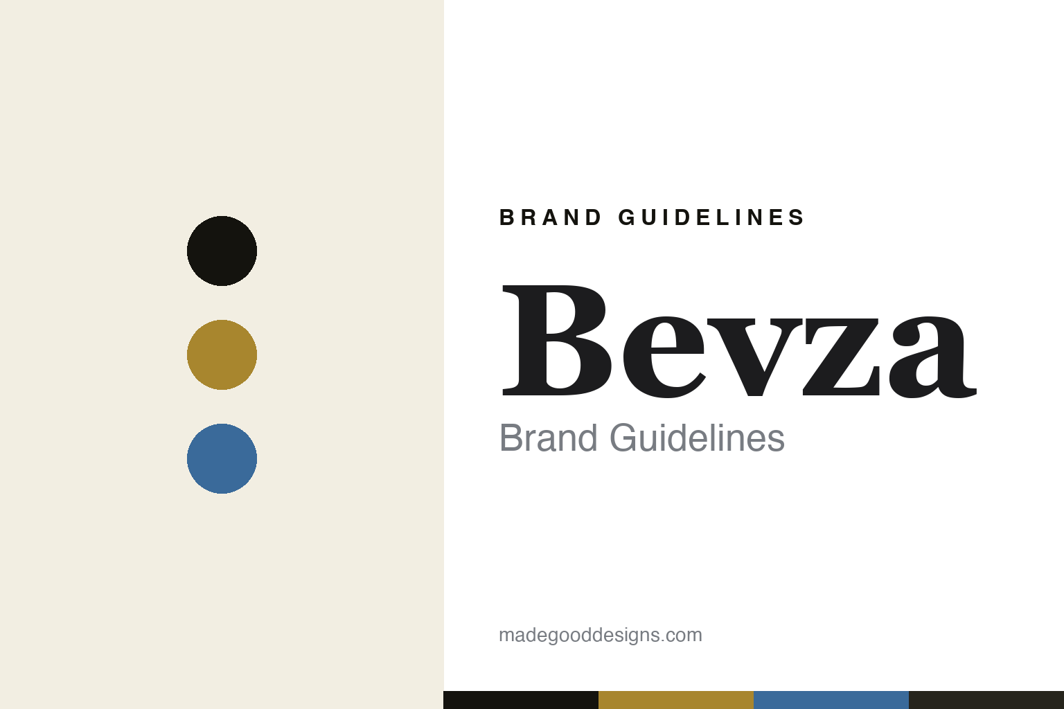
Bevza Brand Guidelines
Minimalism, and wheat.
Aa
Two constants: a wheat-gold-and-blue palette and a refined serif register. Abstract homage — not a Bevza garment, motif or wordmark.
Minimalism, and wheat
Bevza makes refined, minimalist womenswear rooted in Ukrainian heritage, with a wheat-spike motif.
Bevza is a lesson in a heritage motif as the identity. A Ukrainian house founded in Kyiv, it makes refined, minimalist womenswear — “less and luxe,” with precise cut and a neutral palette — and threads a wheat-spike, or “spikelet,” motif drawn from Ukraine’s agricultural heritage through its clothing and jewellery. Minimalism, rooted in a place.
Its identity is minimalism, and wheat. Bevza’s clean, architectural pieces — the little white dress, the spikelet motif — are the work it is known for. Restraint, made meaningful. A house that carries its country quietly.
(Honest notes, so the story stays precise, and told with care. Bevza is an independent, founder-led Ukrainian brand founded in Kyiv in 2006 by its founder and creative director, Svitlana Bevza. It is a Kyiv-founded house that has continued operating through the ongoing war — a fact we state plainly and factually, never as marketing colour, and without asserting a specific current production location or dramatising it. Its signature is minimalist, architectural womenswear, with the wheat-spike, or spikelet, motif — a reference to Ukraine’s agricultural, “breadbasket” heritage — appearing across its clothing and jewellery; this is the designer’s own cultural heritage, so we frame it as authorship, described respectfully and never reproduced. Its collaborations, with the tennis champion Elina Svitolina and with Mastercard, are described without reproducing partner marks; a family connection to a former minister is personal, not a corporate tie. Its pieces and wordmark are its IP, and there is no official brand hex — these tones are an unofficial interpretation. This is design commentary and does not promote any product.)
Colour
Bevza lives in a wheat-gold-and-blue palette. Click a swatch to copy the hex.
Bevza’s identity is refined, neutral and rooted — a wheat gold, an ink, a sky blue, an ecru, and an ivory. The palette leans wheat gold and blue: the register of Ukrainian wheat and sky. It signals restraint and heritage over flash. The honest caveat: with no published brand hex, these values are an original, unofficial interpretation, not first-party colours.
The lesson is a wheat-gold-and-blue palette signals a rooted, minimalist identity. Bevza’s world is a refined, neutral, rooted object. For designers, it is a reminder that a restrained palette drawn from a homeland — the gold of wheat, the blue of sky — can carry a brand built on minimalism and heritage. Because a mid wheat-gold can fail as small text, keep type dark and let the colour live in the accents, palette and band. The takeaways: keep it minimal; root it in a place; carry heritage quietly; and treat any single hex as unofficial.
Typography
The register is a refined serif — elegant, restrained, rooted.
Bevza’s identity carries an elegant, restrained, rooted spirit — a refined object, not a loud one. A refined serif captures the mood: graceful, quiet and considered, the register of minimalist luxury with meaning. Set in a wheat-gold-and-blue palette, the refined serif feels elegant and restrained — exactly the personality Bevza carries. It is rooted rather than showy, mirroring clean, architectural womenswear. (Bevza’s real garments, the spikelet motif and its wordmark are things we describe but do not reproduce, and the exact typeface is not ours to use.) Because it is not ours to use, the honest description is “a refined-serif spirit,” shown here in a stand-in. The type behaves like the brand: elegant, restrained and rooted.
Aa
A refined-serif spirit — elegant and restrained. (Specimen set in Playfair Display, a refined-serif STAND-IN; NOT the Bevza wordmark or any motif design.)
A heritage motif as identity
Bevza stands for minimalism, and wheat.
Bevza is a lesson in making a heritage motif the identity. A wheat-gold-and-blue palette, a refined serif and minimalist womenswear make Ukrainian heritage the whole brand — refined, neutral and rooted. The motif is the differentiator. The differentiator is a quiet, genuine symbol — the wheat spike of a homeland — carried through restrained, architectural design, so a minimalist house still says something specific.
Put to work, the identity is heritage as design. A house building in this spirit would root a restrained aesthetic in a real, personal heritage and carry one meaningful motif consistently, so the customer buys into both refinement and meaning. The lesson Bevza teaches is that minimalism plus a genuine heritage motif can build a brand: the restraint gives it elegance, and the wheat gives it a soul — carried with dignity, especially through hard times. The motif is the personality, and the restraint is the proof.
For designers and brand-builders, Bevza offers a clear takeaway: carry one meaningful motif quietly. The lessons: keep it minimal; root it in a real heritage; carry the motif consistently; and be honest and respectful about the story. It is also a reminder to stay accurate: Bevza was founded in Kyiv in 2006 by Svitlana Bevza, is independent, and has continued operating through the war — a fact stated plainly, without dramatisation or claiming a specific production city; the wheat motif is her own Ukrainian heritage, and its pieces are described but never reproduced, with the palette here an unofficial interpretation. Bevza made minimalism and wheat the brand — proof that a rooted motif can be the difference.
Explore & save
Keep Bevza’s identity on hand — save it to a board in the Made Good inspiration library.
Bevza identity set
Pin the wheat-gold-and-blue palette and the refined-serif register to your own board.