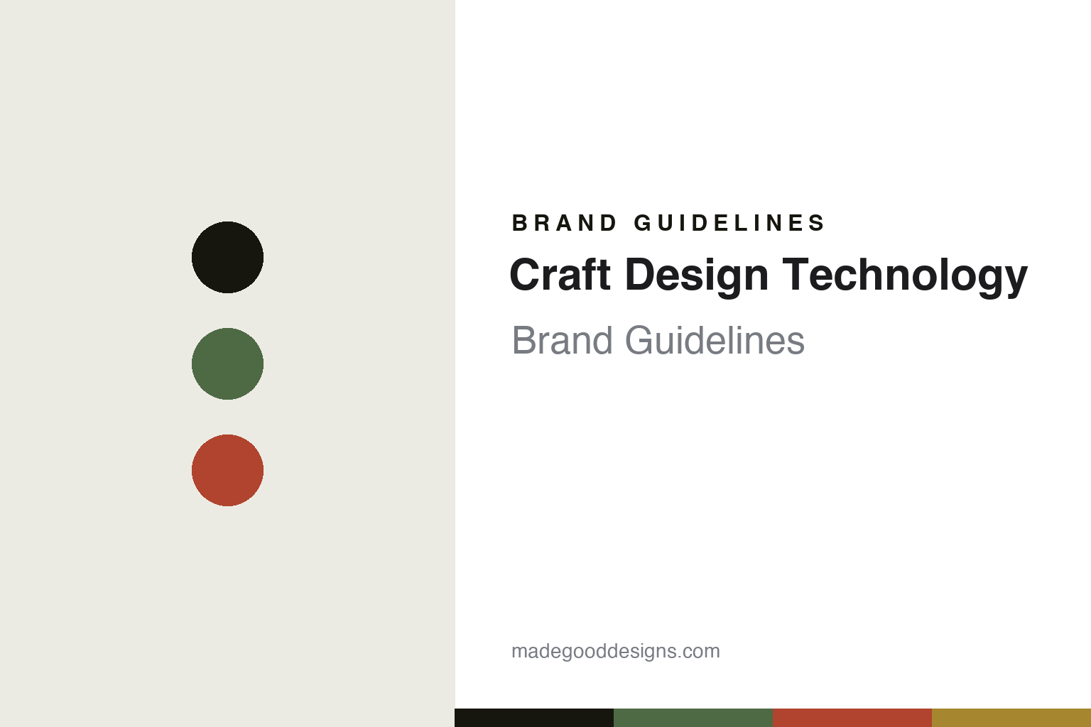
Craft Design Technology Brand Guidelines
The office-tool system.
Aa
Two constants: a refined-green palette and a system sans register. Abstract homage — not the CDT tools, pattern or packaging.
The office-tool system
Craft Design Technology redesigns the desk.
Craft Design Technology (CDT) is a lesson in the everyday tool, redesigned. A Tokyo company founded in 2006, it takes the standard tools of the Japanese office — scissors, staplers, tape dispensers, pens, clips, glue — and reworks them into one coherent, well-designed desk system.
Its identity is the office-tool system. CDT works with established Japanese manufacturers to redesign ordinary items around a shared code of colour, pattern and proportion — a refined green and traditional Japanese colours, an Edo-period braided-rope (sanada-himo) motif, and a considered geometry — so that a whole desk can match. Its watchword is a kind of practical beauty. Everyday tools, made to belong together. Design applied to the things you already use.
(Honest notes: CDT is its own company, Craft Design Technology, Inc., in Tokyo — not a project of Nakagawa Masashichi, and not designed by Fumie Shibata. Its product design is by Shuwa Tei of Intentionallies, and its graphic identity is by Winkreative; it was founded in 2006 (with a preliminary office in 2004). It is made in Japan through established manufacturers — Pentel, Sun-Star, Shachihata, Lion, Takeo, Yamato — so CDT is the design house and the partners make the goods. Its signature colour we describe as a refined, pale green (that is closer to the brand’s own language than “olive” or “khaki”), and we don’t assert a Good Design Award we couldn’t confirm. There’s no official brand hex, and we reproduce no logo or the exact pattern — these tones are an unofficial interpretation. This is design commentary and does not promote any product.)
Colour
CDT lives in a refined-green palette. Click a swatch to copy the hex.
CDT’s identity is refined, systematic and Japanese — a refined green, an ink, a vermilion, an ochre, and a chalk. The palette centres on a refined green with traditional accents — the register of a coherent desk system. It signals order and craft rather than novelty. The honest caveat: with no published brand hex, these tones are an original, unofficial interpretation, not first-party values.
The lesson is a refined green signals a design-system house. CDT’s world is a matched, considered desk. For designers, it is a reminder that a shared code — one colour, one motif, one proportion — can turn a set of ordinary objects into a system, and that the everyday is worth redesigning. Because a mid green can fail as small text, keep type dark and let the colour live in the accents, palette and band. The takeaways: unify with a code; redesign the ordinary; work with real makers; and treat any single hex as unofficial.
Typography
The register is a system sans — refined, precise, Japanese.
CDT’s identity carries a refined, precise, Japanese spirit — a coherent, engineered desk. A clean modern sans captures the mood: it is orderly and exact, the register of a design system. Set in a refined-green palette, the system sans feels refined and precise — exactly the personality CDT carries. It is systematic rather than decorative, mirroring a matched set of tools. (CDT’s real tools, the sanada-himo pattern and wordmark are works we describe but do not reproduce, and the exact typeface is not ours to use.) Because it is not ours to use, the honest description is “a system sans spirit,” shown here in a stand-in. The type behaves like the brand: refined, precise and Japanese.
Aa
A system sans spirit — refined and precise. (Specimen set in Plus Jakarta Sans, a clean modern sans STAND-IN; NOT the CDT packaging.)
The everyday tool, redesigned
CDT stands for the office-tool system.
Craft Design Technology is a lesson in making a system the identity. A refined-green palette, a system sans and a matched desk make the office-tool system the whole brand — refined, systematic, Japanese. The system is the differentiator. The differentiator is a shared design code applied across ordinary tools until they belong together.
Put to work, the identity is a code. A designer building in this spirit would define the smallest possible set of rules — a colour, a motif, a proportion — and hold every object to them, so that variety reads as a family rather than a jumble. The lesson CDT teaches is that coherence is a product in itself: by imposing one refined green and one geometry on scissors, staplers and pens made by different manufacturers, it turns a shelf of commodities into a designed environment, and shows that a system can be more valuable than any single object in it.
For designers and brand-builders, CDT offers a clear takeaway: design the system, not just the object. The lessons: unify with a code; redesign the ordinary; work with real makers; and be honest about the story. It is also a reminder to stay accurate: it is its own Tokyo company (product design by Intentionallies, graphics by Winkreative), founded in 2006, made in Japan through established manufacturers — the palette here is an unofficial interpretation. CDT made the system the brand — proof that coherence can be the difference.
Explore & save
Keep Craft Design Technology’s identity on hand — save it to a board in the Made Good inspiration library.
Craft Design Technology identity set
Pin the refined-green palette and the system-sans register to your own board.


