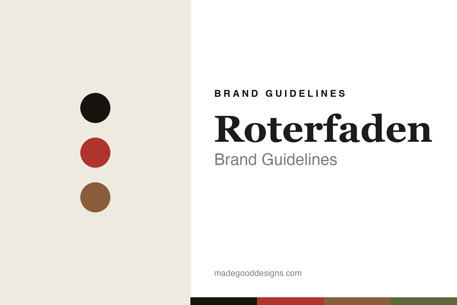
Roterfaden Brand Guidelines
The red thread.
Aa
Two constants: a red-and-leather palette and a craft slab register. Abstract homage — not the Roterfaden organizer or packaging.
The red thread
Roterfaden makes one cover hold everything.
Roterfaden is a lesson in modularity as the identity. Grown from a 2006 design thesis into a company founded in 2007 in Saarbrücken, Germany, its name means “red thread,” and its whole idea is a single cover that holds and swaps everything you write in.
Its identity is the Taschenbegleiter — the “pocket companion.” A leather or fabric cover carries an internal set of stainless-steel spring clips that grip and release interchangeable notebooks, planners and loose papers, so one organizer reconfigures endlessly without hole-punching or special formats. Buy it once, rebuild it forever. A cover designed to outlast its contents.
(Honest notes: Roterfaden began as Beate Mangrig’s 2006 diploma thesis at HBK Saar and was established as a company in 2007 — so we hedge the year rather than say a flat “2006.” It is based in Saarbrücken, in Saarland (not Baden-Württemberg or near Stuttgart). Its signature is the clip system; the mechanism was filed with the patent office at inception, but we don’t assert a granted, in-force patent. It is “100% made in Germany,” handcrafted — clips by a small Bavarian family business, notebooks bound with a red thread — in vegetable-tanned German leather plus vegan and upcycled options, and it is now run as a worker cooperative (since 2024). There’s no official brand hex, and we reproduce no logo or design — these tones are an unofficial interpretation. This is design commentary and does not promote any product.)
Colour
Roterfaden lives in a red-and-leather palette. Click a swatch to copy the hex.
Roterfaden’s identity is modular, crafted and German — a red thread, an ink, a leather tan, an olive, and a chalk. The palette pairs a red with a leather tan — the register of a handcrafted organizer (and a nod to the red thread of its name). It signals craft and system rather than novelty. The honest caveat: with no published brand hex, these tones are an original, unofficial interpretation, not first-party values.
The lesson is a red with a leather tan signals a modular-craft house. Roterfaden’s world is a durable, reconfigurable object. For designers, it is a reminder that a single clever mechanism — a clip that lets one cover hold anything — can be a whole identity, and that “buy once” can be a brand position. Because a bright red can fail as small text, keep type dark and let the colour live in the accents, palette and band. The takeaways: design one strong mechanism; make it modular; build it to last; and treat any single hex as unofficial.
Typography
The register is a craft slab — sturdy, handmade, durable.
Roterfaden’s identity carries a sturdy, handmade, durable spirit — a leather organizer built to last. A robust slab serif captures the mood: it is solid and honest, the register of a workshop. Set in a red-and-leather palette, the craft slab feels sturdy and handmade — exactly the personality Roterfaden carries. It is workmanlike rather than delicate, mirroring vegetable-tanned leather. (Roterfaden’s real organizer, clip system and wordmark are works we describe but do not reproduce, and the exact typeface is not ours to use.) Because it is not ours to use, the honest description is “a craft slab spirit,” shown here in a stand-in. The type behaves like the brand: sturdy, handmade and durable.
Aa
A craft slab spirit — sturdy and handmade. (Specimen set in Hepta Slab, a robust slab serif STAND-IN; NOT the Roterfaden packaging.)
Modularity as the identity
Roterfaden stands for the red thread.
Roterfaden is a lesson in making a mechanism the identity. A red-and-leather palette, a craft slab and a durable cover make modularity the whole brand — modular, crafted, German. The mechanism is the differentiator. The differentiator is a clip system that lets one handmade cover hold and swap anything, for years.
Put to work, the identity is a single good idea, executed fully. A designer building in this spirit would let one mechanism define everything — the sizes, the materials, the promise — and back it with visible craft and honest longevity rather than seasonal newness. The lesson Roterfaden teaches is that “buy once” is a viable brand position when the object genuinely earns it: by making a cover that reconfigures instead of a notebook that gets used up, it turns durability into the whole value proposition, and its worker-cooperative structure makes that ethic more than marketing.
For designers and brand-builders, Roterfaden offers a clear takeaway: build one thing to last. The lessons: design one strong mechanism; make it modular; build it to last; and be honest about the story. It is also a reminder to stay accurate: it grew from a 2006 thesis into a 2007 company in Saarbrücken, it is 100% made in Germany, and it is now a worker cooperative — the palette here is an unofficial interpretation. Roterfaden made modularity the brand — proof that a mechanism can be the difference.
Explore & save
Keep Roterfaden’s identity on hand — save it to a board in the Made Good inspiration library.
Roterfaden identity set
Pin the red-and-leather palette and the craft-slab register to your own board.


