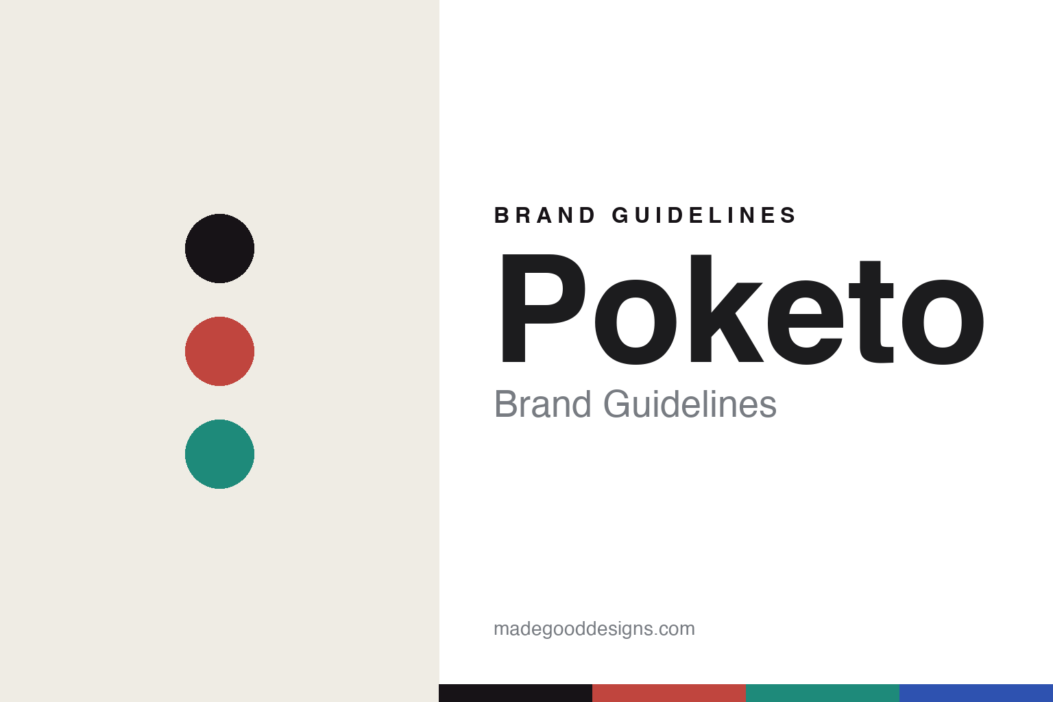
Poketo Brand Guidelines
Art for the everyday.
Aa
Two constants: a bright multicolour palette and a playful sans register. Abstract homage — not the Poketo products, artist artwork or packaging.
Art for the everyday
Poketo put artists on everyday objects.
Poketo is a lesson in art as the everyday object. Founded in 2003 in Los Angeles by Ted Vadakan and Angie Myung — a husband-and-wife team — it began with artist-designed wallets and grew into a colourful design-goods brand under the banner “Art for Your Everyday.”
Its identity is art, made useful. Poketo turned wallets, stationery, housewares and accessories into canvases for artists and designers, in a bright, graphic, playful register, and built a physical home in the LA Arts District. Bringing art into daily life — a wallet, a notebook, a mug — was the whole idea. Accessible art, sold as objects.
(Honest notes: Poketo was founded in 2003 by Ted Vadakan and Angie Myung (Myung as chief creative), starting from artist-designed wallets — early collaborators included Tim Biskup, Gary Baseman, Esther Pearl Watson and licensed properties like Adventure Time. We describe its design identity, which is what endures — but on status we’re careful: Poketo was acquired by Pattern Brands in 2022, poketo.com now redirects to that group, and its independent shop era has since wound down, so we don’t present it as a currently independent, operating store. Its manufacturing locations aren’t documented. Many of its designs are licensed artist and third-party works, so we reproduce none. There’s no official brand hex — these tones are an unofficial interpretation. This is design commentary and does not promote any product.)
Colour
Poketo lives in a bright multicolour palette. Click a swatch to copy the hex.
Poketo’s identity is bright, playful and Californian — a coral, an ink, a teal, a cobalt, and a bone. The palette leans bright multicolour — the register of art-forward design goods. It signals colour and joy rather than novelty. The honest caveat: with no published brand hex, these tones are an original, unofficial interpretation, not first-party values.
The lesson is bright multicolour signals an art-forward goods brand. Poketo’s world was a colourful, artist-made object. For designers, it is a reminder that putting real artists’ work on everyday things — and treating accessibility as a virtue — can be a whole identity. Because bright hues can fail as small text, keep type dark and let the colour live in the accents, palette and band. The takeaways: bring in the artists; make art accessible; keep it joyful; and treat any single hex as unofficial.
Typography
The register is a playful sans — bright, friendly, art-forward.
Poketo’s identity carries a bright, friendly, art-forward spirit — a colourful, artist-made object. A rounded, confident sans captures the mood: it is upbeat and approachable, the register of an accessible-art brand. Set in a bright multicolour palette, the playful sans feels bright and friendly — exactly the personality Poketo carries. It is joyful rather than austere, mirroring artist-designed goods. (Poketo’s real products, artist artwork and wordmark are works we describe but do not reproduce, and the exact typeface is not ours to use.) Because it is not ours to use, the honest description is “a playful sans spirit,” shown here in a stand-in. The type behaves like the brand: bright, friendly and art-forward.
Aa
A playful sans spirit — bright and friendly. (Specimen set in Red Hat Display, a rounded confident sans STAND-IN; NOT the Poketo packaging.)
Art as the everyday object
Poketo stood for art for the everyday.
Poketo is a lesson in making art the everyday object. A bright multicolour palette, a playful sans and an artist-made object made accessible art the whole brand — bright, playful, Californian. The art was the differentiator. The differentiator was inviting real artists onto ordinary things and keeping the result affordable.
Put to work, the identity was a collaboration engine. A designer building in this spirit would treat the object as a frame for someone else’s work — a rotating cast of artists, a bright house palette to unify them, and a low enough price that art felt like something anyone could own. The lesson Poketo teaches is that a brand can be a platform: by consistently commissioning and licensing artists, it turned a wallet or a notebook into a way to live with art, and made its own identity the act of curation rather than a single signature style. That platform model has a catch worth noting: when the brand is the roster of artists, the house voice — here, a bright, unifying palette and a playful tone — has to be strong enough to hold wildly different work together, or the range fragments. Poketo’s consistency of colour and spirit is what let a hundred different artists still read as one brand, and that is the real lesson in curation as identity.
For designers and brand-builders, Poketo offers a clear takeaway: be a canvas for others. The lessons: bring in the artists; make art accessible; keep it joyful; and be honest about the story. It is also a reminder to stay accurate: it was founded in 2003 by Ted Vadakan and Angie Myung, it grew from artist wallets, and it was acquired by Pattern Brands in 2022 — so we describe its identity in the past tense where its independence is concerned. Poketo made accessible art the brand — proof that a platform can be the difference.
Explore & save
Keep Poketo’s identity on hand — save it to a board in the Made Good inspiration library.
Poketo identity set
Pin the bright-multicolour palette and the playful-sans register to your own board.