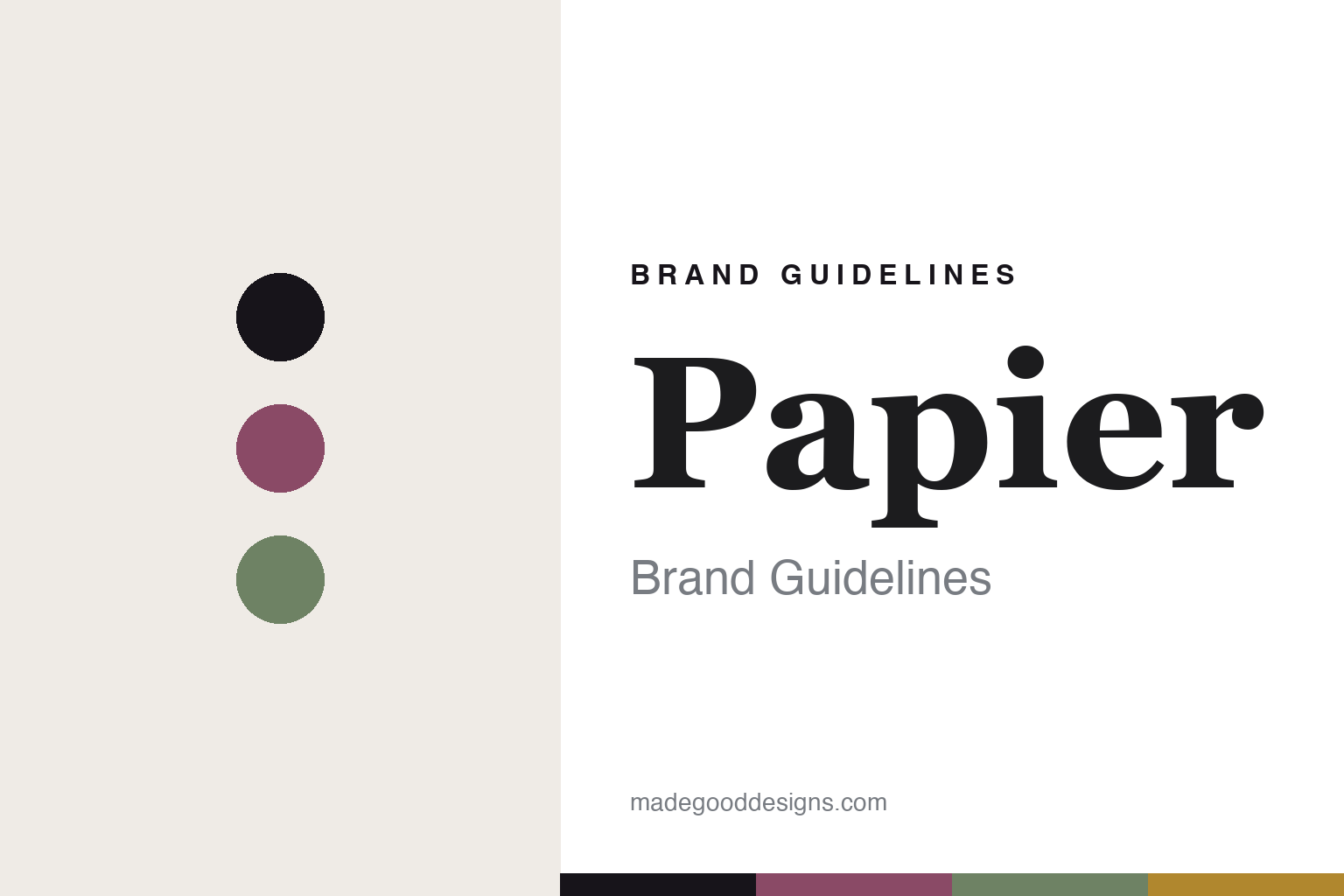
Papier Brand Guidelines
The design-led notebook.
Aa
Two constants: a plum-and-sage palette and an editorial serif register. Abstract homage — not the Papier covers or packaging.
The design-led notebook
Papier makes made-to-order stationery beautiful.
Papier is a lesson in customisation as the product. Founded in 2015 in London by Taymoor Atighetchi, it is a direct-to-consumer stationery brand that makes design-led, personalised, made-to-order notebooks, journals, diaries and cards.
Its identity is the design-led notebook, made yours. Papier pairs a contemporary, colourful, collaboration-driven aesthetic with print-on-demand personalisation — add your name, choose from designs created with more than forty design partners, from the V&A and Liberty to individual artists. A modern take on stationery, built for e-commerce and personal touch. Design, printed to order. (Not to be confused with Papier Tigre, the separate Paris brand.)
(Honest notes: Papier was founded in 2015 in London by Taymoor Atighetchi — this is Papier, papier.com, not the Paris brand Papier Tigre. It is a venture-backed startup (a Series A around $4M in 2017; a $50M Series C led by Singular in 2022) and remains founder-led and independent, with no acquirer. On production, its goods are made to order through a distributed, localised print network reported to span the UK, US and Australia — so we don’t claim “made in Britain.” Its paper is described as ethically sourced from sustainably managed forests (we don’t assert an FSC certification), and its cover designs are original plus licensed collaborations, so we reproduce none. There’s no official brand hex — these tones are an unofficial interpretation. This is design commentary and does not promote any product.)
Colour
Papier lives in a plum-and-sage palette. Click a swatch to copy the hex.
Papier’s identity is contemporary, colourful and British — a plum, an ink, a sage, an ochre, and a chalk. The palette pairs a plum with a sage — the register of design-led, collaboration-driven stationery. It signals taste and colour rather than novelty. The honest caveat: with no published brand hex, these tones are an original, unofficial interpretation, not first-party values.
The lesson is a plum with a sage signals a design-led DTC stationer. Papier’s world is a considered, personalised cover. For designers, it is a reminder that customisation and curated collaboration — real designers’ work, made to order — can be a whole identity, and that a paper brand can be built like a tech startup. Because a mid plum can fail as small text, keep type dark and let the colour live in the accents, palette and band. The takeaways: make it personal; curate real collaborators; print to order; and treat any single hex as unofficial.
Typography
The register is an editorial serif — contemporary, elegant, considered.
Papier’s identity carries a contemporary, elegant, considered spirit — a design-led cover. A soft editorial serif captures the mood: it is refined and current, the register of a modern stationery house. Set in a plum-and-sage palette, the editorial serif feels contemporary and elegant — exactly the personality Papier carries. It is polished rather than plain, mirroring a curated cover. (Papier’s real covers and wordmark are works we describe but do not reproduce, and the exact typeface is not ours to use.) Because it is not ours to use, the honest description is “an editorial serif spirit,” shown here in a stand-in. The type behaves like the brand: contemporary, elegant and considered.
Aa
An editorial serif spirit — contemporary and elegant. (Specimen set in Petrona, a soft editorial serif STAND-IN; NOT the Papier packaging.)
Customisation as the product
Papier stands for the design-led notebook.
Papier is a lesson in making customisation the product. A plum-and-sage palette, an editorial serif and a personalised cover make design-led, made-to-order stationery the whole brand — contemporary, colourful, British. The customisation is the differentiator. The differentiator is a curated cover, made yours and printed on demand.
Put to work, the identity is a system that scales taste. A designer building in this spirit would treat the catalogue as a curated gallery — a large, credible roster of collaborators; a house voice that unifies wildly different covers; personalisation that makes the object feel owned — and back it with the logistics to print each order individually. The lesson Papier teaches is that a stationery brand can be a technology and a curation platform at once: by combining made-to-order manufacturing with designer collaborations, it turned personalisation into the point, and showed that even paper can be reinvented as a modern, design-led business. The made-to-order model is quietly central to the identity, too: because nothing is printed until it is ordered, the brand can carry an enormous, ever-changing library of designs without holding stock, which is exactly what makes the collaboration-heavy catalogue possible. The logistics are not a footnote to the design story — they are what lets the design story scale.
For designers and brand-builders, Papier offers a clear takeaway: curate, then personalise. The lessons: make it personal; curate real collaborators; print to order; and be honest about the story. It is also a reminder to stay accurate: it was founded in 2015 in London by Taymoor Atighetchi, it is venture-backed and independent, and it prints to order across a distributed network — the palette here is an unofficial interpretation. Papier made customisation the brand — proof that personalisation can be the difference.
Explore & save
Keep Papier’s identity on hand — save it to a board in the Made Good inspiration library.
Papier identity set
Pin the plum-and-sage palette and the editorial-serif register to your own board.


