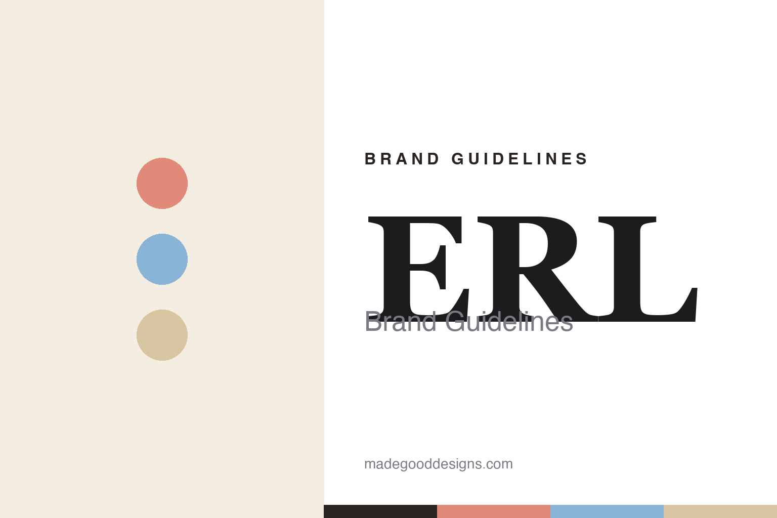
ERL Brand Guidelines
California nostalgia.
Aa
Two constants: a sun-bleached palette and a romantic serif register. Abstract homage — not the ERL wordmark or logo.
California nostalgia
ERL bottles a sun-bleached Venice Beach.
ERL is a lesson in place and nostalgia as a design language. Founded around 2018 by Eli Russell Linnetz (with a formal ready-to-wear launch by 2020) in Venice Beach, California, the independent label — named for the founder’s initials — filters West Coast skate and surf culture through a romantic, cinematic lens.
Its brand identity is nostalgic, sun-bleached and Americana — faded pastels, boyish SoCal silhouettes, and “straightforward, sensual interpretations of American classics.” Linnetz, a USC-trained filmmaker, brings a director’s eye (he directed Kanye West’s “Fade” and creative-directed Lady Gaga’s Enigma residency).
(Honest notes: everything creative is run in-house by Linnetz; early support came from Comme des Garçons (support, not ownership). Sources give 2018 (brand) and 2020 (RTW launch), so we hedge the year. It won the Karl Lagerfeld Prize at the 2022 LVMH Prize. And there’s no official brand hex, so the tones here are an unofficial interpretation.)
Colour
ERL lives in a sun-bleached palette. Click a swatch to copy the hex.
ERL’s identity is faded, warm and nostalgic — a faded coral, a washed sky, a sand, an ink, and a cream. The palette leans on sun-bleached pastels — faded coral, washed sky blue and sand — the register of a Venice Beach afternoon and a washed vintage tee. It signals nostalgia, warmth and Californian ease rather than sharp contrast. The honest caveat: with no published brand hex, these tones are an original, unofficial interpretation, not first-party values.
The lesson is sun-bleached pastels signal Californian nostalgia. ERL’s world is a faded SoCal photograph. For designers, it is a reminder that washed pastels — faded coral, washed sky, sand — read as nostalgic and warm, right for a brand that romances West Coast Americana. The takeaways: use sun-bleached pastels; keep contrast soft; and treat any single hex as unofficial — using ink for small text so the pastels stay soft.
Typography
The register is a romantic serif — cinematic and warm.
ERL’s identity carries a romantic, cinematic, nostalgic spirit — sun-bleached Americana and a director’s eye. A romantic high-contrast serif captures the mood: it is elegant and filmic, the register of a vintage poster and an old title card. Set in sun-bleached tones, the serif feels cinematic and warm — exactly the personality ERL carries. It is romantic rather than harsh, mirroring a faded photograph. (ERL’s real wordmark and logo are trademarks we describe but do not reproduce, and the exact brand typeface is not ours to use.) Because the mark is not ours to use, the honest description is “a romantic serif spirit,” shown here in a stand-in. The type behaves like the brand: romantic, cinematic and nostalgic.
Aa
A romantic serif spirit — cinematic and warm. (Specimen set in Bodoni Moda, a romantic serif STAND-IN; NOT the ERL wordmark or logo, which are trademarks.)
Nostalgia as identity
ERL stands for Californian nostalgia.
ERL is a lesson in making nostalgia the identity. A sun-bleached palette, romantic Americana and a filmmaker’s storytelling make Californian nostalgia the whole brand — faded, warm, cinematic. The nostalgia is the differentiator. The differentiator is a nostalgic, sun-bleached, storytelling identity.
For designers and brand-builders, ERL offers a clear takeaway: a place and a feeling can be a brand. The lessons: root the brand in a specific place (Venice Beach); use a soft, sun-bleached palette; and let storytelling lead (film, photography). It is also a reminder to stay accurate: name Venice specifically, hedge the founding year (2018 brand / 2020 RTW), note the Karl Lagerfeld Prize, and treat the palette as an unofficial interpretation. ERL made nostalgia the brand — proof that a feeling can be the difference.
Explore & save
Keep ERL’s identity on hand — save it to a board in the Made Good inspiration library.
ERL identity set
Pin the sun-bleached palette and the romantic-serif register to your own board.


