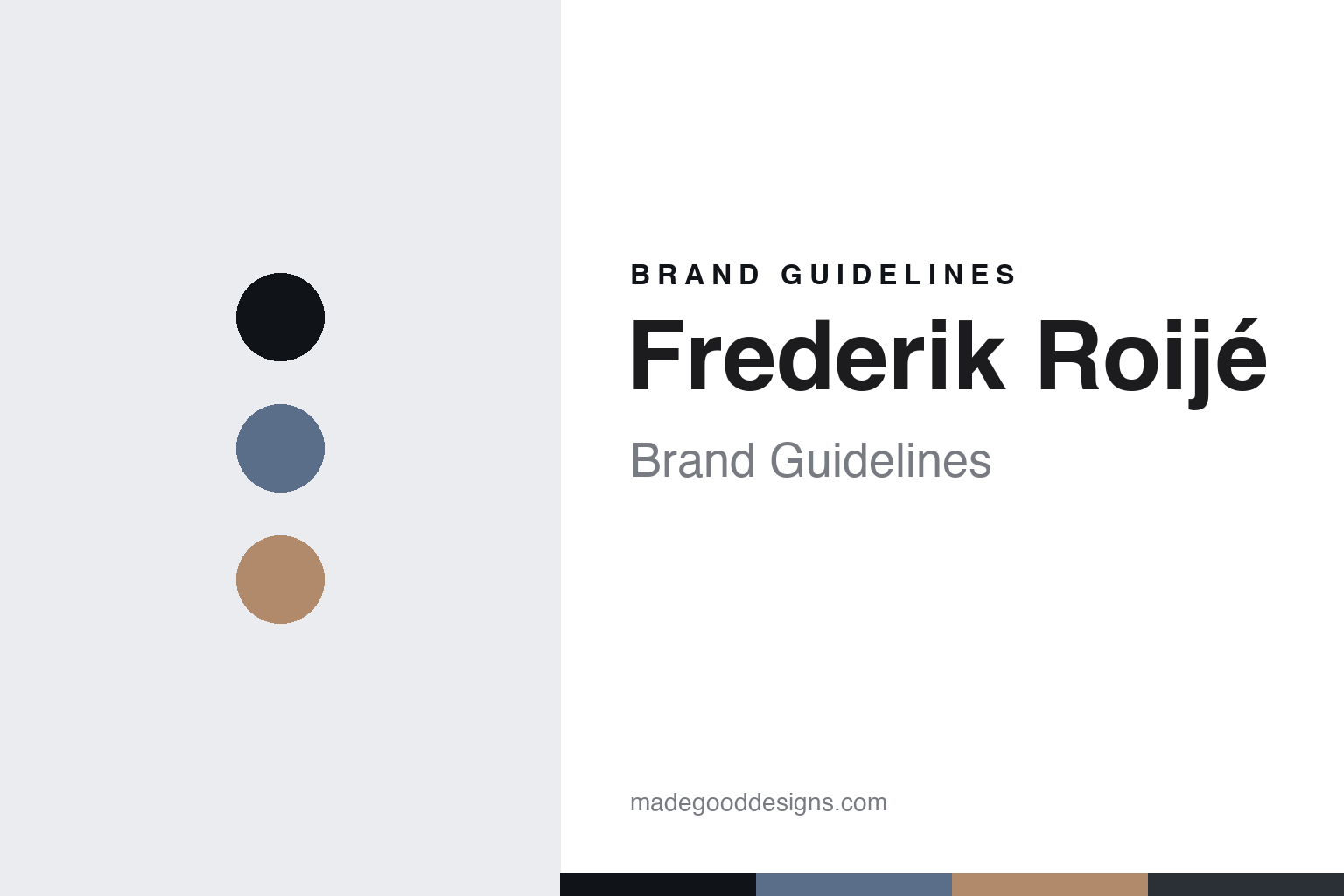
Frederik Roijé Brand Guidelines
The poetic light.
Aa
Two constants: a soft-blue-and-clay palette and a poetic sans register. Abstract homage — not a Frederik Roijé piece or wordmark.
The poetic light
Frederik Roijé makes poetic, minimal Dutch design — with lighting at its heart.
Frederik Roijé is a lesson in a poetic point of view as the identity. A Dutch studio in Amsterdam, it makes minimal, narrative design across furniture, objects and lighting — quiet pieces with a story, made in the Netherlands.
Its identity is the poetic light. Roijé’s minimal lighting — the Lampscapes, the cityscape-silhouette Skylight, the Sliced Sphere — is a central part of the work it is known for. Design, with a poem in it. Light, made thoughtful.
(Honest notes: Frederik Roijé is a Dutch design studio in Amsterdam, led by Frederik Roijé, born in 1978, a Design Academy Eindhoven graduate who trained under Piero Lissoni and Marcel Wanders. It was founded in 2002, not 2007. Its signature is poetic, minimal, narrative Dutch design across furniture, objects and lighting — so lighting is a core pillar rather than the whole output — with lighting models including the Lampscapes, the Skylight series (steel cityscape silhouettes), the Cellight and the Sliced Sphere; note that “Shade of Light,” “Prop Light” and “Breeding Table” are misattributions we don’t use, the Prop Light in fact being a Bertjan Pot design for Moooi. On the making, it is designed and made in the Netherlands “by the best craftsmen” — that is, through skilled partner makers rather than a single named in-house workshop, so we say made in the Netherlands without claiming an own factory. It is independent and founder-led. Its model names are IP we describe but don’t reproduce, and there’s no official brand hex, so these tones are an unofficial interpretation. This is design commentary and does not promote any product.)
Colour
Frederik Roijé lives in a soft-blue-and-clay palette. Click a swatch to copy the hex.
Frederik Roijé’s identity is poetic, minimal and Dutch — a soft blue, an ink, a clay, a graphite, and a mist. The palette leans soft blue and clay — the register of quiet, considered Dutch design. It signals thought and craft rather than novelty. The honest caveat: with no published brand hex, these tones are an original, unofficial interpretation, not first-party values.
The lesson is a soft-blue-and-clay palette signals poetic minimal design. Frederik Roijé’s world is a poetic, minimal, Dutch object. For designers, it is a reminder that a point of view — quiet, narrative, thoughtful — can be the whole identity, and that a soft, considered palette signals that poetry. Because a mid soft blue can fail as small text, keep type dark and let the colour live in the accents, palette and band. The takeaways: design with a story; keep it minimal; make it locally; and treat any single hex as unofficial.
Typography
The register is a poetic sans — quiet, minimal, thoughtful.
Frederik Roijé’s identity carries a quiet, minimal, thoughtful spirit — a poetic, considered object. A soft, humanist sans captures the mood: it is gentle and clear, the register of narrative minimalism. Set in a soft-blue-and-clay palette, the poetic sans feels quiet and minimal — exactly the personality Frederik Roijé carries. It is thoughtful rather than loud, mirroring a minimal light. (Frederik Roijé’s real pieces, model names and wordmark are works we describe but do not reproduce, and the exact typeface is not ours to use.) Because it is not ours to use, the honest description is “a poetic sans spirit,” shown here in a stand-in. The type behaves like the brand: quiet, minimal and thoughtful.
Aa
A poetic sans spirit — quiet and minimal. (Specimen set in Figtree, a soft humanist sans STAND-IN; NOT the Frederik Roijé wordmark.)
A poetic point of view as identity
Frederik Roijé stands for the poetic light.
Frederik Roijé is a lesson in making a poetic point of view the identity. A soft-blue-and-clay palette, a poetic sans and a minimal light make a narrative sensibility the whole brand — quiet, minimal, thoughtful. The point of view is the differentiator. The differentiator is a sensibility: design with a story and a stillness, so a simple lamp carries an idea.
Put to work, the identity is a point of view as design. A studio building in this spirit would let a narrative sensibility run through everything — furniture, objects and lighting alike — keep the forms minimal, and make locally with skilled hands, so the work feels considered rather than styled. The lesson Frederik Roijé teaches is that a poetic point of view plus real craft can build a brand: a consistent sensibility, minimal forms, and Dutch making give it an identity a trend-driven label can’t. The point of view is the personality, and the craft is the substance.
For designers and brand-builders, Frederik Roijé offers a clear takeaway: let a point of view carry the object. The lessons: design with a story; keep it minimal; make it locally; and be honest about the story. It is also a reminder to stay accurate: the studio was founded in 2002, not 2007, and lighting is a core pillar within a multi-category practice, not the whole of it; it is made in the Netherlands through skilled partner makers rather than a single named factory — the palette here is an unofficial interpretation. Frederik Roijé made the poetic light a signature — proof that a point of view can be the difference.
Explore & save
Keep Frederik Roijé’s identity on hand — save it to a board in the Made Good inspiration library.
Frederik Roijé identity set
Pin the soft-blue-and-clay palette and the poetic-sans register to your own board.


