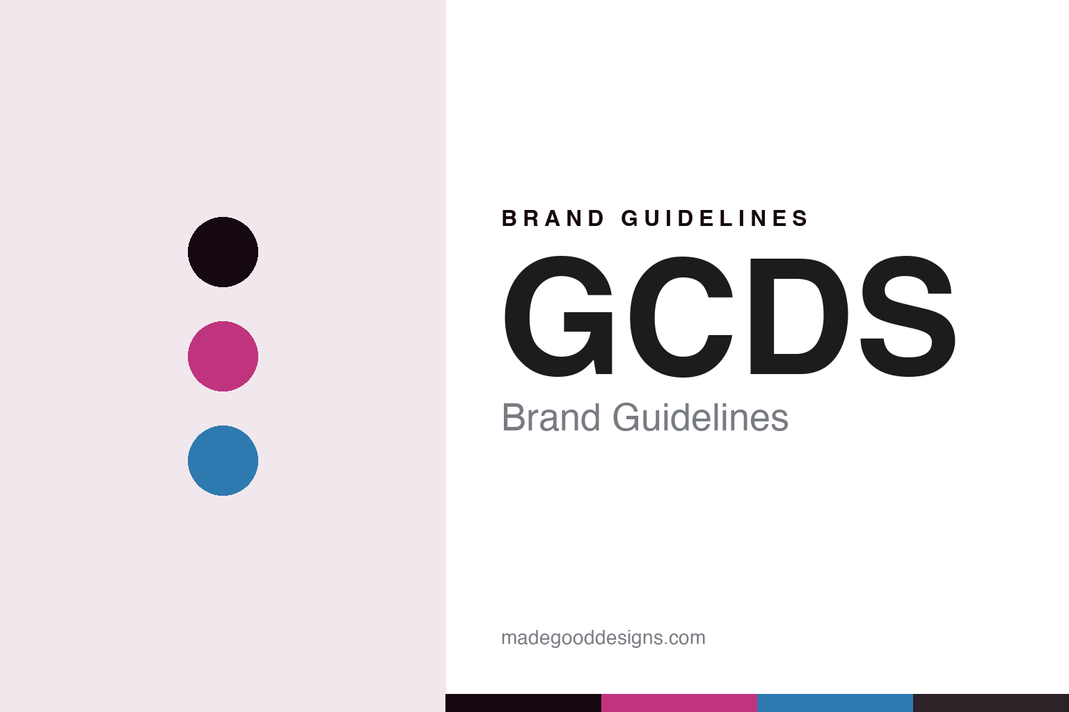
GCDS Brand Guidelines
Logomania as a pop engine.
Aa
Two constants: a magenta-and-electric-blue palette and a loud display register. Abstract homage — not a GCDS piece, character or wordmark.
Logomania as a pop engine
GCDS turns a bold wordmark and pop-culture energy into a Milanese club aesthetic.
GCDS is a lesson in the logo itself as the identity. An Italian label from Milan, it built its whole aesthetic on logomania — a bold wordmark repeated across technicolor, club-and-rave clothing — powered by a relentless stream of pop-culture collaborations.
Its identity is logomania as a pop engine. GCDS’ nightlife palette, body-conscious cuts and cartoon-character energy, all anchored to its own repeated name, are the work it is known for. A logo, made loud. A brand that runs on pop.
(Honest notes, because the catchy version is only half true. GCDS is an Italian brand based in Milan, founded in 2015 by brothers Giuliano Calza (creative director) and Giordano Calza (CEO). The name is widely promoted with the backronym “God Can’t Destroy Streetwear,” but the initials actually derive from the founder’s own name, Giuliano Calza Design Studio — so we present the religious phrase as the brand’s playful slogan, not the literal sole origin. Its signature is logomania, a club, rave and nightlife aesthetic, technicolor palettes and body-con silhouettes, plus heavy licensed character collaborations. On ownership, the important point: it is not independent — since November 2020 a majority stake has been held by the Made in Italy Fund, managed by Quadrivio Group, with the Calza brothers retaining a minority and running the brand day to day. On production, its early logo pieces were made in China and the brand now positions itself as Italian-made, so we describe that shift rather than claiming that everything, in every category, is made in Italy. Its wordmark, and the many licensed characters it has worked with — among them Hello Kitty and Sanrio, Pokémon, One Piece, Bratz, Betty Boop, Care Bears and Chucky — are third-party IP we describe but never reproduce, and there is no official brand hex — these tones are an unofficial interpretation. This is design commentary and does not promote any product.)
Colour
GCDS lives in a magenta-and-electric-blue palette. Click a swatch to copy the hex.
GCDS’ identity is loud, technicolor and nocturnal — a magenta, an ink, an electric blue, a graphite, and a blush. The palette leans magenta and electric blue: the register of a club floor and a neon sign. It signals pop energy and nightlife rather than restraint. The honest caveat: with no published brand hex, these tones are an original, unofficial interpretation, not first-party values.
The lesson is a magenta-and-electric-blue palette signals a pop engine. GCDS’ world is a loud, nocturnal, high-energy object. For designers, it is a reminder that a saturated, clashing palette can carry a whole aesthetic — that a brand built on the logo and the collaboration needs colour that reads at club volume. Because a bright magenta can fail as small text, keep type dark and let the loud hues live in the accents, palette and band. The takeaways: commit to the logo; let the colour shout; keep the pop energy flowing; and treat any single hex as unofficial.
Typography
The register is a loud display — bold, technicolor, nocturnal.
GCDS’ identity carries a bold, technicolor, nocturnal spirit — a logo-first, high-volume object. A loud display type captures the mood: heavy, confident and graphic, the register of a wordmark meant to be worn at scale. Set in a magenta-and-electric-blue palette, the loud display feels electric and pop — exactly the personality GCDS carries. It is maximal rather than quiet, mirroring a repeated logo across a technicolor knit. (GCDS’ real garments, wordmark and licensed characters are things we describe but do not reproduce, and the exact typeface is not ours to use.) Because it is not ours to use, the honest description is “a loud-display spirit,” shown here in a stand-in. The type behaves like the brand: bold, technicolor and nocturnal.
Aa
A loud-display spirit — bold and technicolor. (Specimen set in Archivo, a loud-display STAND-IN; NOT the GCDS wordmark or any licensed character.)
The logo as identity
GCDS stands for logomania as a pop engine.
GCDS is a lesson in making the logo the identity. A magenta-and-electric-blue palette, a loud display and a repeated wordmark make logomania the whole brand — bold, technicolor and nocturnal. The pop engine is the differentiator. The differentiator is total commitment to the name and the collaboration: a logo worn at scale, refreshed constantly by pop-culture tie-ins, so the brand always feels current and loud.
Put to work, the identity is energy as design. A house building in this spirit would treat its own logo as the hero graphic, then keep it alive with a steady rhythm of collaborations and colour, so the customer buys into a mood — nightlife, pop, now — as much as a garment. The lesson GCDS teaches is that a confident logo plus a genuine pop-culture engine can build a brand fast: the wordmark gives instant recognition, and the collaborations keep it from going stale. The logo is the personality, and the pop energy is the fuel.
For designers and brand-builders, GCDS offers a clear takeaway: make the logo do the work. The lessons: commit to one bold mark; feed it with collaboration and colour; keep the volume high; and be honest about the story. It is also a reminder to stay accurate: GCDS was founded in 2015 in Milan, its name derives from Giuliano Calza’s initials with “God Can’t Destroy Streetwear” as a playful backronym, it has been majority-owned by the Made in Italy Fund since 2020 rather than being independent, and its production shifted from China toward an Italian-made positioning rather than being wholly Italian in every category — the palette here is an unofficial interpretation, and its licensed characters are described but never reproduced. GCDS made the logo the engine — proof that a mark plus pop can be the difference.
Explore & save
Keep GCDS’s identity on hand — save it to a board in the Made Good inspiration library.
GCDS identity set
Pin the magenta-and-electric-blue palette and the loud-display register to your own board.


