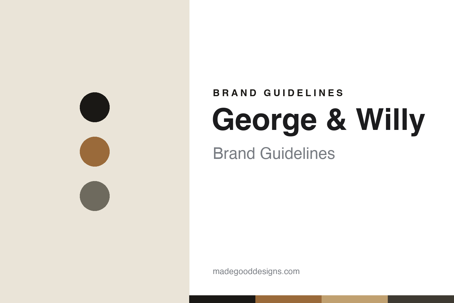
George & Willy Brand Guidelines
The Studio Roller.
Aa
Two constants: a kraft-and-plywood palette and a functional grotesk register. Abstract homage — not the George & Willy roller or wordmark.
The Studio Roller
George & Willy started with a wall-mounted roll of paper.
George & Willy is a lesson in functional workspace design as the identity. A New Zealand studio founded in the mid-2010s, it made its name with a wall-mounted kraft-paper roller for the desk.
Its identity is the Studio Roller. George & Willy’s Studio Roller — a powder-coated bracket holding a roll of kraft paper — is the object it is known for, alongside a modular wooden pegboard for organizing a workspace. A blank page you pull down. Organization as a warm, functional object.
(Honest notes: George & Willy is a New Zealand functional-design studio based in Mount Maunganui, in the Bay of Plenty, with a US fulfillment arm. It was founded in the mid-2010s — around 2015–2016, an approximate window we don’t pin to an exact year — by George Wilkins and Will (“Willy”) McCallum, childhood friends and business partners, not brothers, who studied commerce together in Otago and drifted into design via a university woodshop. Its signature is the Studio Roller, a wall-mounted kraft-paper roller that became its most-photographed piece, alongside a modular birch-plywood Wooden Pegboard (we drop the unverified name “Depto”). Its wider catalogue leans toward café and retail signage and display furniture, so we frame it as a functional-design and workspace-organization studio rather than a pure desk-tools brand. On production, it is made in New Zealand in the founders’ studio and flat-packed for shipping (US orders ship from US warehouses, but manufacture is described as NZ). It is independent and founder-led. There’s no official brand hex — these tones are an unofficial interpretation. This is design commentary and does not promote any product.)
Colour
George & Willy lives in a kraft-and-plywood palette. Click a swatch to copy the hex.
George & Willy’s identity is functional, warm and natural — a kraft, an ink, a plywood, a slate, and a paper. The palette leans kraft and plywood — the register of birch ply, kraft paper and black powder-coat. It signals utility and warmth rather than novelty. The honest caveat: with no published brand hex, these tones are an original, unofficial interpretation, not first-party values.
The lesson is a kraft-and-plywood palette signals functional design. George & Willy’s world is a warm, functional, natural object. For designers, it is a reminder that workspace organization can be designed with warmth — plywood, kraft, black steel — and that a natural, utilitarian palette signals that spirit. Because a kraft tone can fail as small text, keep type dark and let the colour live in the accents, palette and band. The takeaways: design the workspace; keep it warm; keep it functional; and treat any single hex as unofficial.
Typography
The register is a functional grotesk — clean, sturdy, warm.
George & Willy’s identity carries a clean, sturdy, warm spirit — a functional, natural object. A workhorse grotesque sans captures the mood: it is honest and contemporary, the register of functional design. Set in a kraft-and-plywood palette, the functional grotesk feels clean and sturdy — exactly the personality George & Willy carries. It is warm rather than clinical, mirroring plywood and kraft. (George & Willy’s real roller and wordmark are works we describe but do not reproduce, and the exact typeface is not ours to use.) Because it is not ours to use, the honest description is “a functional grotesk spirit,” shown here in a stand-in. The type behaves like the brand: clean, sturdy and warm.
Aa
A functional grotesk spirit — clean and sturdy. (Specimen set in Hanken Grotesk, a workhorse grotesque sans STAND-IN; NOT the George & Willy wordmark.)
Functional workspace design as identity
George & Willy stands for the Studio Roller.
George & Willy is a lesson in designing the workspace warmly. A kraft-and-plywood palette, a functional grotesk and a paper roller make functional workspace design the whole brand — clean, warm, natural. The warmth is the differentiator. The differentiator is treating workspace organization — a paper roll, a pegboard — as warm, natural objects rather than office supplies.
Put to work, the identity is utility made warm. A designer building in this spirit would take the functional bones of a workspace and render them in honest, warm materials, so a paper dispenser or a pegboard feels like furniture rather than equipment. The lesson George & Willy teaches is that a functional object can be a brand: a wall-mounted paper roller, well made in plywood and steel, became a recognisable signature, and a warm, functional design language keeps that utility consistent across the range.
For designers and brand-builders, George & Willy offers a clear takeaway: make utility warm. The lessons: design the workspace; keep it warm; keep it functional; and be honest about the story. It is also a reminder to stay accurate — and to correct assumptions: George and Willy are friends and partners, not brothers, and the brand dates to the mid-2010s rather than an exact stated year — the palette here is an unofficial interpretation. And it is a reminder that made-where honesty can be a genuine boast: the pieces are made in New Zealand in the founders’ own studio, and that is worth stating plainly. It is a reminder, too, that scope should be framed honestly: the brand also makes café signage and display furniture, so we write about its workspace objects specifically. George & Willy made the Studio Roller the brand — proof that warm utility can be the difference.
Explore & save
Keep George & Willy’s identity on hand — save it to a board in the Made Good inspiration library.
George & Willy identity set
Pin the kraft-and-plywood palette and the functional-grotesk register to your own board.


