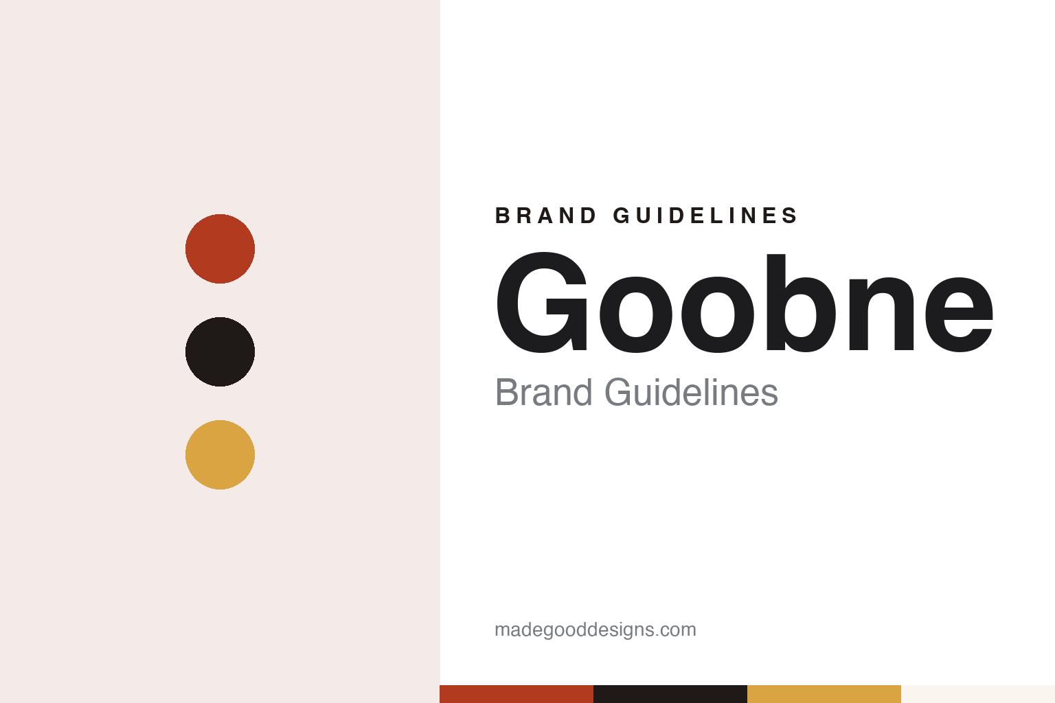
Goobne Brand Guidelines
The South Korean chicken chain that roasts instead of frying.
Aa
Two constants: an ember red, charcoal and crust gold palette and a heavy grotesque sans register. Abstract homage — not a Goobne product or mark; no box, logo or character is reproduced.
The oven
A chicken chain built on roasting, not frying.
Goobne is a South Korean chicken chain built on one idea: chicken roasted in an oven rather than fried in oil. Korean Wikipedia dates the head office to March 2005 and says the business began that year as Goobne Chicken before growing into a wider restaurant company. The operating company took the name GN Food in January 2011; English-language press such as The Asia Business Daily spells it G&Food. Korean Wikipedia says the head office moved to Mokdong, in Seoul’s Yangcheon district, in June 2014.
The early entries in that history are about supply rather than shops. Korean Wikipedia lists a run of regional logistics centres from 2006 onward, in places including Daegu, Yuseong, Gwangju, Gasan, Jeongeup and Yongin, a production plant at Jeongeup in April 2009, and a separate logistics company set up in August 2009. Later entries add training academies for franchisees in Gyeryong, Yongin, Gimhae and Gwangju between 2016 and 2018. Read together, they describe a franchise system building its own back office as the store count grew.
The company’s own history page puts the domestic network at 1,130 franchise stores and says the 1,000th store, in Gamjeong-dong in Gimpo, west of Seoul, opened in November 2017. It calls Goobne an “oven cooking brand” and sums up its values in the motto “Always H.O.T.” Those are the company’s words. The documented core is plainer: a chain that roasts rather than fries, runs through franchisees and keeps its head office in Seoul.
Colour
Named sauces, chi-bap and pizza from the same oven.
Goobne’s menu is organised around named sauces and coatings. The company says Gochu Basasak, launched in 2013, adds Korean Cheongyang chilli to the surface of the chicken for heat and crunch, and that it picked up the nickname “one-second chicken” because one was sold every second, a figure that is the company’s own. Volcano, from 2015, uses a gochujang-based sauce, and Galbi Cheonwang, from 2016, borrows the flavours of Korean grilled short ribs. Both come with an extra sauce meant to be mixed into rice, a habit known in Korea as chi-bap, which the company has made part of the brand.
The oven also carried the name into other dishes. Goobne says it launched Goobne Pizza in May 2019, turning three of its chicken sauces into pizza flavours, and a Chicago-style deep-dish pizza that December; its brand-guide page lists egg tarts and baguette balls among the sides. In 2022, the company says, it launched Namhae Garlic Basasak with garlic from Namhae County on the south coast as part of a local partnership, and in 2025 it added a roasted chicken-leg dish, Jangak-gui, with the martial artist Choo Sung-hoon as its advertising face.
Abroad, Goobne has grown through partners. Korean Wikipedia dates its first Hong Kong shop, in Tsim Sha Tsui, to November 2014, followed by Japan in December 2016 at Shin-Okubo in Tokyo, Macau in April 2017, Jakarta in March 2018, Kuala Lumpur in September 2018 and Ho Chi Minh City in November 2018. RetailNews Asia reported on 27 September 2018 that the Malaysian shop, its first in the country, had opened under a franchise agreement with a local partner on the fourth floor of the My Town shopping centre, with 64 seats, and that Goobne then ran 12 outlets outside Korea.
The United States came later. In February 2025 The Asia Business Daily reported that Goobne had opened a fourth shop in the Los Angeles area, in Artesia, after Torrance, Fullerton and Koreatown, with Soy Garlic, Gochu Basasak and Original as its main oven dishes. The same report gave the overseas network as 30 stores in 10 countries and said the company was looking for partners in further markets.
Typography
The category.
Korean fried-chicken and hot-pot chains tend to present themselves through what happens to the food, not through a mascot. A chicken chain’s company pages will often explain a sauce before they explain a logo: a soy-and-garlic glaze, a chilli version, a honey version, each with its own year of launch and its own name on the menu. Kyochon, for example, describes sauce brushed on piece by piece and has carried the brush into its wordmark; bb.q points to a training centre it calls Chicken University. Hot-pot chains put the pot itself at the centre of the table, so the broth, the burner and the plates of raw ingredients around it become part of how the brand is seen.
Shop interiors and menus are where these identities become consistent. As franchise networks grew into the hundreds and then the thousands, the companies describe bringing in uniform interiors, standard menu boards and set colour schemes; Kyochon, for one, dates uniform shop interiors and orange-based menu boards to 1999, the year it passed 100 shops. Delivery boxes, sauce packs and takeout bags carry the same marks, and some chains have built whole shop formats around delivery and takeout.
Names are usually plain. Menus are organised by sauce or cooking method, and side brands are given short, descriptive names of their own; several groups now run cafés, bars or noodle formats under separate names alongside the main chain. Some write their names in Korean characters, some in Latin letters, and some with punctuation or a founding year built into the mark.
Corporate pages fill in the rest: who founded the company and when, which group owns it, where it is listed, and how many shops and countries it reports. Those figures come from the companies, and dated press reports are the way to check them. This guide reads each brand through those pages and through independent reporting, and treats colour and type as an interpretation, not a copy.
Aa
A heavy grotesque sans for a brand that talks in slogans. (Specimen set in Archivo, a sans STAND-IN; NOT the Goobne logo.)
Goobne
Characters, a slogan and a four-storey brand space.
Goobne’s marketing leans on characters and slogans. The company says that in 2022 it built a campaign around a general called Guulleong, who in the story defeats a frying rival called Twigilleong under lines such as “there is nothing impossible in my oven,” and that the advertisement took a silver prize in the TV category of that year’s Korea Advertising Awards. It then widened the story into what it calls the “Basasak Universe,” with three characters made in collaboration with Mobills Group, known for its Mobetterworks label, and a slogan in English capitals: “NO FRY MORE CRISPY.” Its Instagram account is called the Goobster, and the company calls its followers Goobstars.
The clearest piece of brand design is a building. Goobne Playtown stands in Hongdae, the university district of Seoul’s Mapo district, and the company describes it as its flagship. The business daily Bridge Economy visited on 16 September 2026 and described a four-storey building that looks more like a playground than a chicken shop. It reported that Playtown had once sold Goobne’s menu but now concentrates on brand content: a café, a photo area and a kitchen for oven classes on the ground floor, a board-game room on the second, media art and photo spaces on the third, and a free gallery for young artists and students on the fourth, run under agreements with Hongik and Kookmin universities. Outside, a large mural was painted by a local Hongdae group.
At that visit the class was making a new dish, a chicken with spring-onion oil and rice cakes developed with the chef Woo Jeong-wook, roasted twice in the oven and tossed in sauce. A company representative told the paper that the space was meant for people to take part rather than simply to buy, and that the classes drew many families with children.
For a design guide, Goobne shows how a cooking method can carry a whole identity, from dish names and slogans to a building. Compare Kyochon, another Korean chicken franchise, and Nene Chicken, which built its name on boxed delivery. For this guide we use an ember red, a charcoal and a crust gold with a sans, an unofficial interpretation; no product or logo is reproduced.
Explore & save
Keep Goobne’s identity on hand — save it to a board in the Made Good inspiration library.
Goobne identity set
Pin the Goobne ember red, charcoal and crust gold palette and the heavy grotesque sans register to your own board.