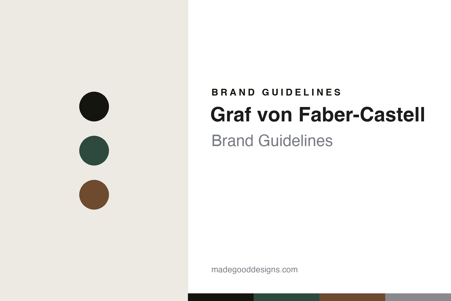
Graf von Faber-Castell Brand Guidelines
Quiet luxury.
Aa
Two constants: a green-and-platinum palette and an understated sans register. Abstract homage — not the Graf von Faber-Castell pen or packaging.
Quiet luxury
Graf von Faber-Castell makes understated luxury from precious materials.
Graf von Faber-Castell is a lesson in restraint as identity. It is the luxury writing-instrument line of Faber-Castell — the German company founded in 1761 in Stein and family-owned across eight generations — with the premium “Graf” line launched later (reported around 1993).
Its identity is understated German luxury built on precious materials and craftsmanship: the brand is known for fluted, platinum-plated barrels, a Classic line in precious woods, guilloché metalwork and a spring-loaded clip — refinement rather than flash. Its showpiece is the annual “Pen of the Year” limited edition, each built around a historical theme and exotic materials (recent years have drawn on Ottoman culture, ancient Egypt, the Aztecs and medieval knights). Its lines include Classic, Guilloche, Tamitio, the Perfect Pencil and a Bentley collaboration, all under Faber-Castell’s two-jousting-knights crest.
(Honest notes: keep the 1761 parent distinct from the ~1993 luxury line (the launch date is reported). Mainstream Faber-Castell — the art pencils — is a different brand from this luxury line. The precious-wood species, platinum plating and sprung clip are widely documented hallmarks, presented here as “known for.” There’s no official brand hex, so these tones are an unofficial interpretation. This is design commentary and does not promote any product.)
Colour
Graf von Faber-Castell lives in a green-and-platinum palette. Click a swatch to copy the hex.
Graf von Faber-Castell’s identity is understated, precious and German — a deep green, an ink, a wood brown, a platinum, and a cream. The palette pairs a deep green with a platinum — the register of dark wood and precious metal. It signals restraint and quality rather than flash. The honest caveat: with no published brand hex, these tones are an original, unofficial interpretation, not first-party values.
The lesson is a deep green with a platinum signals a quiet-luxury brand. Graf von Faber-Castell’s world is a dark-wood barrel with precious-metal trim. For designers, it is a reminder that a deep, material palette reads as understated and expensive — right for a house built on precious materials. The takeaways: source the palette from the materials (wood, platinum); keep it understated; make one showpiece (a Pen of the Year); and treat any single hex as unofficial.
Typography
The register is an understated sans — restrained, precise, German.
Graf von Faber-Castell’s identity carries a restrained, precise, German spirit — precious materials and quiet craft. An understated geometric sans captures the mood: it is clean and precise, the register of German restraint. Set in a green-and-platinum palette, the understated sans feels restrained and precise — exactly the personality the brand carries. It is quiet rather than loud, mirroring understated luxury. (Graf von Faber-Castell’s real pens and jousting-knights crest are works we describe but do not reproduce, and the exact typeface is not ours to use.) Because it is not ours to use, the honest description is “an understated sans spirit,” shown here in a stand-in. The type behaves like the brand: restrained, precise and German.
Aa
An understated sans spirit — restrained and precise. (Specimen set in Jost, a clean geometric sans STAND-IN; NOT the Graf von Faber-Castell packaging.)
Restraint as identity
Graf von Faber-Castell stands for quiet luxury.
Graf von Faber-Castell is a lesson in making restraint the identity. A green-and-platinum palette, an understated sans and precious materials make quiet luxury the whole brand — restrained, precise, German. The restraint is the differentiator. The differentiator is a precious-materials, understated identity.
For designers and brand-builders, it offers a clear takeaway: let materials and craft speak, quietly. The lessons: build on precious materials (woods, platinum); keep the design restrained; make one annual showpiece (Pen of the Year); and be honest about the heritage. It is also a reminder to stay accurate: the 1761 parent and the ~1993 luxury line are distinct, mainstream Faber-Castell is a different brand, and the palette here is an unofficial interpretation. Graf von Faber-Castell made restraint the brand — proof that quiet luxury can be the difference.
Explore & save
Keep Graf von Faber-Castell’s identity on hand — save it to a board in the Made Good inspiration library.
Graf von Faber-Castell identity set
Pin the green-and-platinum palette and the understated-sans register to your own board.


