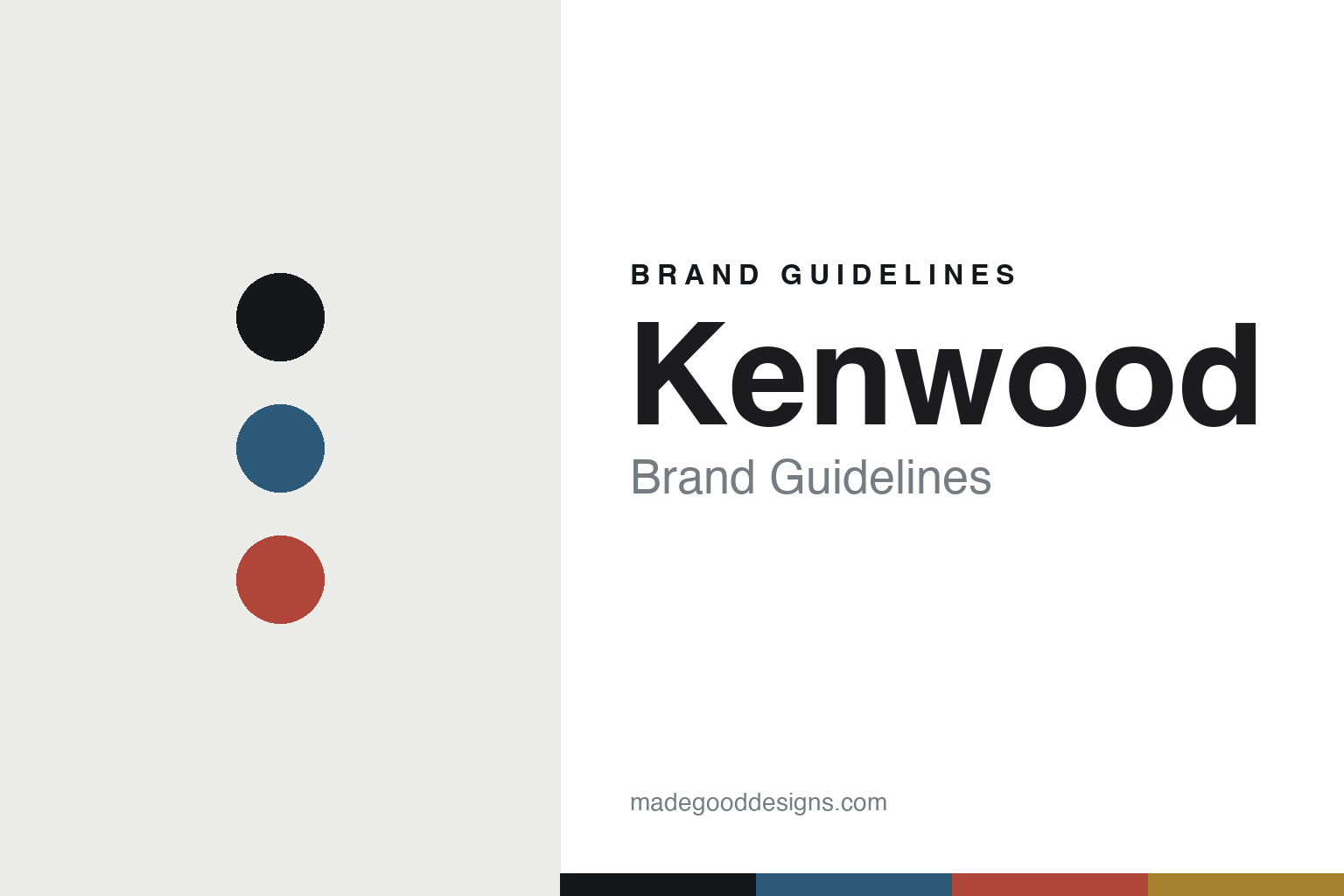
Kenwood Brand Guidelines
The stand mixer.
Aa
Two constants: a heritage-warm palette and a heritage sans register. Abstract homage — not the Kenwood Chef or wordmark.
The stand mixer
Kenwood built its name on one British kitchen icon.
Kenwood is a lesson in a signature machine as the identity. Founded in 1947 in Woking by engineer Kenneth Wood, it built its name on the Kenwood Chef — a stand mixer that became a British kitchen icon.
Its identity is the stand mixer. Kenwood makes the Chef “kitchen machine,” alongside food processors, blenders and hand mixers, but the stand mixer is the object it is known for. A British kitchen classic. A machine that sits on the counter for a generation.
(Honest notes: Kenwood was founded in 1947 in Woking, Surrey, by engineer Kenneth Wood — the name is a contraction of “Kenneth Wood.” Its first product was a toaster; the Kenwood Chef stand mixer launched at the 1950 Ideal Home Exhibition, its later design associated with Kenneth Grange. On production, it is largely offshore (China) today — Kenwood opened its first Chinese factory in 1989 — with British design heritage; its headquarters moved from Woking to Havant, Hampshire, in 1962, and the exact per-product manufacturing split is not disclosed, so we describe it generally. On ownership, the key fact: it is owned by the De’Longhi Group, which acquired Kenwood in 2001. One crucial disambiguation: this British kitchen-appliance Kenwood is entirely separate from Kenwood Corporation, the Japanese car- and home-audio brand (now part of JVCKenwood) — an unrelated company. There’s no official brand hex, and we reproduce no machine or logo — these tones are an unofficial interpretation. This is design commentary and does not promote any product.)
Colour
Kenwood lives in a heritage-warm palette. Click a swatch to copy the hex.
Kenwood’s identity is warm, classic and British — a heritage blue, an ink, a warm red, a gold, and a chalk. The palette leans heritage warm — the register of a trusted, long-lived kitchen machine. It signals dependability and history rather than novelty. The honest caveat: with no published brand hex, these tones are an original, unofficial interpretation, not first-party values.
The lesson is a heritage-warm palette signals a trusted kitchen classic. Kenwood’s world is a warm, familiar, dependable object. For designers, it is a reminder that a single iconic product can anchor a whole brand — that the Kenwood Chef carries the name across a broad range — and that warm, classic colour signals longevity. Because a heritage blue can fail as small text, keep type dark and let the colour live in the accents, palette and band. The takeaways: anchor on an icon; signal longevity; keep it warm; and treat any single hex as unofficial.
Typography
The register is a heritage sans — warm, dependable, classic.
Kenwood’s identity carries a warm, dependable, classic spirit — a trusted, familiar object. A humanist sans captures the mood: it is friendly and steady, the register of a British kitchen mainstay. Set in a heritage-warm palette, the heritage sans feels warm and dependable — exactly the personality Kenwood carries. It is classic rather than trend-driven, mirroring a machine kept for decades. (Kenwood’s real Chef and wordmark are works we describe but do not reproduce, and the exact typeface is not ours to use.) Because it is not ours to use, the honest description is “a heritage sans spirit,” shown here in a stand-in. The type behaves like the brand: warm, dependable and classic.
Aa
A heritage sans spirit — warm and dependable. (Specimen set in Mulish, a humanist sans STAND-IN; NOT the Kenwood wordmark.)
A signature machine as identity
Kenwood stands for the stand mixer.
Kenwood is a lesson in making one machine the identity. A heritage-warm palette, a heritage sans and an iconic mixer make the Kenwood Chef the whole brand — warm, classic, British. The icon is the differentiator. The differentiator is a single, recognisable machine that has carried the name for generations.
Put to work, the identity is an anchor product. A designer building in this spirit would invest in one hero object and let it define the brand, so a food processor or a hand mixer borrows credibility from the icon beside it. The lesson Kenwood teaches is that a signature product compounds trust: because the Chef stand mixer has been a fixture of British kitchens since 1950, the whole range inherits its reputation, and a warm, classic design language keeps that heritage current.
For designers and brand-builders, Kenwood offers a clear takeaway: build the brand around a hero object. The lessons: anchor on an icon; signal longevity; keep it warm; and be honest about the story. It is also a reminder to stay accurate: it was founded in 1947 by Kenneth Wood, the Chef launched in 1950, and — importantly — it has been owned by the De’Longhi Group since 2001 — the palette here is an unofficial interpretation. And it is a reminder that made-where honesty matters even for a heritage British name: describing production as largely offshore today, rather than implying it is still British-made, keeps the story trustworthy. It is a reminder, too, that names collide: this kitchen Kenwood is entirely separate from Kenwood the Japanese audio brand, and saying so plainly spares the reader a common confusion. Kenwood made the stand mixer the brand — proof that a signature machine can be the difference.
Explore & save
Keep Kenwood’s identity on hand — save it to a board in the Made Good inspiration library.
Kenwood identity set
Pin the heritage-warm palette and the heritage-sans register to your own board.