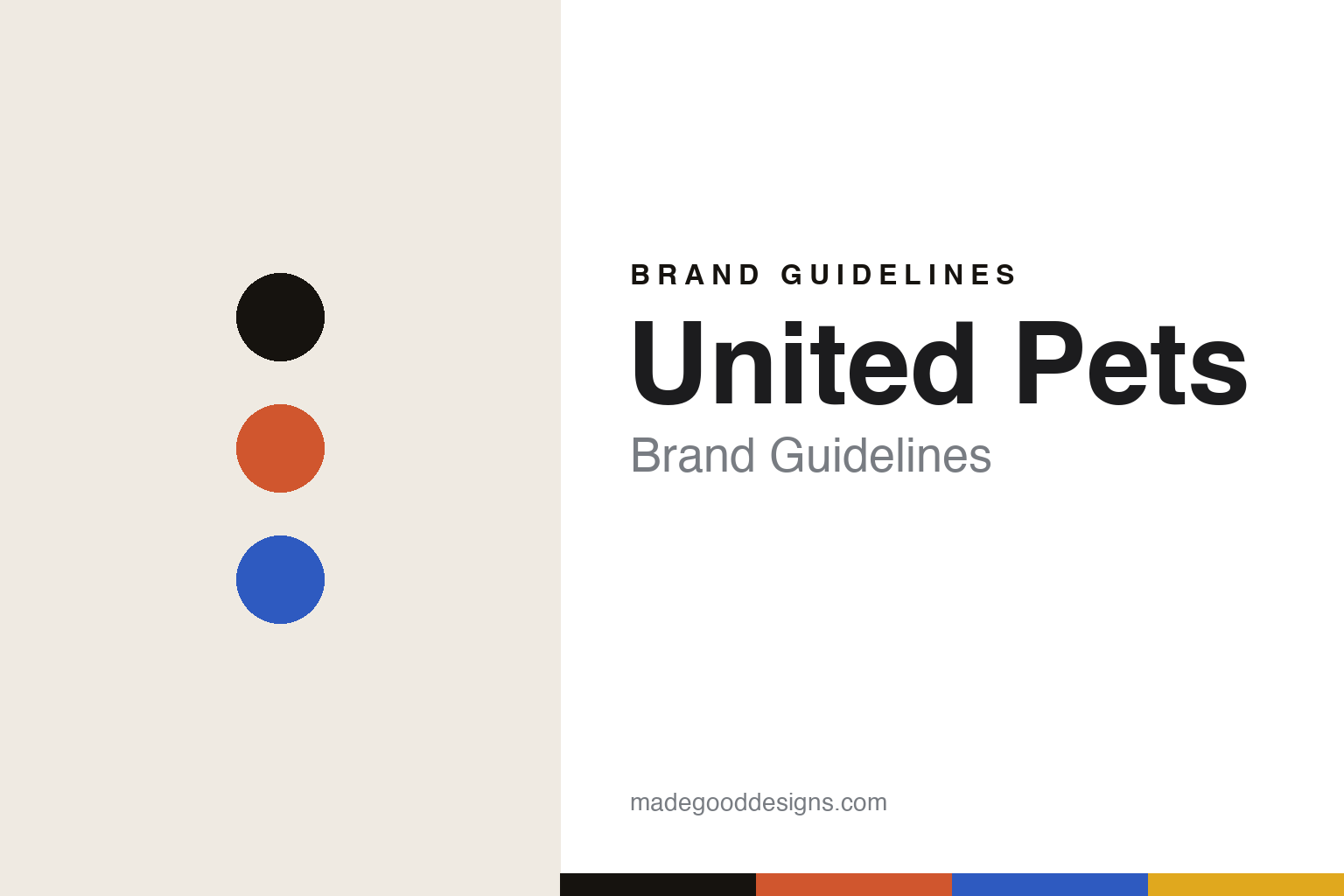
United Pets Brand Guidelines
The design bowl.
Aa
Two constants: a playful-Italian palette and a playful sans register. Abstract homage — not the United Pets bowls or wordmark.
The design bowl
United Pets gives the pet bowl Italian industrial design.
United Pets is a lesson in Italian industrial design as the identity. A Milan brand founded in 1999, it made its name giving the humble pet bowl real design — bright, playful and functional.
Its identity is the design bowl. United Pets’ “Pappy” and “Kitty” bowls are the objects it is known for — playful, colourful, Italian — alongside food containers, mats, beds and leads. A pet bowl as an industrial-design object. Colour and function, the Italian way.
(Honest notes: United Pets (United Pets Srl) is an Italian design pet-accessories brand founded in 1999 — not 1997 — in Milan by Cristina Rivolta and Costantino Psilogenis (reportedly inspired by their Dalmatian). Its signature is the design pet bowl — the polypropylene “Pappy” (dog) and “Kitty” (cat) bowls are iconic early products — in a bright, playful Italian industrial-design aesthetic, with pieces by designers such as Stefano Giovannoni and Giulio Iacchetti (with Ilaria Gibertini). On production, its core bowls are labelled “Made in Italy,” though we don’t assume the whole catalogue is Italian-made, so we keep the claim to the core range. On ownership, it is believed independent and founder-owned (Cristina Rivolta is listed as owner). One disambiguation: it is distinct from “United Petfood,” the Belgian pet-food group. There’s no official brand hex, and we reproduce no bowl or logo — these tones are an unofficial interpretation. This is design commentary and does not promote any product.)
Colour
United Pets lives in a playful-Italian palette. Click a swatch to copy the hex.
United Pets’ identity is bright, playful and Italian — an orange, an ink, a cobalt, a yellow, and a cream. The palette leans playful Italian — the register of colourful Italian industrial design. It signals fun and function rather than novelty. The honest caveat: with no published brand hex, these tones are an original, unofficial interpretation, not first-party values.
The lesson is a playful-Italian palette signals design-led accessories. United Pets’ world is a bright, functional object. For designers, it is a reminder that even the humblest category — the pet bowl — can be elevated by real industrial design and colour, and that a bright, playful palette (a foil to the muted pet-design norm) can be a position. Because an orange can fail as small text, keep type dark and let the colour live in the accents, palette and band. The takeaways: design the humble object; use colour; commission real designers; and treat any single hex as unofficial.
Typography
The register is a playful sans — bright, friendly, geometric.
United Pets’ identity carries a bright, friendly, geometric spirit — a colourful, functional object. A rounded geometric sans captures the mood: it is cheerful and modern, the register of playful industrial design. Set in a playful-Italian palette, the playful sans feels bright and friendly — exactly the personality United Pets carries. It is geometric rather than fussy, mirroring a well-designed everyday object. (United Pets’ real bowls and wordmark are works we describe but do not reproduce, and the exact typeface is not ours to use.) Because it is not ours to use, the honest description is “a playful sans spirit,” shown here in a stand-in. The type behaves like the brand: bright, friendly and geometric.
Aa
A playful sans spirit — bright and friendly. (Specimen set in Poppins, a rounded geometric sans STAND-IN; NOT the United Pets wordmark.)
Italian industrial design as identity
United Pets stands for the design bowl.
United Pets is a lesson in elevating the humblest object with design. A playful-Italian palette, a playful sans and a design bowl make Italian industrial design the whole brand — bright, playful, functional. The design is the differentiator. The differentiator is giving a pet bowl the same industrial-design attention as any Italian household object.
Put to work, the identity is design applied where it is rarely spent. A designer building in this spirit would take an overlooked, utilitarian object — the pet bowl — and commission real industrial designers to make it colourful and well-formed, so it stands out on a shelf full of plain plastic. The lesson United Pets teaches is that design can differentiate a commodity: bringing named Italian designers and bright colour to pet accessories turned a humble category into a design story, and a playful design language keeps that fun consistent.
For designers and brand-builders, United Pets offers a clear takeaway: spend design on the overlooked object. The lessons: design the humble object; use colour; commission real designers; and be honest about the story. It is also a reminder to stay accurate: it was founded in 1999 (not 1997) in Milan by Cristina Rivolta and Costantino Psilogenis, and its bowls carry work by designers like Giovannoni and Iacchetti — the palette here is an unofficial interpretation. And it is a reminder that made-where honesty needs precision: its core bowls are “Made in Italy,” but we keep that claim to the core range rather than the whole catalogue. It is a reminder, too, that a name can collide: United Pets is distinct from the Belgian “United Petfood,” and saying so plainly spares the reader a confusion. United Pets made the design bowl the brand — proof that design on the humble object can be the difference.
Explore & save
Keep United Pets’s identity on hand — save it to a board in the Made Good inspiration library.
United Pets identity set
Pin the playful-Italian palette and the playful-sans register to your own board.