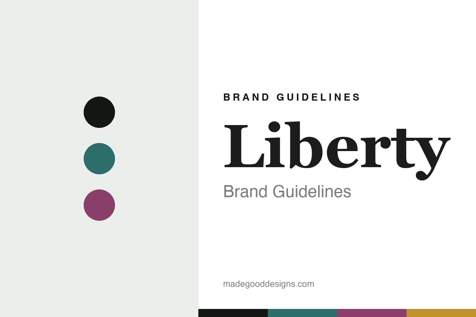
Liberty Brand Guidelines
The Liberty print.
Aa
Two constants: a peacock-and-plum palette and an Art Nouveau serif register. Abstract homage — not the Liberty prints, Tana Lawn or packaging.
The Liberty print
Liberty gave its name to a whole movement.
Liberty is a lesson in a print house that named a movement. Founded in 1875 by Arthur Lasenby Liberty on Regent Street, London, it became so bound up with Art Nouveau that in Italy the style itself is called Stile Liberty — “Liberty style.”
Its identity is the printed fabric. Through Liberty Fabrics, its textiles division, the house is renowned for its printed cottons and its Art Nouveau heritage — championing designers like Archibald Knox and, by the turn of the century, so esteemed as dress and furnishing material that the word “Liberty” came to stand for a whole aesthetic. A shop that became a style.
(Honest notes: Liberty was founded in 1875 on Regent Street; its famous mock-Tudor building came later, in 1924, on Great Marlborough Street. It’s an active department store, private-equity-owned (BlueGem, then a Glendower Capital consortium), with Liberty Fabrics as the textiles division. The “Stile Liberty” link is verified; but the Tana Lawn etymology (Lake Tana) and specific prints like Ianthe or Hera we treat as reported. Crucially, Strawberry Thief is William Morris (1883), not Liberty — a common confusion we avoid — and we don’t assert Liberty’s printing locations. There’s no official brand hex, and we reproduce no actual print — these tones are an unofficial interpretation. This is design commentary and does not promote any product.)
Colour
Liberty lives in a peacock-and-plum palette. Click a swatch to copy the hex.
Liberty’s identity is rich, decorative and British — a peacock, an ink, a plum, a gold, and a chalk. The palette pairs a peacock with a plum — the register of Art Nouveau prints. It signals ornament and heritage rather than novelty. The honest caveat: with no published brand hex, these tones are an original, unofficial interpretation, not first-party values.
The lesson is a peacock with a plum signals an Art Nouveau print house. Liberty’s world is a dense, decorative fabric. For designers, it is a reminder that a print sensibility, held for 150 years, can be so strong it names a style. Because a mid peacock can fail as small text, keep type dark and let the colour live in the accents, palette and band. The takeaways: own a print sensibility; hold an aesthetic; keep the archive; and treat any single hex as unofficial.
Typography
The register is an Art Nouveau serif — rich, decorative, British.
Liberty’s identity carries a rich, decorative, British spirit — an Art Nouveau print world. A high-contrast old-style serif captures the mood: it is elegant and ornamental, the register of the Aesthetic movement. Set in a peacock-and-plum palette, the Art Nouveau serif feels rich and decorative — exactly the personality Liberty carries. It is ornamental rather than plain, mirroring dense florals. (Liberty’s real prints, Tana Lawn and wordmark are works we describe but do not reproduce, and the exact typeface is not ours to use.) Because it is not ours to use, the honest description is “an Art Nouveau serif spirit,” shown here in a stand-in. The type behaves like the brand: rich, decorative and British.
Aa
An Art Nouveau serif spirit — rich and decorative. (Specimen set in Cormorant Garamond, a high-contrast serif STAND-IN; NOT the Liberty prints or packaging.)
A print house that named a movement
Liberty stands for the printed fabric.
Liberty is a lesson in making a print sensibility the identity. A peacock-and-plum palette, an Art Nouveau serif and a dense, decorative fabric make the printed textile the whole brand — rich, decorative, British. The print is the differentiator. The differentiator is a sensibility so strong it named a style.
For designers and brand-builders, Liberty offers a clear takeaway: own an aesthetic completely. The lessons: own a print sensibility; hold an aesthetic; keep the archive; and be honest about the story. It is also a reminder to stay accurate: it was founded in 1875 on Regent Street, its Tudor building came in 1924, Strawberry Thief is Morris not Liberty, and the palette here is an unofficial interpretation. Liberty made a print the brand — proof that an aesthetic can be the difference.
Explore & save
Keep Liberty’s identity on hand — save it to a board in the Made Good inspiration library.
Liberty identity set
Pin the peacock-and-plum palette and the Art-Nouveau-serif register to your own board.