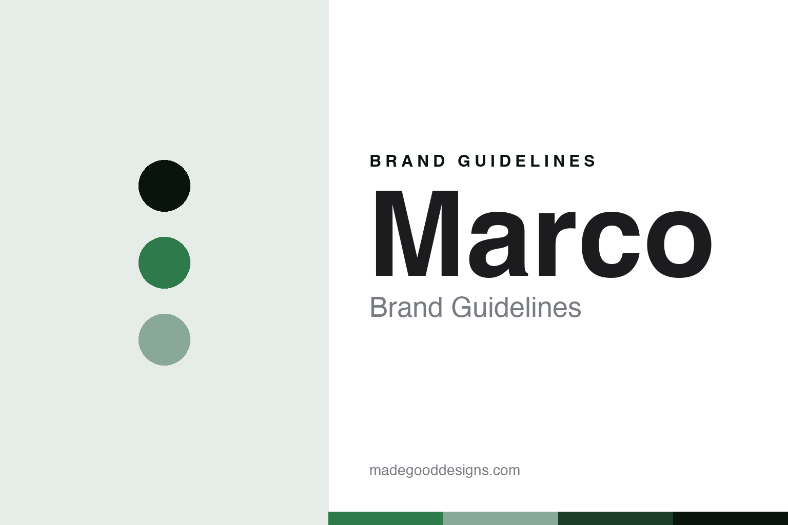
Marco Brand Guidelines
China’s value pencil.
Aa
Two constants: a leaf-green palette and a value-sans register. Abstract homage — not a Marco colour, label or barrel.
China’s value pencil
Marco is China’s value coloured pencil, a modern Shanghai brand now under M&G, popular worldwide as an affordable alternative to premium houses.
Marco is a lesson in how a colour core competes on value. A modern Chinese brand, it makes highly pigmented coloured pencils at a fraction of the price of the premium houses, and it has become a global favourite among budget-conscious colourists and students. Its answer to how a colour is made a pencil is scale and value: manufacture a decent, soft, saturated core at high volume, and sell it affordably around the world. A colour core made to reach everyone.
Its identity is the value coloured pencil. Marco’s Raffiné budget artist pencils and its step-up Renoir line are the work it is known for. A core, made affordable. A modern maker that gave beginners a cheap way in.
(Honest notes, so the story stays precise. Marco is a Chinese brand — owned by Anshuo, a Shanghai educational-products company, not a “Marco Pen Company” — with manufacturing in Shanghai and Changchun, and it is a high-volume, export-scale maker, not a heritage artisan house. It was founded in 1992, so it is modern, not old; and since 2019 it has been controlled by Shanghai M&G, China’s largest stationery group, so we describe it as under M&G rather than independent. On positioning, we are honest: Marco is a value, budget-friendly artist-and-student pencil, popular as an affordable alternative to premium brands, not a premium house itself; and while its Raffiné line is marketed as “fade resistant,” there is no published lightfastness testing, so we do not equate the two. Two of its names borrow a European fine-art aura — “Renoir” takes the Impressionist painter’s name and “Raffiné” is French for “refined” — with no connection to, or endorsement by, the Renoir estate or France; we treat those strictly as brand naming. Its names and labels are its IP, described but never reproduced, and there is no official brand hex — these tones are an unofficial interpretation. This is design commentary and does not promote any product.)
Colour
Marco lives in a leaf-green palette. Click a swatch to copy the hex.
Marco’s identity is accessible, bright and modern — a leaf green, an ink, a sage, a pine, and a paper. The palette leans leaf green and sage: the register of an affordable, everyday colour and a high-volume maker. It signals value and reach over prestige. The honest caveat: with no published brand hex, these values are an original, unofficial interpretation, not first-party colours.
The lesson is a leaf-green palette signals a value, made-in-China identity. Marco’s world is an affordable, mass-scale, Chinese-made object. For designers, it is a reminder that a fresh green and a soft sage can carry a brand built on access — the green of an everyday pencil and the calm of a plain desk. Because these tones can fail as small text, keep type dark and let the colour live in the accents, palette and band. The takeaways: make it affordable; make it at scale; claim only what you can test; and treat any single hex as unofficial.
Typography
The register is a value sans — plain, modern, unpretentious.
Marco’s identity carries a plain, modern, unpretentious spirit — a value maker, not a heritage house. A value sans captures the mood: clean, even and straightforward, the register of an affordable everyday pencil. Set in a leaf-green palette, the value sans feels plain and modern — exactly the personality Marco carries. It is unpretentious rather than ornate, mirroring an accessible colour core. (Marco’s real labels and line names are things we describe but do not reproduce, and the exact typeface is not ours to use.) Because it is not ours to use, the honest description is “a value-sans spirit,” shown here in a stand-in. The type behaves like the brand: plain, modern and unpretentious.
Aa
A value-sans spirit — plain and modern. (Specimen set in Space Grotesk, a value-sans STAND-IN; NOT the Marco wordmark or any label.)
The pencil around the world
Marco stands for the value pencil, honestly positioned.
Marco is a lesson in how a colour core wins on price and access. A leaf-green palette, a value sans and an affordable soft core make one thing — a pencil that lets a beginner start cheaply — the whole brand: accessible, bright and modern. The value is the differentiator, and the global reach is the meaning. The point is a maker that gave budget-conscious colourists a way into the hobby, and that grew to ship pencils to dozens of countries.
Put to work, the identity is value as design. A colour house in this spirit would compete on price and access, and be honest about what value means — good enough for beginners, not a premium archival product. It would decline to imply testing it has not done, keeping “fade resistant” separate from proven lightfastness. A brand learning from it would see that owning the value tier is a legitimate identity — that being the affordable first pencil for a global audience is a real position, not a lesser one — and that being precise, a modern 1992 brand, made in China, under M&G since 2019, keeps the story honest. A brand learning from it would also treat borrowed names carefully: a Chinese budget pencil called “Renoir” lends itself a European aura, and the honest move is to present that as branding, not provenance. The lesson Marco teaches is that value can hold an identity: the price gives it reach, and the honesty about tier keeps it credible. The affordability is the personality, and the everyday colour is the proof.
For designers and brand-builders, Marco opens this round of the pencil around the world, from China: own the value tier, and claim only what you can prove. The lessons: compete on access; be candid about the tier; separate marketing from testing; treat borrowed names as branding; and never reproduce a protected label. It is also a reminder to stay precise: Marco is China’s value coloured pencil, a modern Shanghai brand now under M&G — with the palette here an unofficial interpretation. Marco made value the identity — proof that being the affordable choice, honestly positioned, can be the difference.
Explore & save
Keep Marco’s identity on hand — save it to a board in the Made Good inspiration library.
Marco identity set
Pin the leaf-green palette and the value-sans register to your own board.


