Prologue Brand Guidelines
Kyle Cooper’s title-design studio in Venice, California.
Aa
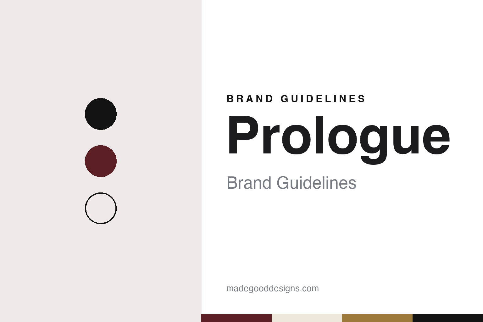
Two constants: an oxblood, black and bone palette and a title-card serif register. Abstract homage — not a Prologue frame or mark; no title sequence, logo or film still is reproduced.
Before the opening credits
From R/Greenberg Associates to a studio of his own.
Prologue, which signs its website as Prologue Films, is a studio for film and television title sequences, visual effects and live action. Art of the Title describes it as a team of designers and filmmakers based in Venice, California, founded in 2003 by Kyle Cooper and Kimberley Cooper, and working at the meeting point of typography and graphic design with sequence, story and sound.
Its story starts with Kyle Cooper’s earlier career. English Wikipedia and Art of the Title both say he earned a master’s degree in graphic design at the Yale School of Art, where he studied with Paul Rand, and then worked at R/Greenberg Associates from 1988 to 1996, first in New York and then in Los Angeles. There he made the opening titles for David Fincher’s Se7en in 1995. Wired, in a June 2004 profile by Jon M. Gibson, described the letters of that sequence as scratched by hand onto film stock, frame by frame, and set to a remix of a Nine Inch Nails track.
In 1996 Cooper founded Imaginary Forces with his R/GA colleagues Peter Frankfurt and Chip Houghton; English Wikipedia, citing Variety of December 1996, records the change as the Los Angeles arm of R/GA becoming Imaginary Forces. That company’s name comes from the prologue to Shakespeare’s Henry V, English Wikipedia says, and it links the idea to the way opening titles act as a prologue to a film; the same thought sits behind the name of Cooper’s next company.
The Wired profile places the split in 2003: as Imaginary Forces grew, it reported, Cooper found himself managing more than designing, and “last year, he went solo” with a new venture, Prologue Films. Cooper told the magazine the move was about wanting to do his own work. Art of the Title gives the same year and says Kyle and Kimberley Cooper formed Prologue when he left Imaginary Forces.
Colour
Titles, visual effects and live action.
Prologue makes opening and closing titles for feature films and television series. Wired reported in 2004 that Cooper was also bringing title work to video-game openings, where players could change the type on screen. Art of the Title lists visual-effects shots among the studio’s work as well as title sequences.
Four credits show the range, each as Art of the Title records it. For Jon Favreau’s Iron Man of 2008, the site credits Prologue Films as production studio, with Danny Yount as creative director and Kyle Cooper as executive producer, and describes the end titles as the hero’s suit taken apart like an exploded technical diagram. For AMC’s The Walking Dead, which began in October 2010, it credits Prologue Films, with Cooper as title designer and Danny Yount and Henry Hobson as creative directors. Cooper’s earlier Se7en came from his R/GA years, before Prologue existed.
The longest run is American Horror Story, from 2011 onward. In an October 2017 feature in Art of the Title, Cooper said that Ryan Murphy called him before the first season, having seen the Se7en titles, and that he read the scripts before meeting him and shot the first sequence as live action. Cooper said he chose an Art Nouveau lettering style in the manner of Charles Rennie Mackintosh after seeing a Frank Lloyd Wright book in Murphy’s office, and that the lettering went on to become the show’s brand. He made the same point about The Walking Dead: in both cases, he said, the typography and logo set in the main titles were taken up for the shows’ marketing.
In 2010, Art of the Title says, Prologue partnered with executive producer Alexander Dervin and director Kurt Mattila to form Prologue Pictures, a company for live-action narrative, documentary and commercial projects. Today the studio’s own website sorts its work into titles, visual effects, live action, entertainment branding, games, advertising and sports, and lists separate contacts for title, visual-effects and live-action work and for commercials.
Typography
Motion, titles and the studio brand.
Motion-design and animation studios sell something that is hard to show in a single image, so most of them lead with the work itself. A studio’s website usually opens on a showreel or a grid of moving thumbnails, and the name, logo and ident sit around that work rather than in front of it. Because an ident can be re-animated for a new reel, a new season or a new office, the written name and a short slogan often carry much of the lasting identity.
The people are part of the presentation. Production companies in advertising commonly list a roster of named directors, each with a page of their own, alongside the in-house producers, designers and animators. Trade press such as SHOOT, Stash, Televisual and Cartoon Brew reports hires, promotions and new offices, and credits commercials, title sequences, series openings and music videos to studios and directors by name; those credits, rather than the studio’s own wording, are the record that later histories rely on.
Ownership takes several forms. Some studios remain founder-owned for decades, with the founders still listed as directors in company registers. Others take a minority investment from a larger studio, join a group of sister companies, or are bought outright, sometimes by a company from outside animation, and keep trading under their own name afterwards. A studio’s corporate pages on founders and history are useful, but dated trade reports and register entries show when these changes actually happened.
For a design guide, the useful lesson is how much these studios ask of a name. A short, memorable studio name has to work as a credit at the end of a commercial, as a word animated in a reel and as a signature on a website, often in the same week. The palettes and type in these guides are our own unofficial interpretations, and no studio frame, character or logo is reproduced.
Aa
A title-card serif for a studio that sets type in motion. (Specimen set in Fraunces, a serif STAND-IN; NOT the Prologue logo.)
Prologue
A name taken from what titles do.
Prologue’s name describes its job. A prologue comes before the main story, and English Wikipedia ties both of Cooper’s company names to the idea that opening titles do the same for a film. The studio’s website keeps its presentation plain: a short statement about visual narrative in visual effects, title design and storytelling, followed by a long grid of projects labelled by category, so the sequences themselves carry most of the brand.
Lettering runs through the sources. The Art of the Title feature on American Horror Story shows how a typeface chosen for a main title can become the identity of a whole series, while the site’s note on Iron Man describes a sequence built from technical drawing rather than type alone. Wired’s 2004 profile described Cooper’s method as reading the film for its symbols rather than applying a house style, a description that fits the variety of looks across the sequences credited to Prologue.
For ownership, the dated sources give a founder-led company: Kyle and Kimberley Cooper as founders in 2003, according to Art of the Title, and Kyle Cooper still credited as title designer and director on its sequences in the 2017 feature. The website’s footer reads “Prologue Films,” and its contact page places the studio in Venice, California.
For a design guide, Prologue shows how a studio can let its typography do the talking: the identity sits in the sequences, and the studio frame around them stays quiet. Compare Imaginary Forces, the company Cooper co-founded in 1996, and Buck, another design and animation studio. For this guide we use oxblood, a projection black, bone and a tarnished gold with a serif, an unofficial interpretation; no product or logo is reproduced.
Explore & save
Keep Prologue’s identity on hand — save it to a board in the Made Good inspiration library.
Prologue identity set
Pin the Prologue oxblood, black and bone palette and the title-card serif register to your own board.
Source & notes
Frequently Asked Questions
What font can I use to match the Prologue look?
This guide describes Prologue’s type as “A title-card serif for a studio that sets type in motion”. Its type specimen is set in Fraunces from Google Fonts as a stand-in; Fraunces is not Prologue’s own lettering.
What colours are in the Prologue palette?
This guide’s Prologue palette is Oxblood #5B1F24, Projection black #141313, Bone #EDE6DA, Tarnished gold #9C7A3C and Paper #F8F5F0. The tones are the guide’s own unofficial interpretation, not official Prologue hex codes.
When was Prologue founded?
Prologue was founded in 2003, in Venice, California, US. Prologue is known for Film and television title sequences, visual effects.
Who founded Prologue?
Prologue was founded by Kyle Cooper and Kimberley Cooper in 2003.