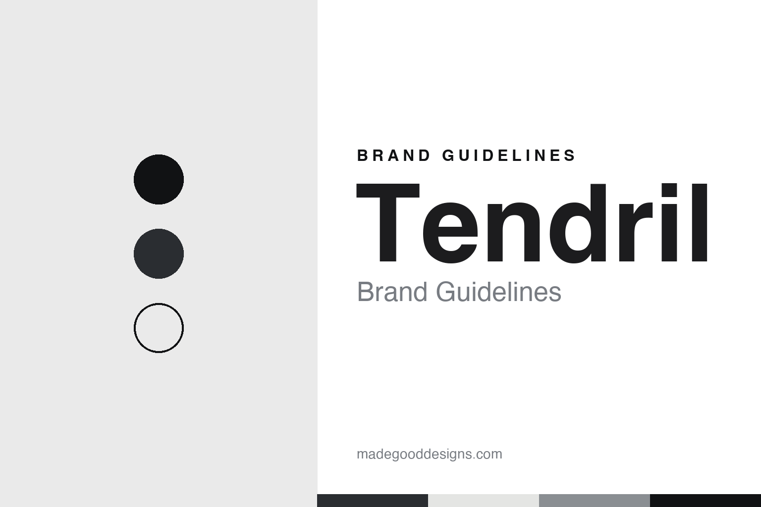
Tendril Brand Guidelines
The Toronto design and animation studio launched in 2010.
Aa
Two constants: a black, white and grey palette and a geometric sans register. Abstract homage — not a Tendril image or mark; no film, logo or T-dot is reproduced.
A Toronto workshop
A Brazilian-Canadian directing team and a studio in Toronto.
Tendril is a design and animation studio based in Toronto. The trade magazine SHOOT reported in March 2012 that it was launched in 2010 by the Brazilian-Canadian directing team Chris Bahry and Alexandre Torres, and described it as a director-driven workshop where designers and artists from different backgrounds used a wide range of techniques. By then, SHOOT said, it had grown into a full-service visual design and animation studio able to take a project from first concept through design, execution and delivery.
In the same item SHOOT reported that the New York animation production company Blacklist had taken Tendril on for representation in the United States.
When Motionographer interviewed the studio in March 2015, Justin Cone described Tendril as a five-year-old studio with roots going back ten years. The team told him its core had started with Chris Bahry, Alex Torres, Vini Nascimento and Leo Mateus, together with executive producer Kate Bate, and that they had come together in Toronto from halfway across the world. They gave a head count of about 20 to 21 people, including a small office in Rio de Janeiro, and said Tendril had just merged with its former sister companies Relish, an editing house, and 567, an online and finishing house, making a group of more than 35. They also said there were no investors directing the studio’s course. Asked about size, the team said a studio of that scale could keep an informal culture in which everyone worked closely together, but was too big to live on very small projects and too small for the very biggest jobs; they described growth as something they had let happen rather than pursued.
Colour
Idents, brand films and interactive work.
Tendril began in broadcast design and widened its range from there. In the 2015 Motionographer interview the team said traditional broadcast motion-design work had been shrinking for a couple of years, and that the studio was moving into what it called art, story and experience: websites, apps, games and virtual-reality pieces approached from a designer’s point of view. They cited an interactive music video for Coors, for which Tendril handled production, design, animation and web development, and an HTML5 project called Heart of the Arctic.
Broadcast work continued alongside it. In July 2015 Motionographer published Tendril’s idents for Bell Media’s Space Channel, crediting Chris Bahry and Alexandre Torres as creative directors and Kate Bate as executive producer. Two of the idents were shot in camera with iron filings; the others were made entirely in computer graphics, including a spider in a fine web with very shallow focus that the studio said tested a new render engine.
The studio’s own website now lists strategy and research, creative direction, design and design systems, full-service production, animation and visual effects, and augmented- and extended-reality experiences among its services. It shows product films and brand systems for technology, finance, sport and luxury clients, and gives a home base in Toronto with an extended team in São Paulo. A 2017 company release carried by Stash already named offices in Toronto and São Paulo, when the studio signed with Strange Beast for representation in the United Kingdom.
Among the projects on its website are a design system for IBM’s global software campaigns, a refreshed emoji library for Microsoft, a new visual identity for ESPN’s college football playoff coverage and launch films for Hublot watches, each presented by the studio with a short description of the project.
Typography
Motion, titles and the studio brand.
Motion-design and animation studios sell something that is hard to show in a single image, so most of them lead with the work itself. A studio’s website usually opens on a showreel or a grid of moving thumbnails, and the name, logo and ident sit around that work rather than in front of it. Because an ident can be re-animated for a new reel, a new season or a new office, the written name and a short slogan often carry much of the lasting identity.
The people are part of the presentation. Production companies in advertising commonly list a roster of named directors, each with a page of their own, alongside the in-house producers, designers and animators. Trade press such as SHOOT, Stash, Televisual and Cartoon Brew reports hires, promotions and new offices, and credits commercials, title sequences, series openings and music videos to studios and directors by name; those credits, rather than the studio’s own wording, are the record that later histories rely on.
Ownership takes several forms. Some studios remain founder-owned for decades, with the founders still listed as directors in company registers. Others take a minority investment from a larger studio, join a group of sister companies, or are bought outright, sometimes by a company from outside animation, and keep trading under their own name afterwards. A studio’s corporate pages on founders and history are useful, but dated trade reports and register entries show when these changes actually happened.
For a design guide, the useful lesson is how much these studios ask of a name. A short, memorable studio name has to work as a credit at the end of a commercial, as a word animated in a reel and as a signature on a website, often in the same week. The palettes and type in these guides are our own unofficial interpretations, and no studio frame, character or logo is reproduced.
Aa
A geometric sans for a studio that builds its mark from simple shapes. (Specimen set in Manrope, a sans STAND-IN; NOT the Tendril logo.)
Tendril
A mark that became the T-dot.
Tendril has rebuilt its own identity twice in public. In the 2015 Motionographer interview the team said that at the start of 2014 they paused production for about a week and a half to review the year, and that this gave them a reason to brand the studio formally, something they said they had not found the time to do before. A young local designer, named in the article as Rafael Rviz, created a set of “Tendril Emojis”: modular characters built from the simple shapes of the Tendril logo, meant, he said, to stand for the variety of the team and the work. The studio’s Rio team animated them, and the composer John Black gave each its own sound.
The second rebuild came in January 2023, when Stash published the studio’s brand refresh, made with the Toronto studio Worship. In the co-founders’ account, Tendril kept its logo, which they called the studio’s most recognisable brand element, and let it evolve into what they named the T-dot. Worship proposed a flexible system that could be quiet or bold depending on context. Because the studio’s work is so colourful, they chose a black-and-white palette with tones of grey so that the work could speak for itself.
From the three shapes that make up the T-dot, the team developed a library of 3D brand images and set down design principles: no more than three shapes, tone on tone, simple visual metaphors, a focus on light and shadow, and less is more. They added paired motion principles, among them elegant and premium, minimal and simple, light and dark, and precision and wonder. The guidelines and toolkit were credited to Rafa Cezar.
For a design guide, Tendril shows how a studio full of colour can choose a neutral frame for its own brand. Compare Giant Ant, another Canadian animation studio, and Psyop, another design and animation studio. For this guide we use graphite, a studio black, fog and shadow greys with a sans, an unofficial interpretation; no product or logo is reproduced.
Explore & save
Keep Tendril’s identity on hand — save it to a board in the Made Good inspiration library.
Tendril identity set
Pin the Tendril black, white and grey palette and the geometric sans register to your own board.
Source & notes
Frequently Asked Questions
What font can I use to match the Tendril look?
This guide describes Tendril’s type as “A geometric sans for a studio that builds its mark from simple shapes”. Its type specimen is set in Manrope from Google Fonts as a stand-in; Manrope is not Tendril’s own lettering.
What colours are in the Tendril palette?
This guide’s Tendril palette is Graphite #2A2D31, Studio black #111214, Fog grey #E4E5E3, Shadow grey #8A8E92 and Paper #F6F6F5. The tones are the guide’s own unofficial interpretation, not official Tendril hex codes.
When was Tendril founded?
Tendril was founded in 2010, in Toronto, Canada. Tendril is known for 3D brand films, broadcast idents, design systems.
Who founded Tendril?
Tendril was founded by Chris Bahry and Alexandre Torres in 2010.