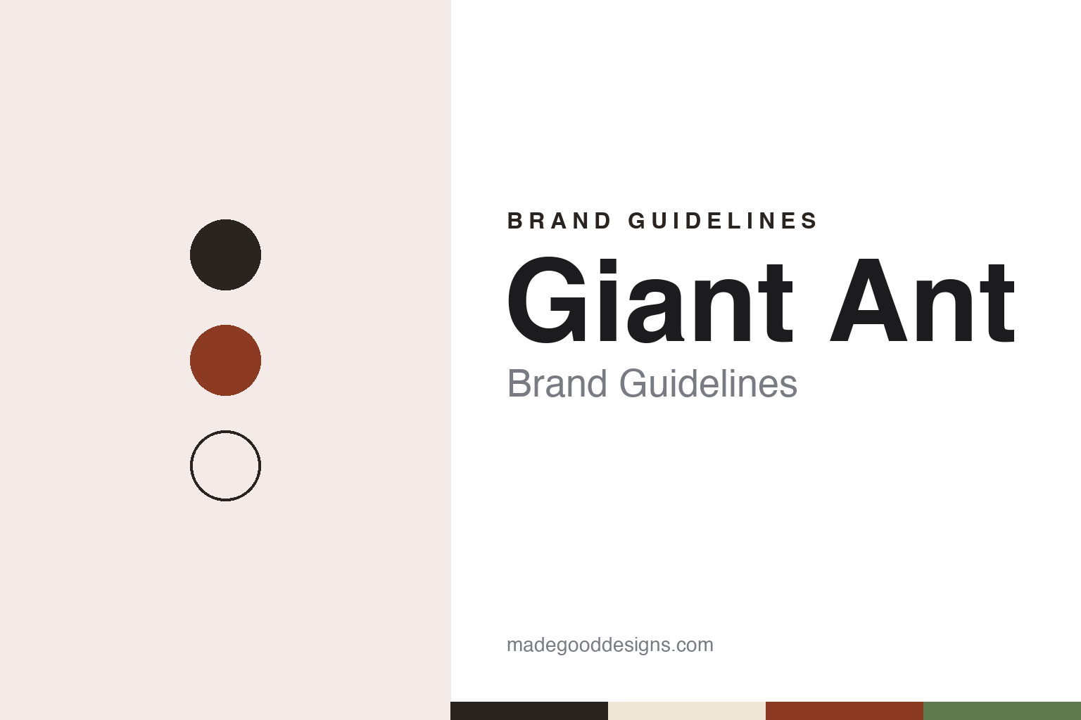
Giant Ant Brand Guidelines
The Vancouver animation studio that grew from a 2007 video.
Aa
Two constants: a rust, charcoal and sand palette and a geometric grotesque register. Abstract homage — not a Giant Ant film, frame or mark; no artwork or logo is reproduced.
From a viral video
Two art-school graduates and a tiny office.
Giant Ant is an animation and design studio in Vancouver, started by Jay Grandin and Leah Nelson. In a feature published in December 2016, Communication Arts writer Valerie Gregory traced it back to 2007, when a quirky video the pair had made about how men and women shower went viral. Myspace noticed and hired them to produce a ten-part series based on it, the magazine reported, and from that experiment “emerged Giant Ant, starting with the two of them in a tiny office.”
Neither founder came from animation. According to Communication Arts, Grandin had studied industrial design and worked as a furniture designer, while Nelson had majored in film, focusing on documentary; the magazine wrote that they had little animation experience and relied on storytelling to carry them. It described the pair as having headed the studio for eight years by the time of its visit.
The name comes from a forest ant in Malaysia, Nelson told the magazine, whose life cycle is taken over by a parasitic fungus. She said she found it funny that the insects are described as “giant” when they are still just ants, and liked “the metaphor of this tiny creature that has such a big impact.”
The studio has grown since. Communication Arts found an office of thirteen people on the ground floor of a residential building on the edge of Vancouver’s Chinatown, with exposed ducts, concrete floors and hanging Chinese lanterns. Today the company’s website places its studio in the historic Strathcona neighbourhood and lists twenty-five people on its team, among them Grandin, Nelson, Shawn Hight, Teresa Toews and Rafael Mayani. It describes Giant Ant as “a creative studio, a design shop, an animation house.”
Colour
Commercials, a samurai and a feature.
Commercial work came first through technology and consumer brands. In January 2016 SHOOT reported that the animation production company Passion Pictures had signed Giant Ant for representation in the United States, describing it as a collaborative studio working in animation and documentary, with clients including Costa Del Mar, Toms, 84000 and Slack. For Slack the studio made “Amazing Spaceship,” which SHOOT described as a whimsical retro-animation spot showing how different factions can come together for space exploration. Grandin told the paper the studio was looking “to take our commercial work in the U.S. to the next level.”
Communication Arts described the Slack film’s 1940s cartoon-themed visuals and music, and Grandin explained that it mixed traditional 2-D animation, After Effects and 3-D, with ownership of each part spread across the team. He also described the studio’s process as a series of gates, such as the style-frame phase, which a project is meant to pass through only once, with clients approving work in progress at each stage.
Personal films ran alongside. In August 2015 Cartoon Brew published “Tako Faito!”, a short in which a modern samurai battles a huge tentacle. The studio told the site it had used a “sliver of downtime” to push its cel character animation, and that it had never before relied on cel animation as the only method for a whole piece; the credits name Henrique Barone, Rafael Mayani, Jay Grandin and Jorge Canedo Estrada.
The longest project is a feature. In September 2022 Cartoon Brew reported that Sarah Leavitt’s 2010 graphic memoir Tangles was being adapted as an animated feature by Monarch Media, Point Grey Pictures, Lylas Pictures and Giant Ant, with Leah Nelson as director and the animation to be done at the Vancouver studio; the site noted the project had been in the works at Giant Ant for years. The studio’s website now says the feature film Tangles was produced independently of its commercial studio operations.
Typography
Studios, showreels and credits.
Motion-design and animation studios sell something that is hard to show in a single image, so most of them lead with the work itself. A studio’s website usually opens on a showreel or a grid of moving thumbnails, and the name, logo and ident sit around that work rather than in front of it. Because an ident can be re-animated for a new reel, a new season or a new office, the written name and a short slogan often carry much of the lasting identity.
The people are part of the presentation. Production companies in advertising commonly list a roster of named directors, each with a page of their own, alongside the in-house producers, designers and animators. Trade press such as SHOOT, Stash, Televisual and Cartoon Brew reports hires, promotions and new offices, and credits commercials, title sequences, series openings and music videos to studios and directors by name; those credits, rather than the studio’s own wording, are the record that later histories rely on.
Ownership takes several forms. Some studios remain founder-owned for decades, with the founders still listed as directors in company registers. Others take a minority investment from a larger studio, join a group of sister companies, or are bought outright, sometimes by a company from outside animation, and keep trading under their own name afterwards. A studio’s corporate pages on founders and history are useful, but dated trade reports and register entries show when these changes actually happened.
For a design guide, the useful lesson is how much these studios ask of a name. A short, memorable studio name has to work as a credit at the end of a commercial, as a word animated in a reel and as a signature on a website, often in the same week. The palettes and type in these guides are our own unofficial interpretations, and no studio frame, character or logo is reproduced.
Aa
A geometric grotesque with small, sturdy forms. (Specimen set in Space Grotesk, a sans STAND-IN; NOT the Giant Ant logo.)
Giant Ant in Residence
An independent name inside a network.
In October 2022 Giant Ant became part of a larger group. Cartoon Brew reported on 7 October that seven creative companies had joined forces to form Residence, a network that included Buck, It’s Nice That, VTProDesign, Anyways Creative, Creative Lives in Progress, If You Could Jobs and Giant Ant, which it described as a “Vancouver-based art, design, and animation studio.” The companies would keep their names under the Residence umbrella, the site reported; some would be integrated more closely into the network led by Buck, while others would continue to operate more independently. Residence is headquartered in Los Angeles, according to the same report. It’s Nice That, announcing its own membership the day before, said Residence had been founded by the team behind Buck.
Giant Ant’s website reflects that arrangement with a short line, “Giant Ant is in Residence,” repeated at the foot of its pages, while the studio keeps its own name, address and team list.
Its identity rests as much on stated rules as on visuals. Communication Arts reported in 2016 that the studio followed three: don’t miss a deadline, don’t be a jerk, and put love into your work. One line Grandin used in that interview, “everything we put into the world is a statement of our taste,” now appears in a slightly shorter form on the company’s About page. Nelson told the magazine that people say they can spot a Giant Ant project, which surprised the founders because “nothing looks the same” across their portfolio.
For a design guide, Giant Ant shows how a studio name chosen as a metaphor, a short set of house rules and a clearly stated network membership can carry an identity across very different visual styles. Compare Buck, its partner in Residence, and Passion Pictures, which represented it in the United States from 2016. For this guide we use a rust, a warm charcoal, a pale sand and a forest moss with a sans, an unofficial interpretation; no product or logo is reproduced.
Explore & save
Keep Giant Ant’s identity on hand — save it to a board in the Made Good inspiration library.
Giant Ant identity set
Pin the Giant Ant rust, charcoal and sand palette and the geometric grotesque register to your own board.
Source & notes
Frequently Asked Questions
What font can I use to match the Giant Ant look?
This guide describes Giant Ant’s type as “A geometric grotesque with small, sturdy forms”. Its type specimen is set in Space Grotesk from Google Fonts as a stand-in; Space Grotesk is not Giant Ant’s own lettering.
What colours are in the Giant Ant palette?
This guide’s Giant Ant palette is Ant rust #8C3A22, Warm charcoal #2A2420, Pale sand #EFE6D6, Forest moss #5E7A4E and Paper #F8F6F2. The tones are the guide’s own unofficial interpretation, not official Giant Ant hex codes.
Who founded Giant Ant?
Giant Ant was founded by Jay Grandin and Leah Nelson.


