Readings Brand Guidelines
A Lygon Street bookshop named after the couple who opened it.
Aa
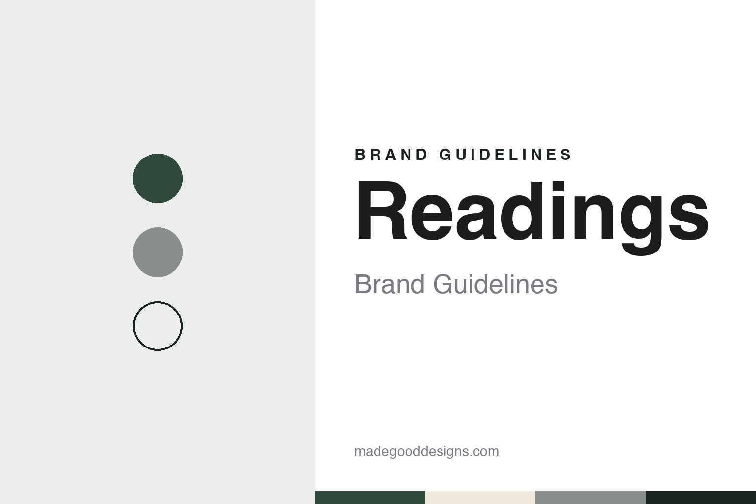
Two constants: a green, paper and bluestone palette and a bookish serif register. Abstract homage — not a Readings product or mark; no sign, logo or bag is reproduced.
Ross and Dorothy Reading
A surname, not a verb.
Readings opened in 1969 on Lygon Street in the Melbourne suburb of Carlton. The company says it was started by Ross Reading with his wife Dorothy Reading and their friend Peter Reid; Ross Reading and Reid had worked together at Cheshire’s, an older Melbourne bookseller, and had marked out Carlton as the likeliest spot for a new bookshop in the city. The company describes the shop as a tiny stand-alone store at first.
The name is a family name. “Many people think that the name Readings was inspired by the act of reading but it’s actually the surname of the original owners, Ross and Dorothy Reading,” Mark Rubbo, the shop’s later owner, told the Melbourne newspaper Il Globo in April 2022. The street around the shop was changing at the time. In a 2019 letter for the shop’s 50th year, Rubbo recalled that the La Mama theatre had opened nearby in 1967 and the Pram Factory theatre in November 1969, and that the Melbourne Filmmakers’ Co-operative opened a cinema in 1973 in the building Readings then occupied.
Rubbo arrived from the music side of the trade. He has written that he worked part-time in the music section of the Melbourne University bookroom as a student, and in 1972 opened Professor Longhair’s Music Shop on Lygon Street, named after the New Orleans blues pianist. Il Globo reported that the bookshop stood just down the road from his record shop and that he knew the Readings as customers and friends.
Colour
From one shop to nine.
In 1976 the Readings decided to move to the country and offered Rubbo the business. He and his two partners in music retail, Greg Young and Steve Smith, agreed to buy it, Rubbo told Il Globo; in his own account on the company’s website, they then added books to their music shops in South Yarra and Hawthorn and changed the name to Readings Books and Music. Peter Reid stayed on for a few years after the sale, and some of the Readings’ staff stayed too, the company says.
The Carlton shop moved twice along the same street. Il Globo dated the first move to larger premises to 1983, while the company’s own shops page gives 1982; both place the final move in 1998, which Il Globo described as a move across the road to the former Commonwealth Bank building, five times the size of the original shop. That building remains the Carlton flagship, according to the company.
The chain grew slowly, within Melbourne. In April 2022 Il Globo reported that Readings had opened its eighth shop the previous December in the Melbourne city centre, a shop opened by Rubbo’s son, Joe Rubbo, who the paper said would take over from his father. The same report described Mark Rubbo as a past president of the Australian Booksellers Association and the founding chair of the Melbourne Writers Festival. In September 2023 the company’s website announced that Mark Rubbo had retired as managing director, and Joe Rubbo wrote that he had been given stewardship of Readings.
As of November 2026 the company’s website lists nine shops, all in Melbourne: the Carlton flagship and shops at Chadstone, Doncaster, Hawthorn, Malvern, St Kilda and the Emporium centre in the city, along with a small shop at the State Library of Victoria and a separate children’s and young-adult shop in Carlton. The company describes itself as an independent retailer of books and music.
Typography
How bookshops present themselves.
Bookshop chains and online booksellers present themselves in different places. A chain’s identity is seen first on the street: the name over the shop front, the table displays inside, and the bookmarks, bags and seasonal catalogues handed over at the counter. An online bookseller has no shop front, so its name, its website and the catalogue pages it publishes carry the same work, along with the parcels that arrive at the door.
Store and imprint names are usually plain. Many chains carry a founder’s surname, as Dymocks does with William Dymock, who opened his first Sydney shop in 1879, according to English Wikipedia. Others are coined for the web, such as Booktopia, founded in Sydney in 2004. Older names often survive inside newer businesses: Angus & Robertson became an online brand within Booktopia after a 2015 purchase, SmartCompany reported, and the last Dymocks shop in New Zealand passed to Paper Plus franchisees in 2012, according to Stuff.
Ownership shapes the presentation. Some chains are franchise networks, in which local operators run shops under one name; others are family companies, listed companies or units of larger retail groups. The corporate pages that booksellers publish, and the trade and business press that covers them, set out founders, owners, acquisitions and, where they happened, administrations and changes of owner.
This guide describes each bookseller from dated sources: who founded it, who owns it, and what happened when the business changed hands. Where a chain closed or passed through administration, it says so with the date. The palettes and typefaces shown are our own unofficial interpretations, not the companies’ marks.
Aa
A bookish serif for a family name. (Specimen set in Libre Baskerville, a serif STAND-IN; NOT the Readings logo.)
Readings
Architect-designed shops.
Readings has made its newer shops a visible part of its identity, and the design press has noticed. In February 2026 ArchitectureAU published the Readings Chadstone shop by Kerstin Thompson Architects with Edward Linacre Studio, in the Chadstone shopping centre’s Market Pavilion. The magazine described a clean, minimal shell with reclaimed bluestone cobbles from Melbourne’s streets, so that the rows of books carry the display.
The fitout was planned for disassembly. Shopping-centre rules required permanent floors, walls and ceilings, Kerstin Thompson Architects associate Sarah Cooper told ArchitectureAU, but the shopfront, joinery, lighting and display were designed so they could be adapted and later taken apart. An aluminium frame with mechanical fixings, the magazine reported, can be moved to another store rather than thrown away. The magazine said this was the practice’s third project for Readings.
The centrepiece is a paper lantern ceiling. According to ArchitectureAU, it is made from Readings’ own paper waste from misprinted books, the main source of the company’s waste, and took about a year to develop as a recycled paper, with the team studying the Japanese nagashizuki papermaking method and making and testing paper by hand before scaling it up. Open House Melbourne, which opened the shop for architect talks in July 2025, gave the lantern’s size as 23 by 3.4 metres and named Ambience Lighting as a collaborator.
The older shops carry their own stories. The company says its Hawthorn shop sits in an Edwardian bank building designed by Christopher Cowper in 1916, with interiors by Kerstin Thompson Architects, and that its Doncaster shop was designed by Nest Architects.
For a design guide, Readings shows how a bookseller can build an identity from a founder’s surname, one street and a run of carefully designed rooms. Compare Daunt Books, a London bookseller with its own shop-led identity, and Powell’s Books, another independent that grew from one shop. For this guide we use a deep green, a lantern-paper white and a bluestone grey with a serif, an unofficial interpretation; no product or logo is reproduced.
Explore & save
Keep Readings’s identity on hand — save it to a board in the Made Good inspiration library.
Readings identity set
Pin the Readings green, paper and bluestone palette and the bookish serif register to your own board.