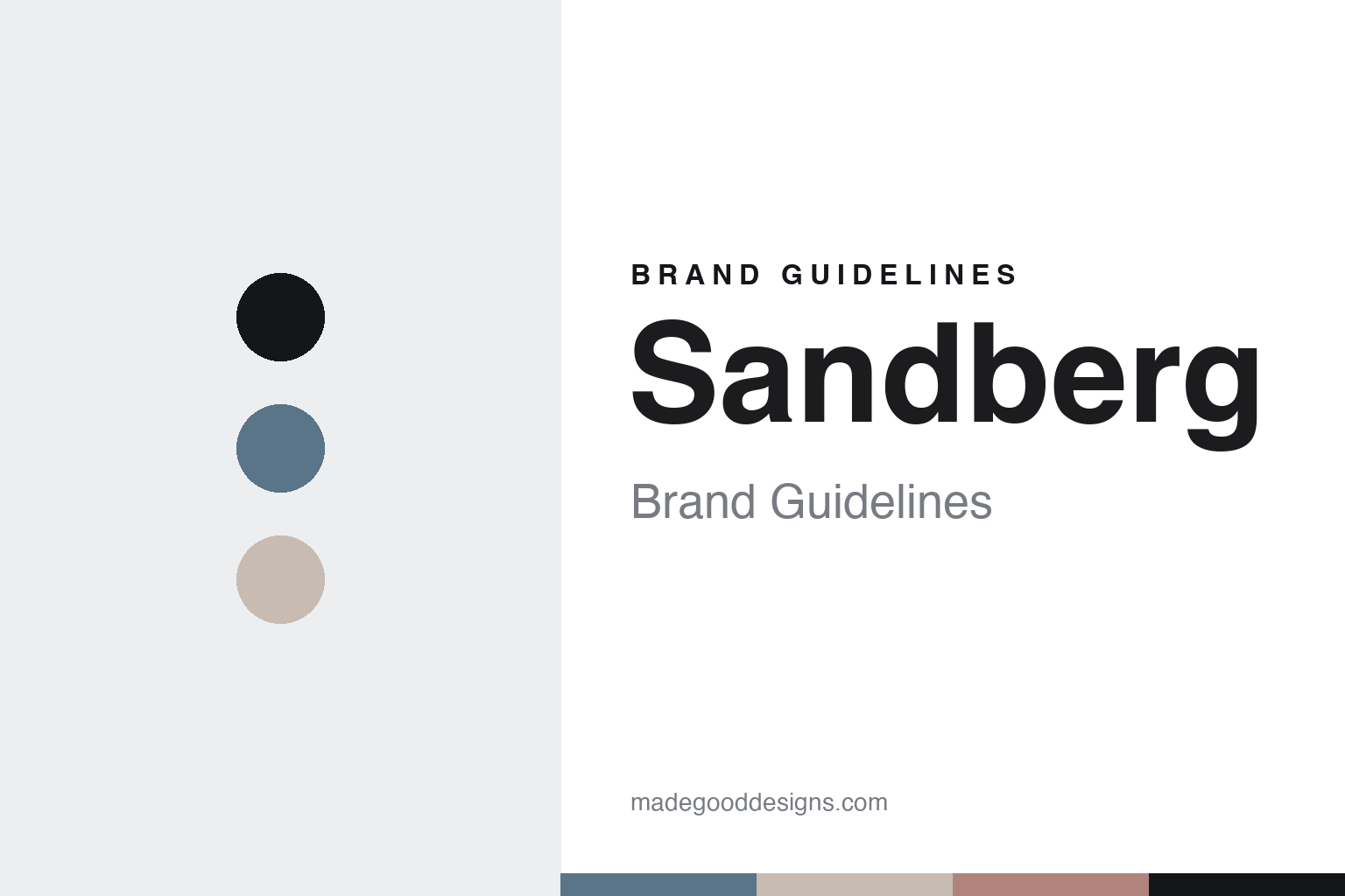
Sandberg Brand Guidelines
The painter’s hand.
Aa
Two constants: a watercolour-blue palette and a soft sans register. Abstract homage — not a Sandberg design or wordmark.
The painter’s hand
Sandberg hand-paints its motifs in-house in Sweden, then prints them at home.
Sandberg is a lesson in a hand as the identity. A Swedish wallpaper house, its patterns begin as motifs hand-drawn and hand-painted by its own studio in Sweden — a soft, watercolour, Scandinavian look — then printed at home. A wallpaper, painted by hand before it is printed.
Its identity is the painter’s hand. Sandberg’s hand-painted, Swedish-made papers, gentle and painterly, are the work it is known for. A hand, made a signature. A studio that paints before it prints.
(Honest notes, so the story stays precise. Sandberg was founded in 1976 in Ulricehamn by the Sandberg family — we credit the family rather than name an individual the sources do not confirm. Since 2012 it has belonged to the Gimmersta Wallpaper Company, founded by Irene and Christofer Gimmersta, which also owns Rebel Walls, Happywall, Bien Fait and Hovia; a Swedish investor holds a minority stake. One accuracy note: Sandberg is a separate company from Boråstapeter and from Midbec, all Borås-area Swedish firms often confused. Its designs are genuinely hand-painted in-house in Borås and printed in Sweden and the UK on FSC-certified non-woven paper with water-based inks. Its patterns are its IP, described but never reproduced, and there is no official brand hex — these tones are an unofficial interpretation. This is design commentary and does not promote any product.)
Colour
Sandberg lives in a watercolour-blue palette. Click a swatch to copy the hex.
Sandberg’s identity is soft, painterly and Scandinavian — a watercolour blue, an ink, a linen, a dusty rose, and a chalk. The palette leans watercolour blue and rose: the register of a gentle, hand-painted wash. It signals calm and craft over show. The honest caveat: with no published brand hex, these values are an original, unofficial interpretation, not first-party colours.
The lesson is a watercolour-blue palette signals a soft, painterly identity. Sandberg’s world is a hand-painted, made-in-Sweden, gentle object. For designers, it is a reminder that a soft blue and a dusty rose can carry a brand built on a hand — the blue of a watercolour and the rose of a painted motif. Because these tones can fail as small text, keep type dark and let the colour live in the accents, palette and band. The takeaways: paint by hand; keep it soft; make it in Sweden; and treat any single hex as unofficial.
Typography
The register is a soft sans — gentle, clean, calm.
Sandberg’s identity carries a gentle, clean, calm spirit — a painterly object, not a loud one. A soft sans captures the mood: rounded, even and quiet, the register of a hand-painted Scandinavian wallpaper. Set in a watercolour-blue palette, the soft sans feels gentle and clean — exactly the personality Sandberg carries. It is calm rather than bold, mirroring a soft, washed motif. (Sandberg’s real designs and wordmark are things we describe but do not reproduce, and the exact typeface is not ours to use.) Because it is not ours to use, the honest description is “a soft-sans spirit,” shown here in a stand-in. The type behaves like the maker: gentle, clean and calm.
Aa
A soft-sans spirit — gentle and clean. (Specimen set in Hanken Grotesk, a soft-sans STAND-IN; NOT the Sandberg wordmark or any wallpaper design.)
A hand as identity
Sandberg stands for the painter’s hand.
Sandberg is a lesson in making a hand the identity. A watercolour-blue palette, a soft sans and hand-painted papers make one studio’s hand the whole maker — soft, painterly and Scandinavian. The hand is the differentiator. The differentiator is a genuine practice — beginning each pattern as a hand-painted motif in its own Swedish studio, rather than buying in artwork.
Put to work, the identity is a hand as design. A maker building in this spirit would keep an in-house painting studio, keep a soft and consistent look, and print close to home, so the customer buys into an artist’s touch rather than a stock pattern. It would let the painterliness be visible, so that each design feels made by a person. It would be honest about its group and its Borås peers. The lesson Sandberg teaches is that a hand can build a brand: the painting gives it warmth, and the Swedish making gives it grounding. The hand is the personality, and the painting is the proof.
For designers and brand-builders, Sandberg offers a clear takeaway: keep the hand in the work. The lessons: paint in-house; stay soft; print in Sweden; and be accurate about ownership. It is also a reminder to stay precise: Sandberg is a Swedish house founded in 1976 in Ulricehamn by the Sandberg family, part of the Gimmersta Wallpaper Company since 2012, hand-painting motifs in Borås — with the palette here an unofficial interpretation. Sandberg made the painter’s hand the maker — proof that a hand can be the difference.
Explore & save
Keep Sandberg’s identity on hand — save it to a board in the Made Good inspiration library.
Sandberg identity set
Pin the watercolour-blue palette and the soft-sans register to your own board.


