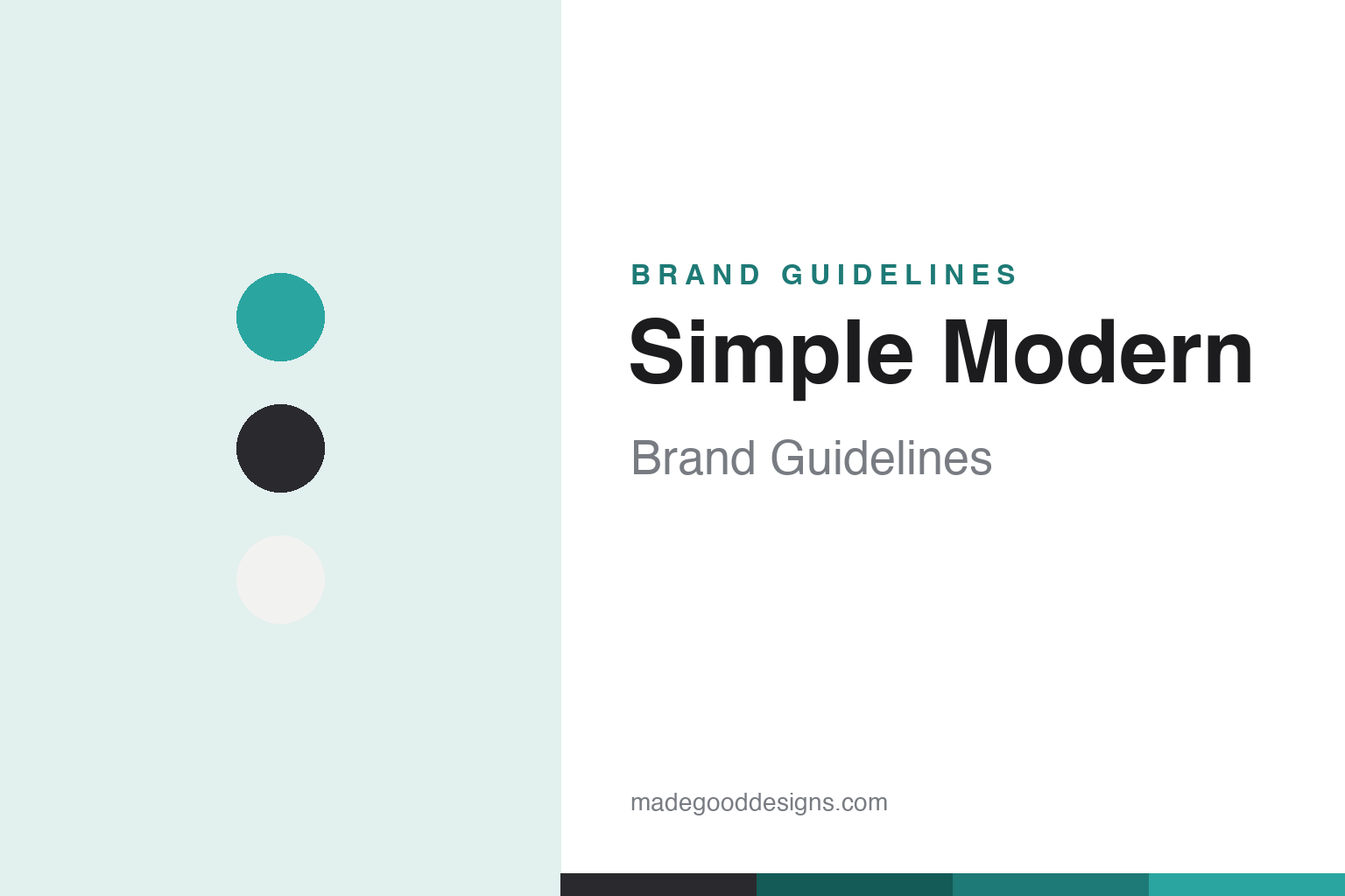
Simple Modern Brand Guidelines
Good everywhere — value insulated drinkware sold at scale, built around a founding mission to give generously.
Aa
Two constants: a clean teal-and-charcoal palette and a friendly, clean modern sans. Abstract homage — not the Simple Modern wordmark.
Value drinkware with a mission
Simple Modern built giving into the model.
Simple Modern is a lesson in a mission built in from day one. It was founded in 2015 by three University of Oklahoma alumni — Mike Beckham (co-founder & CEO), Bryan Porter and Micah Ames — and is based in the Oklahoma City area (Moore, OK), where it also reports operating a domestic manufacturing facility. (An honest correction to a common error: there is no “Bryan Beckham” and no family/brother co-founder — the three names above are the founders. Two more honest notes: no official brand hex is published, and the wordmark typeface is undocumented.)
Simple Modern makes value-priced insulated stainless drinkware — tumblers, water bottles and travel mugs (lines like the Summit bottle, the Trek tumbler and the Voyager mug) — sold at a wide range of colours, patterns and licensed collections (Disney, NFL, Marvel and more). Its growth engine has been selling online at scale, earning a reputation as a top-selling drinkware brand on Amazon; the company reports figures like 50M+ products sold and availability across all 50 states and 10,000+ retail storefronts.
The distinctive part is the giving mission, framed as a founding purpose rather than a later add-on: Simple Modern states it gives “at least 10% of annual profits” to non-profit partners, with the line “we exist to give generously,” and employees personally direct a share of the giving. (Honest caveats: the accurate commitment is “at least 10%,” not a “majority” of profits; the framing is generosity, so avoid calling it overtly “faith-driven”; and the total given is self-reported and varies across their pages — commonly cited as more than $13M to date — so attribute it.) The company is privately held and founder-led, and its tagline is “Good Everywhere™.” Value drinkware with a mission.
Colour
Simple Modern lives in teal and charcoal. Click a swatch to copy the hex.
Simple Modern’s identity reads through a clean, approachable palette — a teal/turquoise accent with charcoal, black and white — that feels friendly, modern and value-minded. The look suits a brand whose name promises exactly that: simple and modern, uncomplicated and contemporary. The teal adds warmth and approachability without tipping into hype, matching a brand that competes on value and everyday usefulness rather than fashion exclusivity. (The product range, of course, spans a huge spectrum of colours, patterns and licensed designs — but the core brand accent is the teal.) The honest caveat: Simple Modern publishes no official brand hex, so the teal and charcoal here are observed approximations, not first-party values.
The lesson is a clean, friendly palette suits a value brand. Simple Modern’s teal-and-charcoal world reads as approachable and modern — matching an accessible, everyday drinkware brand. For designers, it’s a reminder that friendly, uncomplicated colour can communicate value and warmth. The takeaways: use clean, approachable tones for a value brand (teal, charcoal); let the huge product range carry the colour variety; and treat specific hexes as approximate when no official spec is published.
Typography
The wordmark is a clean modern sans — friendly and uncomplicated.
Simple Modern’s identity carries a clean, friendly, uncomplicated spirit — a straightforward modern sans-serif wordmark that reads as approachable, contemporary and honest, literally embodying the brand’s name. The simple letterforms match a value-minded, everyday drinkware brand, and the friendliness suits a company that foregrounds generosity and accessibility. Set against a teal-and-charcoal palette, the type feels warm and modern — exactly the approachable, “good everywhere” personality Simple Modern cultivates. It’s clean and friendly rather than luxurious or rugged, mirroring the accessible products. Because the exact wordmark face isn’t publicly documented, the honest description is “a clean modern sans spirit,” not a named font. The type behaves like the brand: friendly, modern and uncomplicated.
Aa
A clean modern sans spirit — friendly and uncomplicated. (Specimen set in Figtree, a clean modern sans in the spirit of the Simple Modern identity; the real face is undocumented.)
A mission-built brand
Simple Modern led with generosity.
Simple Modern is a lesson in building a mission into the model from the start. Plenty of companies add charitable giving once they’re successful; Simple Modern framed generosity as its founding purpose — “we exist to give generously,” a stated commitment of at least 10% of annual profits, with employees personally directing a share of the giving. In a commoditised, value-driven category won largely on Amazon, that mission gives the brand a genuine differentiator and an internal culture that isn’t easily copied: customers can feel good about an affordable purchase, and the team is bound by a shared purpose beyond selling tumblers. It’s paired with a pragmatic business: value pricing, a huge colour and licensed range, and mastery of online-at-scale distribution. The lesson is that a real, structural mission — built in, quantified, and lived (not bolted on for marketing) — can differentiate even a value commodity brand, provided the claims stay honest and precise. Build the mission in, and it becomes part of the product.
For designers and brand-builders, Simple Modern offers a clear takeaway: a genuine, structural mission can differentiate a value brand. The lessons: build purpose in from the start and quantify it honestly (“at least 10% of profits,” not vague claims); pair mission with pragmatic execution (value pricing, online scale, wide range); and keep the identity clean and friendly so it stays accessible. It’s also a reminder to keep the facts precise — Simple Modern was founded in 2015 by Mike Beckham, Bryan Porter and Micah Ames (OU alumni) in the Oklahoma City area; it commits to giving at least 10% of profits (not a majority); and its tagline is “Good Everywhere.” Simple Modern led with generosity — proof that a built-in mission can differentiate a value brand.
Explore & save
Keep Simple Modern’s identity on hand — save it to a board in the Made Good inspiration library.
Simple Modern identity set
Pin the teal-and-charcoal palette and the modern-sans spirit to your own board.