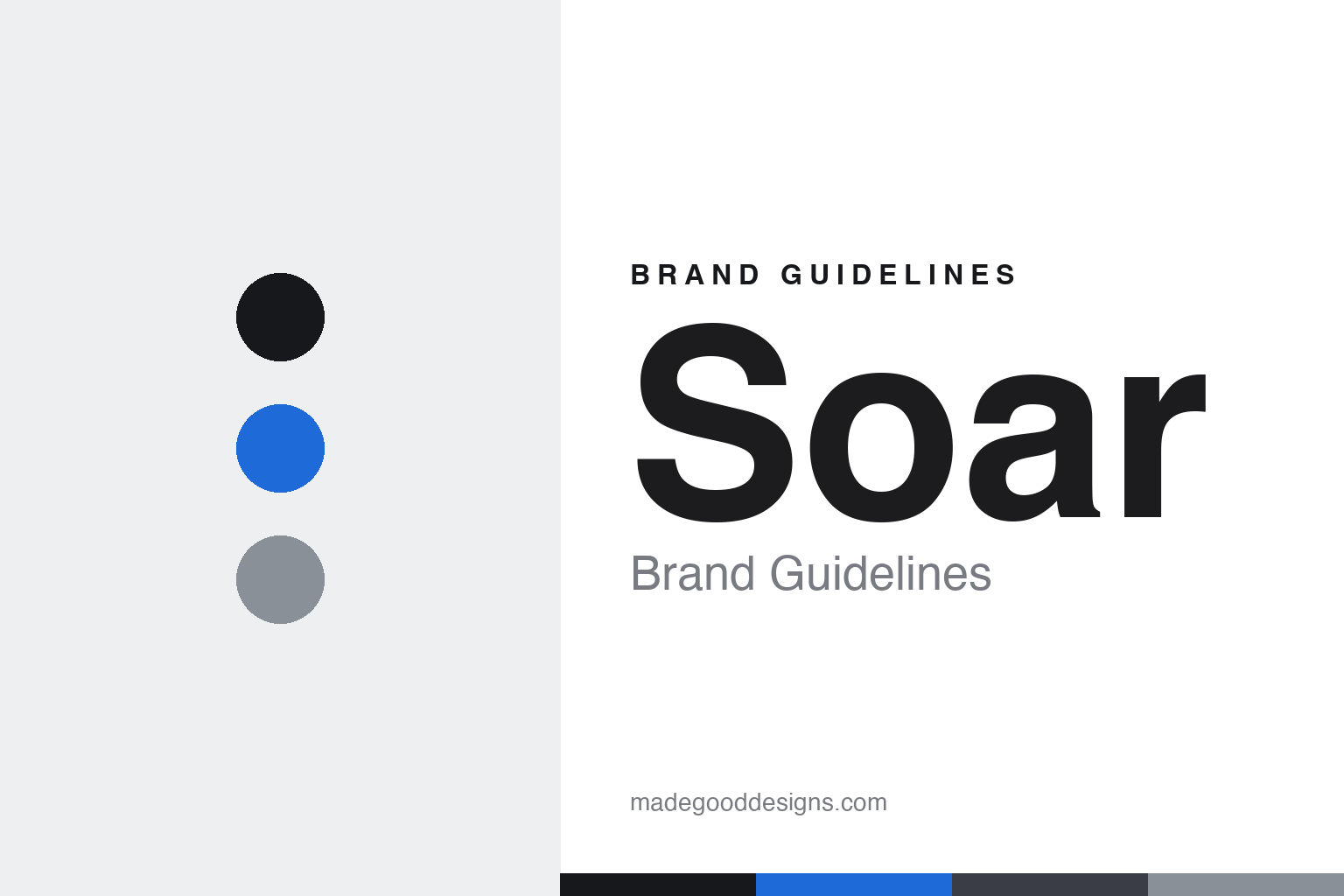
Soar Running Brand Guidelines
Built to perform.
Aa
Two constants: a technical, precise palette and a technical sans register. Abstract homage — not the Soar wordmark or logo.
Built to perform
Soar engineers running kit like a science.
Soar Running is a lesson in engineering as a design language. Founded in 2015 by Tim Soar in Hackney, London, the independent label takes a scientific, performance-first, anti-lifestyle approach: advanced fabrics developed from scratch with mills, and precise construction in service of one outcome — speed.
Its brand identity is technical, precise and disciplined — a numbered, iterative product system (versions like 2.0), an experimental “ProtoLab” line, and a flagship Race Vest. Tim Soar himself came from design and music: he worked as a graphic designer under Neville Brody, DJed, and ran his own menswear label before Soar.
(Honest notes: Tim Soar is a graphic designer and DJ — not a band musician — and a keen cyclist-turned-runner, so “designer and runner” is the accurate phrase. The product “numbers” are version numbers, not a catalog system. There’s no official brand hex, so the tones here are an unofficial interpretation.)
Colour
Soar lives in a technical, precise palette. Click a swatch to copy the hex.
Soar’s identity is technical, precise and cool — an ink, a signal blue, a cool grey, a graphite, and an off-white. The palette pairs a signal blue with ink and cool grey — the register of an engineering diagram, a spec sheet and a lab. It signals precision, performance and rigour rather than lifestyle warmth. The honest caveat: with no published brand hex, these tones are an original, unofficial interpretation, not first-party values.
The lesson is a technical, cool palette signals engineering rigour. Soar’s world is a fabric lab and a spec sheet. For designers, it is a reminder that a signal blue on ink and cool grey reads as precise and performance-led — right for a brand built on fabric engineering. The takeaways: use a cool, technical palette; keep it precise; and treat any single hex as unofficial — using ink for small text so the signal blue stays sharp.
Typography
The register is a technical sans — precise and engineered.
Soar’s identity carries a technical, precise, disciplined spirit — fabric engineering and performance. A technical, machined sans captures the mood: it is precise and engineered, the register of a data label and a spec sheet. Set in a technical palette, the technical sans feels precise and engineered — exactly the personality Soar carries. It is machined rather than warm, mirroring a lab-tested garment. (Soar’s real wordmark is a trademark we describe but do not reproduce, and the exact brand typeface is not ours to use.) Because the mark is not ours to use, the honest description is “a technical sans spirit,” shown here in a stand-in. The type behaves like the brand: technical, precise and disciplined.
Aa
A technical sans spirit — precise and engineered. (Specimen set in Rajdhani, a technical sans STAND-IN; NOT the Soar wordmark, which is a trademark.)
Precision as identity
Soar stands for engineered performance.
Soar Running is a lesson in making precision the identity. A technical palette, mill-developed fabrics and a numbered, iterative product system make engineered performance the whole brand — precise, disciplined, anti-lifestyle. The precision is the differentiator. The differentiator is a technical, precise, performance-first identity.
For designers and brand-builders, Soar offers a clear takeaway: rigour can be a brand. The lessons: engineer the product (fabrics, construction); show your iterations (version numbers); and stay focused on one outcome (speed). It is also a reminder to stay accurate: Tim Soar is a designer and DJ (not a musician), the numbers are versions, and the palette here is an unofficial interpretation. Soar made precision the brand — proof that rigour can be the difference.
Explore & save
Keep Soar Running’s identity on hand — save it to a board in the Made Good inspiration library.
Soar Running identity set
Pin the technical palette and the technical-sans register to your own board.


