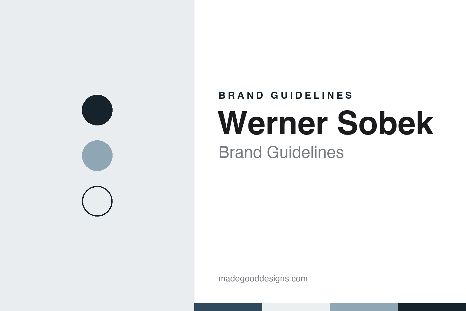
Werner Sobek Brand Guidelines
The Stuttgart office that joins engineering and design.
Aa
Two constants: a slate, steel blue and glass white palette and an engineered sans register. Abstract homage — not a Werner Sobek drawing or mark; no project image, logo or wordmark is reproduced.
Büro Werner Sobek
An engineer and architect opens his own office.
The firm takes its name from its founder, Werner Sobek, a German structural engineer and architect. German Wikipedia says he studied civil engineering and architecture at the University of Stuttgart from 1974 to 1980, worked on the university’s research programme on wide-span lightweight structures, took his doctorate there in 1987, and then spent four years, from 1987 to 1991, at the Stuttgart engineering office of Schlaich Bergermann und Partner.
In 1991 he became a professor at the University of Hannover, and in 1992 he founded his own office, the Büro Werner Sobek, in Stuttgart. German Wikipedia says the office has traded as Werner Sobek AG since 2018, with Sobek as founder, co-owner and member of the supervisory board. The company’s own website gives the founding year as 1992 and describes him as chairman of the supervisory board.
Teaching ran alongside the practice for three decades. From 1994 Sobek was a professor at the University of Stuttgart, succeeding the architect Frei Otto at the Institute for Lightweight Structures; in 2000 he took over a second chair, succeeding Jörg Schlaich, and founded the Institute for Lightweight Structures and Conceptual Design, known as ILEK, which German Wikipedia says brings design and structural analysis together in research and teaching. He retired from his Stuttgart professorship at the end of March 2021. In 2004 the Pinakothek der Moderne in Munich showed his engineering and design work in the exhibition “show me the future.” A second exhibition, “Skizzen für die Zukunft” (Sketches for the Future), on Sobek and the ILEK, opened at the Ringturm gallery in Vienna in 2009 and travelled to Moscow in 2010.
Abroad, German Wikipedia records a visiting professorship at the Harvard Graduate School of Design in 2007–2008 and a post as Mies van der Rohe Studio Professor at the Illinois Institute of Technology in Chicago from 2008 to 2014. His writing runs from journal papers on glass and adaptive structures to two Birkhäuser reference books he co-authored, the Glasbau Atlas of 1998 and the Stahlbau Atlas of 1999; in 2005 he wrote on glass structures for The Structural Engineer.
Colour
Towers, museums and a membrane.
German Wikipedia lists the office’s buildings with the architects who designed them. Among them are the Sony Center in Berlin, completed in 2000 to a design by Helmut Jahn; the Post Tower in Bonn, of 2002, designed by Murphy/Jahn; and the Mercedes-Benz Museum in Stuttgart, of 2006, designed by UNStudio. Sobek and colleagues described the structural planning of the museum, with its complex three-dimensional geometry, in the journal Detail in 2006.
One project documented in the trade press is the test tower at Rottweil in southwest Germany. Architectural Record reported in August 2018 that in 2013 the industrial group thyssenkrupp needed a facility to test a rope-free high-speed lift, and that Helmut Jahn and Werner Sobek answered with a tower rising more than 800 feet: a reinforced-concrete tube about 69 feet across, with the test facility at its centre and an observation deck at the top. The textile membrane wrapped around it, made of PTFE, was completed in 2018, the magazine said. Sobek told the magazine that, given the landscape around Rottweil, it was clear from the start that the tower “had to be more than just a technical structure.” The company now lists the project as the TK Elevator Test Tower and says its work covered design, structural engineering and façade engineering.
For designers, the lesson is in how the practice presents that range. Its website opens with large, credited photographs of finished buildings, short captions on how each structure is built, and separate pages for locations, team, publications and lectures. German Wikipedia adds that the office plans one house a year as a test bed for technologies that later reach its larger projects. The founder’s name works as the brand, written plainly, with the projects doing the rest.
Typography
Design and documentation.
Structural and façade engineering consultancies rarely sell a product, so their identity rests on a name and a record. Many carry the surnames of founders or partners, sometimes joined by a plus sign or an ampersand, sometimes run together in lower case, and many shorten to initials in everyday use. The wordmark is usually typographic rather than pictorial: a plain sans or a restrained serif, set on a quiet background, with one accent colour at most.
The work itself does most of the talking. Websites, brochures and monographs lead with project photography of bridges, stadium roofs, glass façades, towers and temporary pavilions, often shot at dusk or from below to show cables, members and joints. Alongside the photographs come drawings, sections, physical and digital models and construction sequences, and the projects are credited together with the architects and builders who worked on them, since an engineer’s name rarely appears on a building alone.
Writing about these firms tends to follow the same pattern. Founders and partners are described in their professional roles, with dates for when they joined or took over; ownership is set out plainly, whether a partnership, a firm owned by its employees or a practice absorbed into a larger group; and renamings and mergers are dated. History pages trace a practice back through earlier names, and office pages list the cities where teams are based, often with the year each office opened.
This guide follows that approach. It sets out what dated sources say about each firm: who founded it, how its name and ownership changed, where it works and which projects independent publications credit to it. It describes what was engineered rather than what it achieves, and it treats the palette and typefaces shown here as an unofficial interpretation, not the firms’ own identity.
Aa
An engineered sans for an engineering and design office. (Specimen set in Manrope, a sans STAND-IN; NOT the Werner Sobek logo or wordmark.)
Werner Sobek AG
Fifteen locations, one name.
The firm has grown well beyond its Stuttgart base. German Wikipedia names offices in Belgrade, Berlin, Buenos Aires, Dubai, Frankfurt am Main, Hamburg, Istanbul, Copenhagen, Tashkent, Weinheim and Vienna, among others. In November 2026 the company’s own locations page lists fifteen: Augsburg, Belgrade, Berlin, Buenos Aires, Cologne, Copenhagen, Dubai, Frankfurt, Hamburg, Istanbul, Riyadh, Stuttgart, Tashkent, Vienna and Weinheim. The company says it has more than 450 employees from over 40 countries, and that it provides engineering, design and consultancy services.
On ownership, the company says it is “management-owned”: managers are given the chance to buy shares, and the members of its executive board have been with the firm for many years. It names architectural practices it works with, among them Ingenhoven, JAHN, Sauerbruch Hutton, UNStudio and Zaha Hadid Architects.
The website relies on photography credited to named photographers, and projects are introduced by short technical captions. That presentation suits a practice whose founder trained as both engineer and architect, and whose work spans structures, façades and product design: German Wikipedia lists a cabin design for Doppelmayr in Koblenz in 2010 and an airport chair from 2001.
A design system borrowed from this register would keep to cool, mineral tones, generous white space and a single sans used at a few weights, with photography credited line by line. It would let the founder’s name stand alone, without a tagline, and put the technical caption beside the image as the main voice.
For a design guide, Werner Sobek shows how an engineering office can carry a personal name as a quiet, durable brand, letting credited photographs and technical captions speak for the work. Compare schlaich bergermann partner, the Stuttgart office where Sobek worked before founding his own, and Knippers Helbig, another Stuttgart engineering practice. For this guide we use slate, steel blue, membrane grey and glass white with a sans, an unofficial interpretation; no product or logo is reproduced.
Explore & save
Keep Werner Sobek’s identity on hand — save it to a board in the Made Good inspiration library.
Werner Sobek identity set
Pin the slate, steel blue and glass white palette and the engineered sans register to your own board.
Source & notes
Frequently Asked Questions
What font can I use to match the Werner Sobek look?
This guide describes Werner Sobek’s type as “An engineered sans for an engineering and design office”. Its type specimen is set in Manrope from Google Fonts as a stand-in; Manrope is not Werner Sobek’s own lettering.
What colours are in the Werner Sobek palette?
This guide’s Werner Sobek palette is Steel blue #2F4A5C, Night slate #16232C, Membrane grey #8FA7B5, Glass white #ECEFF0 and Paper #F7F7F5. The tones are the guide’s own unofficial interpretation, not official Werner Sobek hex codes.
When was Werner Sobek founded?
Werner Sobek was founded in 1992, in Stuttgart, Germany. Werner Sobek is known for Sony Center, Mercedes-Benz Museum, Rottweil test tower.
Who founded Werner Sobek?
Werner Sobek was founded in 1992 by Werner Sobek, engineer and architect.