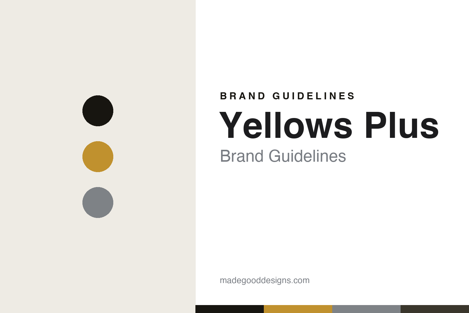
Yellows Plus Brand Guidelines
The light frame.
Aa
Two constants: an amber-and-titanium palette and a clean sans register. Abstract homage — not the Yellows Plus frame or wordmark.
The light frame
Yellows Plus makes featherweight frames in its own Fukui factory.
Yellows Plus is a lesson in featherweight Fukui craft as the identity. A Japanese house from the eyewear region of Fukui, it makes light, precise, own-manufactured frames — and lightness is the point.
Its identity is the light frame. Yellows Plus’s refined titanium and acetate frames — with every screw, rivet and hinge in titanium — are the work it is known for. Eyewear you barely feel. Craft, made light.
(Honest notes: Yellows Plus is a Japanese eyewear brand from the Sabae area of Fukui, founded around 2001 by Toshiaki Yamagishi — the 2001 launch and roughly 2003 for its Fukui family-factory production give an “early 2000s” date. Its signature is Fukui craft and lightness — refined, classic shapes prized for proportion and lightness, in titanium and premium cellulose acetate, with all hardware, the screws, rivets and hinges, in nickel-free, hypoallergenic titanium, across models like Rick and Russel. On production, it makes genuinely in its own family Fukui factory, start to finish — its own material says “Made in Japan,” and we found no offshore assembly. It is an independent house. One small note: Sabae and Fukui are used loosely, since Sabae is the eyewear city within Fukui Prefecture. Its model names and wordmark are IP we describe but don’t reproduce. There’s no official brand hex — these tones are an unofficial interpretation. This is design commentary and does not promote any product.)
Colour
Yellows Plus lives in an amber-and-titanium palette. Click a swatch to copy the hex.
Yellows Plus’s identity is warm, light and precise — an amber, an ink, a titanium, a graphite, and a chalk. The palette leans amber and titanium — the register of warm acetate and cool, nickel-free metal. It signals craft and lightness rather than novelty. The honest caveat: with no published brand hex, these tones are an original, unofficial interpretation, not first-party values.
The lesson is an amber-and-titanium palette signals featherweight craft. Yellows Plus’s world is a warm, light, precise object. For designers, it is a reminder that a single quality — lightness, achieved through titanium hardware and careful proportion — can be the whole identity, and that a warm-and-metal palette signals that craft. Because a mid amber can fail as small text, keep type dark and let the colour live in the accents, palette and band. The takeaways: chase the lightness; own the making; refine the proportion; and treat any single hex as unofficial.
Typography
The register is a clean sans — light, precise, refined.
Yellows Plus’s identity carries a light, precise, refined spirit — a considered, featherweight object. A clean sans captures the mood: it is calm and exact, the register of quiet craft. Set in an amber-and-titanium palette, the clean sans feels light and precise — exactly the personality Yellows Plus carries. It is refined rather than decorative, mirroring a featherweight frame. (Yellows Plus’s real frames and wordmark are works we describe but do not reproduce, and the exact typeface is not ours to use.) Because it is not ours to use, the honest description is “a clean sans spirit,” shown here in a stand-in. The type behaves like the brand: light, precise and refined.
Aa
A clean sans spirit — light and precise. (Specimen set in Manrope, a clean sans STAND-IN; NOT the Yellows Plus wordmark.)
Featherweight Fukui craft as identity
Yellows Plus stands for the light frame.
Yellows Plus is a lesson in making lightness the identity. An amber-and-titanium palette, a clean sans and an own-made frame make featherweight craft the whole brand — light, precise, refined. The lightness is the differentiator. The differentiator is discipline: titanium hardware throughout, careful proportion, and manufacture in the house’s own Fukui factory.
Put to work, the identity is refinement as design. A designer building in this spirit would pick one hard-to-fake quality — genuine lightness — and pursue it through material and proportion, then protect it by owning the making, so the result feels effortless precisely because the process is exacting. The lesson Yellows Plus teaches is that quiet craft plus own-manufacture can build a brand: a Fukui factory, nickel-free titanium detailing, and a refined, understated design language give it authority without noise. It doesn’t shout; it earns trust by feel.
For designers and brand-builders, Yellows Plus offers a clear takeaway: chase one quality, and own the making. The lessons: pursue the lightness; refine the proportion; own the factory; and be honest about the story. It is also a reminder to stay accurate: the founding is best given as the early 2000s, and Sabae is the eyewear city within Fukui — the palette here is an unofficial interpretation. And it is a reminder that made-where honesty can be a genuine boast: Yellows Plus makes in its own Fukui factory, in Japan, and that is worth stating plainly. Yellows Plus made the light frame the brand — proof that owning the making can be the difference.
Explore & save
Keep Yellows Plus’s identity on hand — save it to a board in the Made Good inspiration library.
Yellows Plus identity set
Pin the amber-and-titanium palette and the clean-sans register to your own board.


