AT&T Brand Guidelines
Two Saul Bass logos, a corporate break-up, and a striped sphere that engineers still call the Death Star.
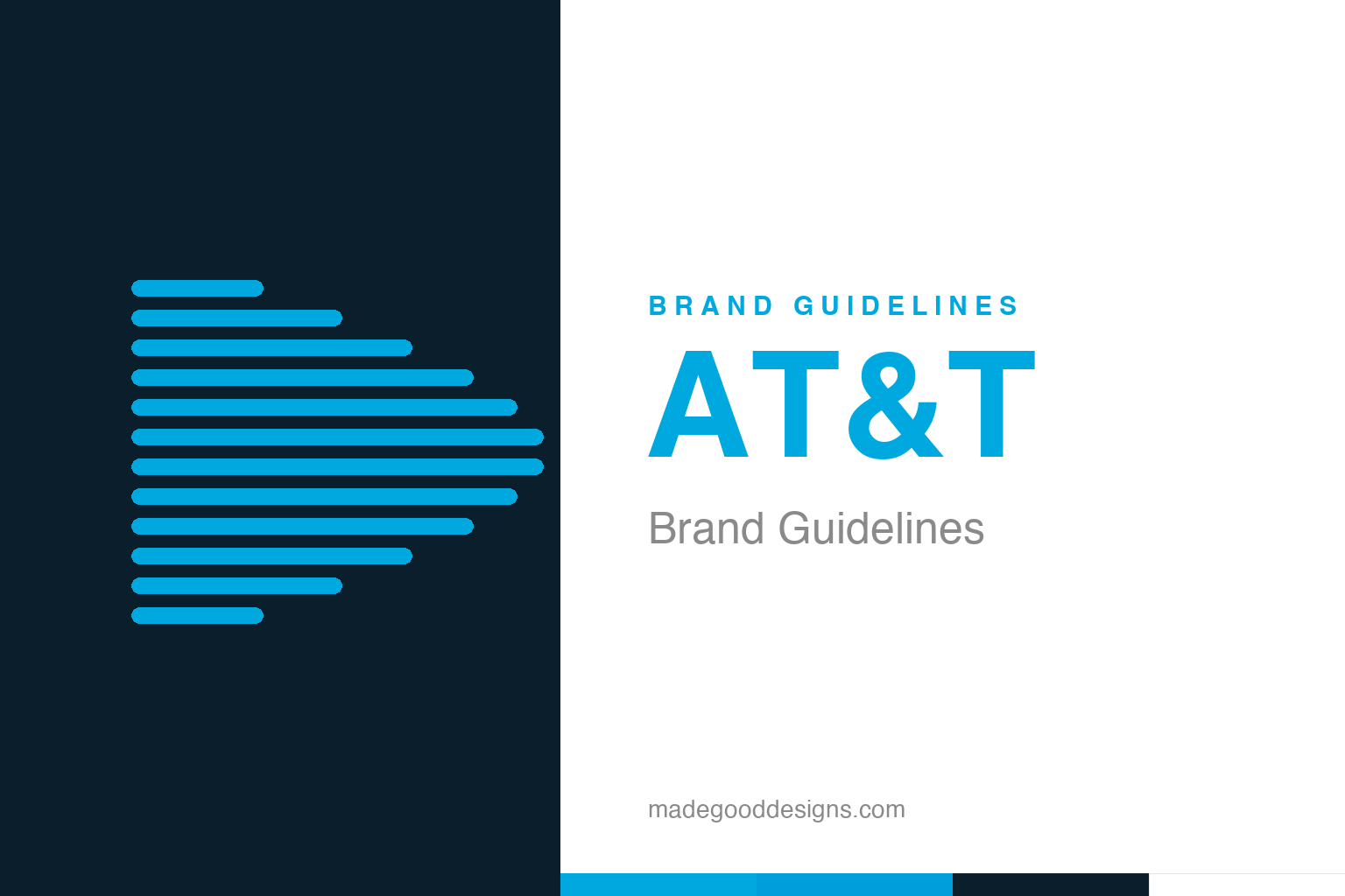
An abstract set of twelve flat stripes — the line-count idea, unwrapped from the sphere. Deliberately not the AT&T globe.
Saul Bass, twice
AT&T is one of the few brands designed by the same master across two eras.
Most companies are lucky to get one landmark logo. AT&T got two, both from Saul Bass — the filmmaker-designer behind Hitchcock title sequences and a dozen classic corporate marks. In 1969 Bass redesigned the Bell System identity, tidying the old bell-in-a-circle into a crisp, unified symbol for the entire national telephone network. It was one of the most comprehensive identity programmes ever attempted, rolled out across hundreds of thousands of trucks, phones and buildings. Then history intervened: the government moved to break up the Bell monopoly, and Bass was asked to design what came next — not a bell, but a globe.
The globe and the break-up
The striped sphere was built for a company about to be dismantled.
The 1982 antitrust settlement forced AT&T to divest the regional Bell companies, effective 1 January 1984. The bell symbol went to the spun-off “Baby Bells,” so AT&T needed a fresh mark for its slimmer, long-distance-and-technology future. Bass delivered the striped globe in 1983: a sphere wrapped in twelve horizontal lines, suggesting a world girdled by communications. It launched just ahead of the break-up — a confident new flag raised the moment the old empire was carved up. Few logos have ever done so much political and emotional work in a single geometric form.
Why they call it the Death Star
The most durable thing about the globe is its nickname.
AT&T’s own employees dubbed the striped sphere the “Death Star,” after the Star Wars battle station it faintly resembles — the horizontal banding, the ominous perfect roundness. The nickname stuck for forty years, which tells you the mark has genuine presence: bland logos don’t earn nicknames. Bass’s globe reads as power and reach, a little cold and a little imperial, which for a telecommunications giant is arguably on-brand. It’s a useful reminder that a strong symbol invites the audience to project meaning onto it — and that a nickname, even a cheeky one, is a sign the design landed.
Flattening the sphere
In 2005 the globe survived a merger — by getting glassier and lower-case.
When SBC acquired AT&T in 2005 and took the more famous name, Interbrand restyled the globe: the crisp Bass stripes softened into a translucent, 3D glassy sphere, paired with a lower-case “at&t” wordmark. Purists mourned the loss of Bass’s flat rigor — the update traded midcentury conviction for mid-2000s gloss. Still, the idea endured: a striped globe, unmistakably AT&T, three-plus decades after Bass drew it. That continuity is the point. Whatever you think of the gradients, the company kept the bones of a great logo instead of starting over — and the twelve-line sphere remains one of the most recognised marks in America. It’s a useful counter-example to the reflex to start fresh at every merger: AT&T treated Bass’s globe as inherited capital, not old furniture, and even a glossy 2005 restyle kept faith with the original geometry. Whatever the gradients, the silhouette a driver sees on a storefront today is still, unmistakably, the one Saul Bass drew in 1983.
It’s worth restating the throughline, because it reaches far beyond AT T: the marks that endure are the ones built on a single clear idea, drawn with restraint, and repeated faithfully long enough to mean something. Fashions fade and technologies change, but a distinctive, well-chosen symbol backed by real substance only grows more valuable with time. The lesson for anyone building an identity is not to be the loudest or the newest, but to be the most consistent and the most authentic — and then to hold that line for as long as it takes.
Type & the wordmark
A telecoms giant keeps its lettering plain and its symbol loud.
AT&T’s wordmark has long been a straightforward bold sans — the lower-case “at&t” sits quietly beside the globe, letting the sphere do the identifying. In recent years the company has used clean humanist and geometric sans faces across its properties. The specimen below stands in with a neutral bold sans.
Reach out
Sturdy, lower-case, unfussy — a wordmark engineered to sit beside a very strong symbol. (Specimen set in Archivo, a neutral stand-in.)
AT&T blue
One confident cyan-blue does most of the work. Click a swatch to copy the hex.
AT&T’s blue is a bright, optimistic cyan: the best-supported value is #00A8E0 (Pantone 298 C), with #009FDB used across its digital design system. Deep navy and white round out the palette. Lead with #00A8E0 for brand blue and note #009FDB for screen. Copy the working values below.
Explore & save
Keep the Bass globe idea on hand — save the twelve-stripe homage and the blue to a board.
AT&T identity set
Pin the twelve-stripe homage, AT&T blue and the lower-case wordmark idea to your own board.


