Lindt Brand Guidelines
The man who invented smooth chocolate — and a gold bunny that made Swiss luxury a supermarket staple.
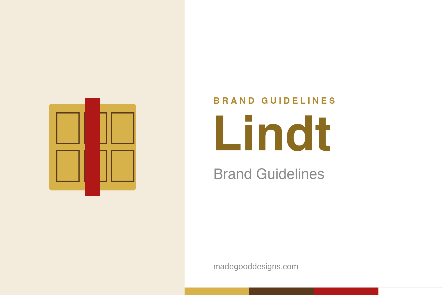
An abstract gold chocolate bar with a ribbon — the luxury idea, not the bunny. Deliberately not the Lindt Gold Bunny.
The man who invented smooth chocolate
Lindt’s whole brand rests on a genuine breakthrough.
Lindt’s identity is anchored by real culinary history. In 1879, the Swiss chocolatier Rodolphe Lindt invented “conching” — a process of long, slow mixing and aerating that produced the first truly smooth, melting chocolate (chocolat fondant). Before Lindt, chocolate was gritty and coarse; his invention gave it the silky, melt-in-the-mouth texture we now take for granted. That’s an extraordinary heritage to own: not just a brand, but the origin of modern eating chocolate itself. (A popular story that Lindt discovered conching by accidentally leaving a machine running over a weekend is charming but best treated as legend; the invention is documented, the accident isn’t.) Our homage keeps a gold chocolate bar, not the Gold Bunny.
Two names, one Swiss dynasty
‘Lindt & Sprüngli’ knots together two chocolate houses.
The full name, Lindt & Sprüngli, tells a two-part story. The Sprüngli confectionery house dates to 1845 in Zurich (founded by David Sprüngli and his son), and it’s from that year that Lindt draws its “Maître Chocolatier Suisse depuis 1845” (Swiss master chocolatier since 1845) heritage line. In 1899, the Sprüngli company — then led by Johann Rudolf Sprüngli-Schifferli — bought Rodolphe Lindt’s factory and, crucially, his secret conching process, uniting the two into Chocoladefabriken Lindt & Sprüngli. So the brand fuses a respected chocolate house (Sprüngli, 1845) with a revolutionary technique (Lindt, 1879) — heritage and innovation in a single name. That combination is the bedrock of Lindt’s claim to premium, authentic Swiss quality.
The Gold Bunny
Lindt’s most famous ambassador wears a red ribbon.
Lindt’s most recognisable single product-icon is the “Gold Bunny” (Goldhase) — a chocolate rabbit wrapped in gold foil with a red ribbon and a small golden bell, introduced in 1952 and now a seasonal fixture worldwide. It’s a brilliant piece of branding: the gold foil signals premium quality and preciousness, the red ribbon adds warmth and gift-giving charm, and the whole thing turns a chocolate bunny into a little luxury object. The Gold Bunny is so distinctive that Lindt has fiercely protected it in court as a trademark. It shows how a brand can create an ownable, iconic form around a seasonal treat — and how gold, used consistently, becomes a powerful shorthand for quality across an entire range.
Gold as the seal of quality
Lindt’s palette makes ‘premium’ visible.
The through-line of Lindt’s identity is gold. That warm metallic gold — on the bunny, on the Lindor truffle balls, across packaging — is applied with real consistency, and it does a specific job: it signals luxury, richness and craftsmanship. Combined with the “Master Chocolatier” positioning and the genuine 1845/1879 heritage, the gold makes Lindt’s central claim — premium Swiss quality — visible at a glance on a crowded confectionery shelf.
What makes Lindt such an effective brand is that its premium image is backed by real substance. The claim to master chocolate-making isn’t invented marketing — the company’s founder literally invented the process that makes fine chocolate smooth. That authenticity lets the gold packaging read as earned rather than pretentious. It’s the recurring lesson of the strongest heritage brands: a premium identity works when there’s a true story underneath it. Lindt pairs a genuine, documented breakthrough (conching, 1879) with a consistent, luxurious visual language (gold, the bunny, the ribbon), and the result is a brand that can sell Swiss-luxury chocolate at scale, in supermarkets around the world, without ever feeling cheap. The gold is the promise; the 1879 invention is the proof.
Ultimately, Lindt’s identity is a reminder that great branding is an exercise in clarity and restraint. Decide the one idea that matters, find the simplest form that expresses it, strip away everything that doesn’t, and then resist the urge to keep fiddling. The discipline to leave a good mark alone — refining rather than replacing, evolving rather than abandoning — is rarer and more valuable than the ability to design something new. That is how a symbol earns a permanent place in people’s memory, and how a brand turns recognition into lasting trust.
Type & the wordmark
An elegant, heritage wordmark in gold.
The Lindt wordmark is elegant and heritage-minded, often rendered in gold with the “Master Chocolatier” line beneath. The specimen below stands in with a refined serif.
Maître Chocolatier
Elegant, heritage, refined — type with the polish of gold foil. (Specimen set in Newsreader, a neutral stand-in.)
Lindt gold
Warm gold, chocolate brown, ribbon red. Click a swatch to copy the hex.
Lindt’s palette leads with a warm gold #D7B14A (Pantone 7751 C), with chocolate brown #5A3A1A and a ribbon red #B01818, over white. Lead with the gold below.
Explore & save
Keep the master-chocolatier idea on hand — save the gold-bar homage and the palette to a board.
Lindt identity set
Pin the gold-bar homage, the gold palette and the conching-invention story to your own board.