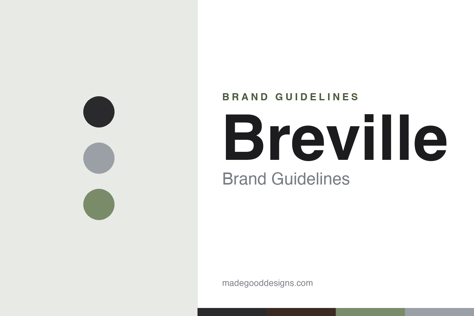
Breville Brand Guidelines
Australian design, premium appliances — from a WWII radio maker to the Barista Express (a.k.a. Sage in Europe).
Aa
Two constants: a premium charcoal-and-stainless palette with a sage nod and a clean, premium sans. Abstract homage — not the Breville wordmark.
From radios to espresso
Breville built premium appliances.
Breville is a lesson in design-led reinvention. It’s an Australian company, established on 11 January 1932 in Sydney by Bill O’Brien and Harry Norville — and the name is a portmanteau of their surnames (O’Brien + Norville → “Bre-ville”). A surprising origin detail: it began as “Breville Radio,” making radios (and WWII mine detectors), and only pivoted to small kitchen appliances in the 1950s. (Two honest notes: no official brand hex is published, and the wordmark typeface is undocumented.)
Breville’s first appliance breakout was the Snack ’n’ Sandwich Toaster in 1974 — the sealed toasted-sandwich maker was such a hit that in Australia and New Zealand “a breville” became a near-generic term for a toastie. Today the brand is known for premium, design-led countertop appliances, especially espresso machines (the Barista Express and Barista Pro) and the Smart Oven line, with a strong reputation for innovation and design. Its espresso education leans on ideas like the “4 Keys Formula” and the “Food Thinkers” platform (campaign/education platforms rather than a single corporate slogan).
There’s a genuinely unusual quirk in the brand: in the UK and Europe, Breville sells under the name “Sage” (Sage Appliances) — because the “Breville” trademark there is owned by an unrelated company (the mark passed through Pulse Home Products and Jarden, and is now owned by Newell Brands). So the same premium appliance is “Breville” at home and “Sage” in Europe — a rare split-identity global brand (Sage launched in the UK around 2010). The parent, Breville Group Limited, is publicly listed on the ASX (ticker BRG) — listed since 1999, not 1932. The identity is premium and clean. From radios to espresso.
Colour
Breville lives in premium charcoal and steel. Click a swatch to copy the hex.
Breville’s identity leans on a premium, restrained palette — near-black and charcoal, stainless-steel tones, and white, with a subtle sage-green nod (fitting for the brand that’s literally called “Sage” in Europe). The palette reads as sophisticated, engineered and design-led, matching a brand built on premium, innovative countertop appliances rather than budget mass-market ones: it feels like quality stainless hardware and considered industrial design. It’s a grown-up, understated look that lets the products’ form and finish lead. The honest caveat: Breville publishes no official brand hex, so the charcoal, steel and sage here are an original, unofficial interpretation, not first-party values.
The lesson is a restrained, premium palette can signal design-led quality. Breville’s charcoal-and-steel world reads as engineered and sophisticated — matching premium appliances. For designers, it’s a reminder that restraint plus quality material tones can communicate premium better than bright colour. The takeaways: use restrained, engineered tones for a premium appliance brand (charcoal, steel); add a subtle brand-linked accent (the sage nod); and treat specific hexes as unofficial when no brand spec is published.
Typography
The wordmark is a clean premium sans — engineered and modern.
Breville’s identity carries a clean, premium, engineered spirit — a modern sans-serif wordmark whose refined, even letterforms read as design-led, quality and contemporary. The clean type matches a brand built on premium, innovative appliances and industrial-design credibility, and the restraint lets the products’ engineering and finish take the spotlight. Set against a charcoal-and-steel palette, the type feels sophisticated and modern — exactly the premium, design-forward personality Breville (and Sage) cultivates. It’s clean and engineered rather than loud or homey, mirroring the premium appliances. Because the exact wordmark face isn’t publicly documented, the honest description is “a clean premium sans spirit,” not a named font. The type behaves like the brand: engineered, premium and modern.
Aa
A clean premium sans spirit — engineered and modern. (Specimen set in Instrument Sans, a clean modern sans in the spirit of the Breville identity; the real face is undocumented.)
Design as the difference
Breville won on design.
Breville is a lesson in design and innovation as the premium difference. Countertop appliances are a crowded, commoditised category — so Breville competed by making its machines genuinely better designed and more thoughtfully engineered, and charging a premium for it. The Barista Express is the emblem: it made real espresso approachable at home by integrating a grinder, dose control and steam wand into one considered, well-designed unit, backed by education (the “4 Keys” of great espresso). That design-led, problem-solving approach — plus a heritage of invention stretching back to the 1974 sandwich maker (and even the WWII-era radio engineering culture) — gives Breville a credible premium position and a devoted following among home enthusiasts. The lesson is that in a mature appliance category, superior design and genuine innovation, communicated with education rather than hype, can justify a premium and build a loyal brand. Design the better machine, and design becomes the difference.
For designers and brand-builders, Breville offers a clear takeaway: superior design and real innovation can command a premium in a commoditised category. The lessons: solve a real problem better through design (approachable home espresso); back it with education, not just marketing (the “4 Keys,” Food Thinkers); and let a restrained, premium identity carry it. It’s also a reminder to keep the facts precise — Breville was founded in 1932 in Sydney by O’Brien and Norville (the name a portmanteau), began as a radio maker, launched the sandwich toaster in 1974, sells as “Sage” in Europe because the trademark there is now Newell Brands’, and is ASX-listed as BRG (since 1999). Breville won on design — proof that design can be the premium difference.
Explore & save
Keep Breville’s identity on hand — save it to a board in the Made Good inspiration library.
Breville identity set
Pin the charcoal-and-steel palette and the premium-sans spirit to your own board.