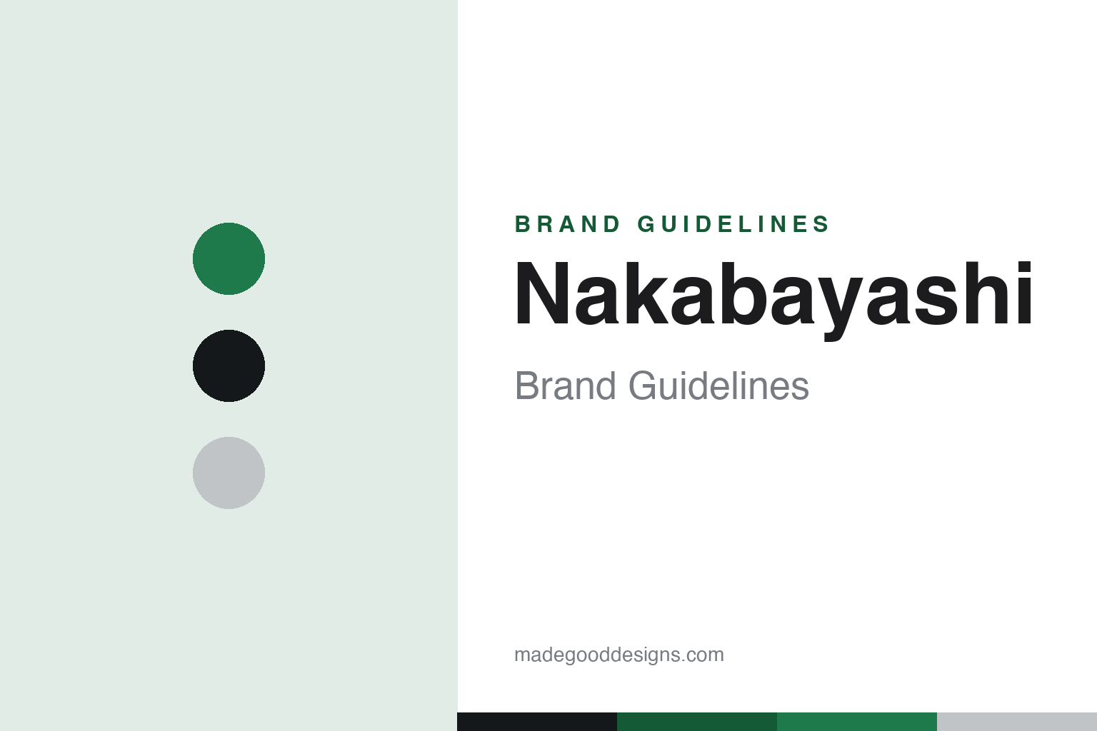
Nakabayashi Brand Guidelines
A 1923 Osaka stationery giant — the Logical notebooks, photo albums, and the parent of Taccia.
Aa
Two constants: a green-and-silver palette and a clean Japanese sans. Abstract homage — not the Nakabayashi wordmark or logo.
A century-old stationery giant
Nakabayashi grew from bookbinding to everything.
Nakabayashi is a lesson in the breadth of a diversified stationery house. Nakabayashi Co., Ltd. was founded in 1923 in Osaka by Yasuemon Nakabayashi as a magazine-binding and book-repair business (“Nakabayashi Bookbinding”), and grew into one of Japan’s large, diversified stationery and office-products makers — notebooks, files and binders, storage, paper shredders, bookbinding machines and more (it’s publicly listed, TSE 7987).
Its best-known consumer line is the Logical notebook (ロジカル), built around a distinctive “Logical rule” — fine dotted guide-lines set between each main horizontal rule (with dotted vertical intervals) that help writing stay tidy and aligned. It comes in ruled, grid and dot variants across sizes and sub-lines (Logical Prime, the ultralight Logical Air). Alongside it, photo albums are a traditional core strength: the long-running “Fueru” album has been made for over fifty years.
⭐ A neat cross-link for design-stationery fans: in April 2018 Nakabayashi acquired the boutique fountain-pen and ink brand Taccia — so the ukiyo-e-inspired Taccia inks now live under Nakabayashi. It’s a telling pairing: a big, practical office-products company as the quiet parent of a refined, artistic ink brand. (Honest notes: keep the founding to “1923, from bookbinding roots”; don’t conflate the big parent with its small Taccia subsidiary; “Logical” is a ruling/notebook line; some sub-line names are hedged; and no official brand hex is published.)
Colour
Nakabayashi lives in a green-and-silver palette. Click a swatch to copy the hex.
Nakabayashi’s identity is practical, dependable and broad — a clean green, ink black, and an album silver. The palette reads as a big stationery maker: the functional green of a notebook range, the black of writing, and the silver of a photo-album spine. It’s a capable, everyday world that signals utility, order and range. It’s a green-and-silver palette that signals a diversified stationery house. The honest caveat: Nakabayashi publishes no official brand hex, so the green, ink and silver here are an original, unofficial interpretation, not first-party values.
The lesson is a green-and-silver palette signals practical, dependable range. Nakabayashi’s world reads as capable and functional. For designers, it’s a reminder that a clean, functional accent (green) with a neutral metallic (silver) can express dependable, everyday utility. The takeaways: use a functional accent with a neutral metallic for dependable range; keep it clean; and treat any single hex as unofficial when there’s no published spec.
Typography
The wordmark spirit is a clean Japanese sans — practical and modern.
Nakabayashi’s identity carries a practical, dependable, modern spirit — a “Nakabayashi” wordmark whose clean forms match a big, diversified stationery maker. A clean Japanese sans captures the mood: it’s functional and modern, matching a company that makes everything from Logical notebooks to photo albums to shredders. Set against a green palette, the clean sans feels capable and everyday — exactly the Logical, photo-album personality Nakabayashi carries. It’s functional rather than decorative, mirroring a dependable notebook. (Nakabayashi’s real wordmark is a trademark we describe but don’t reproduce.) Because the exact mark isn’t ours to use, the honest description is “a clean Japanese sans spirit,” not the Nakabayashi logo. The type behaves like the brand: practical, dependable and modern.
Aa
A clean Japanese sans spirit — practical and modern. (Specimen set in Zen Kaku Gothic New, a clean Japanese sans; NOT the Nakabayashi logo, which is a trademark.)
Range plus a hidden gem as the difference
Nakabayashi is broad — and owns a jewel.
Nakabayashi is a lesson in how a broad, practical company can also hold a refined jewel. Its everyday strength is range and dependability: a century-old, diversified maker whose Logical notebooks, photo albums, files and shredders quietly furnish Japanese homes and offices. That breadth is a real business, but it isn’t glamorous. What makes Nakabayashi interesting to design-stationery lovers is the Taccia acquisition — a big, utilitarian parent choosing to own a small, artistic, ukiyo-e-inspired ink brand. It’s a reminder that scale and refinement aren’t opposites: a large practical company can steward a jewel, giving a boutique brand the stability of a parent while keeping its artistry intact. The Logical rule itself shows the same instinct — even in a mass-market notebook, Nakabayashi added a thoughtful, distinctive detail.
For designers and brand-builders, Nakabayashi offers a clear takeaway: breadth and refinement can coexist in one house. The lessons: build a dependable, broad base (Logical, albums, office goods) and let a smaller acquisition (Taccia) carry the artistry; add a distinctive detail even to mass-market products (the Logical rule); and keep the facts precise — Nakabayashi is a 1923 Osaka stationery giant that owns Taccia. It’s also a reminder to keep it honest: the founding is “1923, from bookbinding”; the big parent and the boutique Taccia are distinct; some sub-line names are hedged; and no official brand hex is published, so the palette here is an interpretation. Nakabayashi is broad and owns a jewel — proof that range plus a gem can be the difference.
Explore & save
Keep Nakabayashi’s identity on hand — save it to a board in the Made Good inspiration library.
Nakabayashi identity set
Pin the green-and-silver palette and the clean-sans spirit to your own board.