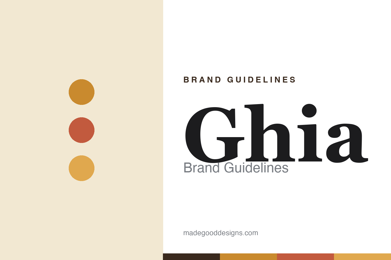
Ghia Brand Guidelines
Apéritivo, without the alcohol.
Aa
Two constants: an ochre-and-terracotta palette and a 1970s display serif wordmark. Abstract homage — not the Ghia bottle or wordmark.
Apéritivo, without the alcohol
Ghia made a sober apéritif feel sophisticated.
Ghia is a lesson in making sobriety sophisticated. Founded in 2020 in Los Angeles by Melanie Masarin — an early Glossier and Dig alum, which explains the design polish — it makes a non-alcoholic apéritif (0% ABV): a botanical, bittersweet, Mediterranean-aperitivo drink for the sober-curious, on a mission to “take back the word drinking from alcohol.” Its Le Spritz cans made it a fridge staple.
The design is instantly recognisable: a warm, 1970s-Riviera mood — ochre, amber and terracotta, sun-drenched European-summer nostalgia — and a distinctive ribbed, embossed glass bottle with a cork top. It looks like an aperitivo hour on the Amalfi coast, minus the alcohol.
(Honest notes: Ghia is independent and VC-backed. Its warm ochre/terracotta is the brand’s identity mood — actual product labels also run burgundy and red, so the ochre is the world, not every can. And its real site is drinkghia.com (the bare ghia.com is an unrelated parked domain). No official brand hex is published.)
Colour
Ghia lives in ochre and terracotta. Click a swatch to copy the hex.
Ghia’s identity is warm, sun-drenched and retro — an ochre, a terracotta, an amber, a cream, and an ink. The signature mood is a 1970s-Riviera palette of ochre, amber and terracotta — European-summer warmth. It signals sophisticated, nostalgic, sober-curious ritual rather than clinical “mocktail” design. The honest caveat: with no published brand hex, these tones are an original, unofficial interpretation, not first-party values.
The lesson is a warm ochre palette conjures European nostalgia. Ghia’s world is a sun-drenched Riviera terrace. For designers, it is a reminder that a specific, warm, retro palette — ochre, amber, terracotta — plus a tactile object (the ribbed glass) can give even a non-alcoholic drink a sophisticated, grown-up ritual feel. The takeaways: choose a warm, evocative palette; make the object tactile; and treat any single hex as unofficial — using a terracotta-brown for small text so the ochre stays warm.
Typography
The wordmark spirit is a 1970s display serif — warm and sophisticated.
Ghia’s identity carries a warm, sophisticated, retro spirit — a 70s-Riviera mood on a ribbed glass bottle. A warm, 1970s-flavoured display serif captures the register: it is elegant and nostalgic, evoking vintage European design. Set against ochre and terracotta, the display serif feels warm and sophisticated — exactly the aperitivo personality Ghia carries. It is retro-elegant rather than clinical, mirroring sun-drenched vintage typography. (Ghia’s real bottle and wordmark are trademarks and trade dress we describe but do not reproduce, and the exact typeface is not published, so we don’t assert it.) Because the specific mark is not ours to use, the honest description is “a 1970s display serif spirit,” not the Ghia logo. The type behaves like the brand: warm, sophisticated and retro.
Aa
A 1970s display serif spirit — warm and sophisticated. (Specimen set in Yeseva One, a display serif; NOT the Ghia logo, which is a trademark.)
Sober, but sophisticated
Ghia stands for the grown-up non-alc ritual.
Ghia is a lesson in elevating a category by design. A warm 70s-Riviera palette and a beautiful ribbed glass bottle make a non-alcoholic apéritif feel sophisticated and adult — not a childish “mocktail,” but a grown-up ritual. The design sophistication is the differentiator. The differentiator is a warm, design-forward, sober-curious identity.
For designers and brand-builders, Ghia offers a clear takeaway: design can reposition an entire category. The lessons: give a “lesser” category (non-alc) a sophisticated, evocative palette; invest in a tactile object; and let a strong design pedigree show. It is also a reminder to stay accurate: Ghia is a non-alcoholic apéritif (0% ABV), its ochre is the brand mood (labels also run burgundy/red), and its real site is drinkghia.com — with the palette here an unofficial interpretation. Ghia made sober sophisticated — proof that design can be the difference.
Explore & save
Keep Ghia’s identity on hand — save it to a board in the Made Good inspiration library.
Ghia identity set
Pin the ochre-and-terracotta palette and the 70s-display-serif spirit to your own board.


