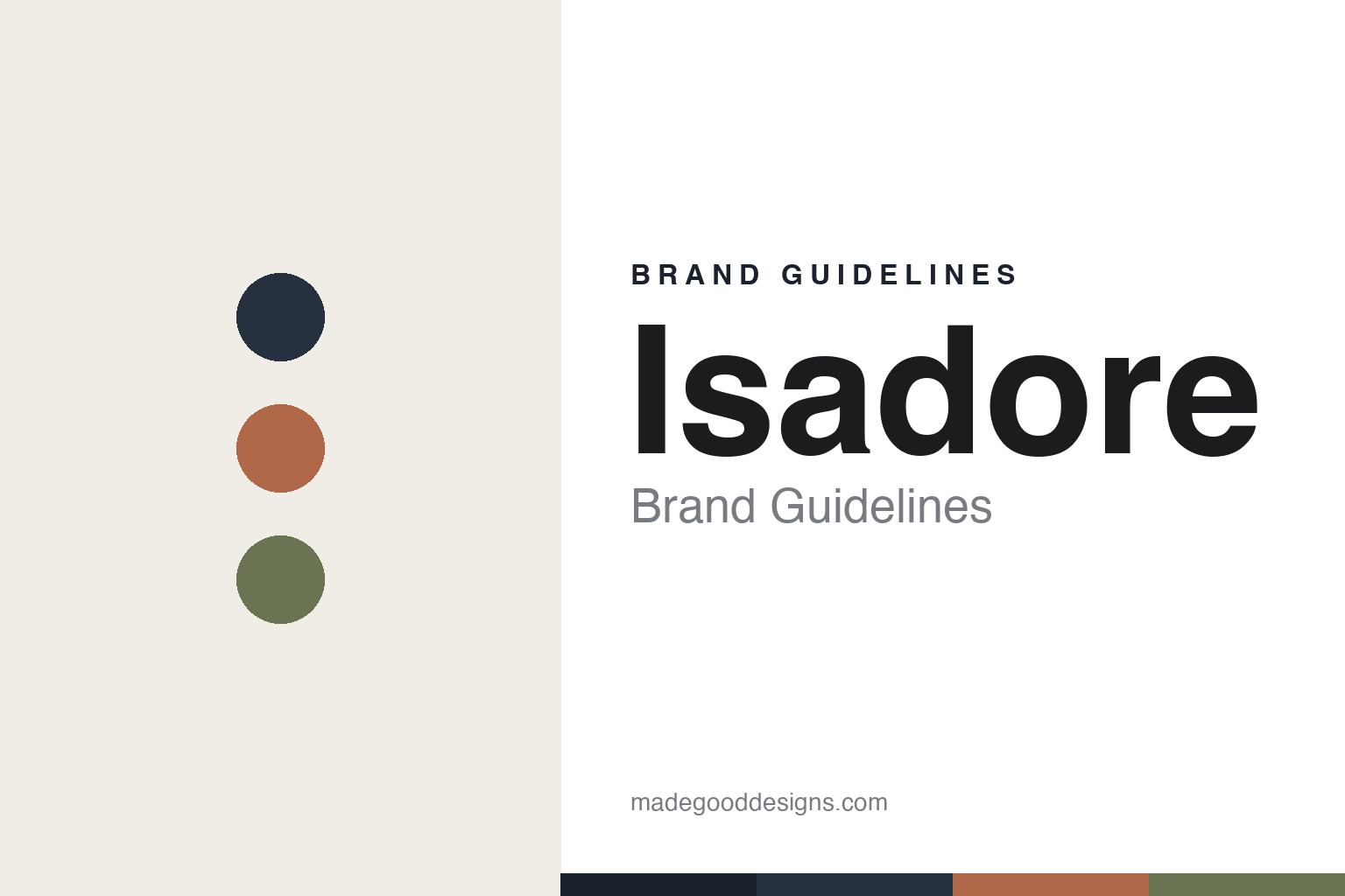
Isadore Brand Guidelines
Responsibly made.
Aa
Two constants: a muted, natural palette and a refined sans register. Abstract homage — not the Isadore wordmark or logo.
Responsibly made
Isadore is cycling kit built by pros.
Isadore is a lesson in expertise and responsibility as a brand. Founded in 2013 by twin brothers Peter and Martin Velits — former professional road cyclists — in Púchov, Slovakia, the brand makes “timeless cycling clothing responsibly made.” Peter Velits finished 3rd overall at the 2010 Vuelta a España and was 2007 U23 World Champion.
Its brand identity is understated, refined and responsible — merino-led kit, European manufacturing, recycled fibres and a repair service (“Love not Landfill”). The pros built the kit they always wanted to wear.
(Honest notes: its HQ is Púchov (Bratislava is a community hub and Peter’s birthplace). It’s founder-led but took outside investment (Crowdberry), so it isn’t purely independent. We attribute its green claims to the brand — and note it does not claim “climate neutral.” There’s no official brand hex, so the tones here are an unofficial interpretation.)
Colour
Isadore lives in a muted, natural palette. Click a swatch to copy the hex.
Isadore’s identity is muted, natural and refined — a navy, a heather, a terracotta, a moss, and a cream. The palette leans on navy with earthy heather, terracotta and moss — the register of merino, responsible materials and timeless design. It signals quality, calm and responsibility rather than loud sport. The honest caveat: with no published brand hex, these tones are an original, unofficial interpretation, not first-party values.
The lesson is a muted, natural palette signals responsible, timeless design. Isadore’s world is a considered merino kit. For designers, it is a reminder that navy with heather, terracotta and moss reads as natural and refined — right for a pro-founded, sustainability-minded brand. The takeaways: use muted, natural tones; keep it timeless; and treat any single hex as unofficial — using navy for small text so the palette stays calm.
Typography
The register is a refined sans — quiet and considered.
Isadore’s identity carries a refined, quiet, considered spirit — merino, responsibility and timeless design. A refined sans captures the mood: it is calm and precise, the register of a considered, understated brand. Set in a muted palette, the refined sans feels quiet and considered — exactly the personality Isadore carries. It is calm rather than loud, mirroring timeless kit. (Isadore’s real wordmark is a trademark we describe but do not reproduce, and the exact brand typeface is not ours to use.) Because the mark is not ours to use, the honest description is “a refined sans spirit,” shown here in a stand-in. The type behaves like the brand: refined, quiet and considered.
Aa
A refined sans spirit — quiet and considered. (Specimen set in Instrument Sans, a refined sans STAND-IN; NOT the Isadore wordmark, which is a trademark.)
Responsibility as identity
Isadore stands for responsible craft.
Isadore is a lesson in making responsibility the identity. A muted, natural palette, merino craft, European manufacturing and a repair service make responsible, timeless design the whole brand — refined, considered, pro-built. The responsibility is the differentiator. The differentiator is a refined, natural, responsible identity.
For designers and brand-builders, Isadore offers a clear takeaway: real expertise plus responsibility can be a brand. The lessons: build from genuine expertise (ex-pros); use responsible materials (merino, recycled, EU-made); and design for longevity (repairs). It is also a reminder to report carefully: HQ is Púchov, it took Crowdberry investment, it doesn’t claim “climate neutral,” and the palette here is an unofficial interpretation. Isadore made responsibility the brand — proof that care can be the difference.
Explore & save
Keep Isadore’s identity on hand — save it to a board in the Made Good inspiration library.
Isadore identity set
Pin the muted natural palette and the refined-sans register to your own board.


