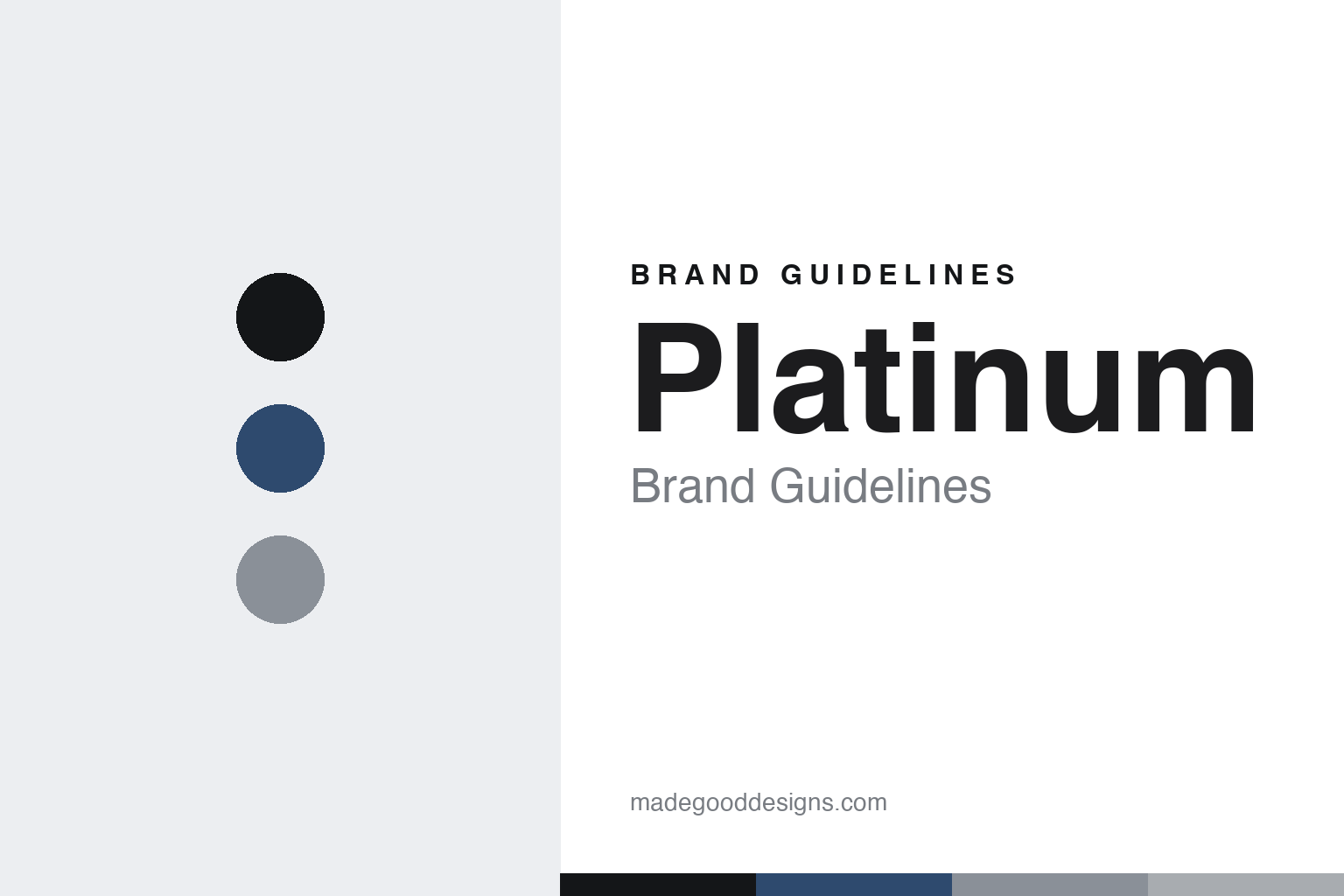
Platinum Brand Guidelines
Sealed against time.
Aa
Two constants: a Fuji-blue-and-grey palette and an engineered sans register. Abstract homage — not the Platinum pen or packaging.
Sealed against time
Platinum built its identity on an engineered, dry-proof cap.
Platinum is a lesson in engineering as identity. Founded in 1919 in Tokyo by Shunichi Nakata, it is one of Japan’s major pen houses, and it made its name on quiet engineering firsts — the world’s first cartridge fountain pen (1956) and the first platinum-nibbed pen (1967).
Its identity centres on the #3776 Century — the flagship, launched in 1978, whose number is the height of Mount Fuji in metres (3,776). Its signature is the “Slip & Seal” cap: an inner cap that seals the nib to prevent the ink drying out over long periods — engineering you feel rather than see. Alongside the value lines (Preppy, Plaisir, Procyon, the capless Curidas) sits the Izumo art line, finished with traditional Japanese decorative techniques.
(Honest notes: Platinum was founded in 1919; the “Nakaya Seisakusho” company name is attested by 1924, so it wasn’t simply “founded as Nakaya Seisakusho.” The Slip & Seal’s exact dry-proof duration and the “big three with Pilot and Sailor” framing are widely reported rather than confirmed here, as is the link to the artisan brand Nakaya. There’s no official brand hex, so these tones are an unofficial interpretation. This is design commentary and does not promote any product.)
Colour
Platinum lives in a Fuji-blue-and-grey palette. Click a swatch to copy the hex.
Platinum’s identity is engineered, clean and Japanese — a Fuji blue, an ink, a snow grey, a platinum, and a paper. The palette pairs a Fuji blue with a snow grey — the register of Mount Fuji and precise engineering. It signals reliability and clarity rather than flash. The honest caveat: with no published brand hex, these tones are an original, unofficial interpretation, not first-party values.
The lesson is a Fuji blue with a snow grey signals an engineered, Japanese brand. Platinum’s world is a sealed, reliable pen named for a mountain. For designers, it is a reminder that a cool, clean palette reads as engineered and dependable — right for a house that competes on mechanism and value. The takeaways: name from the landscape (Mt Fuji, 3776); solve a real problem (dry-out); keep the palette clean; and treat any single hex as unofficial.
Typography
The register is an engineered sans — clean, precise, dependable.
Platinum’s identity carries a clean, precise, dependable spirit — a sealed cap and a mountain name. A clean geometric sans captures the mood: it is precise and modern, the register of quiet engineering. Set in a Fuji-blue-and-grey palette, the engineered sans feels clean and precise — exactly the personality Platinum carries. It is dependable rather than loud, mirroring a reliable mechanism. (Platinum’s real pens and wordmark are works we describe but do not reproduce, and the exact typeface is not ours to use.) Because it is not ours to use, the honest description is “an engineered sans spirit,” shown here in a stand-in. The type behaves like the brand: clean, precise and dependable.
Aa
An engineered sans spirit — clean and precise. (Specimen set in Manrope, a clean geometric sans STAND-IN; NOT the Platinum packaging.)
Engineering as identity
Platinum stands for the sealed, reliable pen.
Platinum is a lesson in making engineering the identity. A Fuji-blue-and-grey palette, an engineered sans and the Slip & Seal cap make quiet engineering the whole brand — clean, precise, dependable. The mechanism is the differentiator. The differentiator is a sealed, reliable identity.
For designers and brand-builders, Platinum offers a clear takeaway: compete on the mechanism. The lessons: solve a real problem (ink dry-out); name from a landmark (Mt Fuji); keep value high; and be honest about the history. It is also a reminder to stay accurate: it was founded in 1919 (the Nakaya Seisakusho name came by 1924), and the palette here is an unofficial interpretation. Platinum made engineering the brand — proof that a mechanism can be the difference.
Explore & save
Keep Platinum’s identity on hand — save it to a board in the Made Good inspiration library.
Platinum identity set
Pin the Fuji-blue-and-grey palette and the engineered-sans register to your own board.